Mapping Population
By Anna Rohl
What’s the best way to share population information? After a national census, how can the data collected be represented in a way that actually helps people understand it? How can information about a given place be connected to that place’s physical location?
Over the years, people have tried to answer these questions with many different approaches to mapping population information, each with their own strengths and weaknesses.
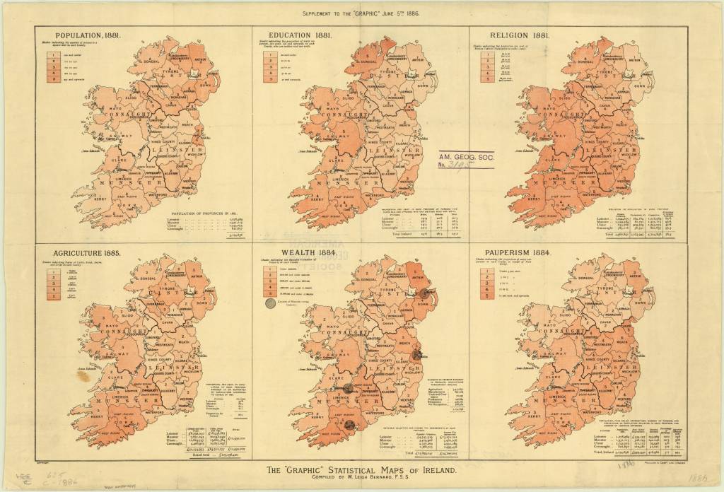
One approach is to use a base map (the fundamental lines of natural features or national borders that all the other information on a map is built on top of) and add colors to it. Different shades or intensities of color can then indicate different percentages or quantities of a given category of people, as indicated by the map’s legend. This method of mapping population is visible in “The ‘Graphic’ Statistical Map of Ireland” created by William Leigh Bernard in 1886. This map includes various small maps of Ireland which share information about the population’s education, religion, income, and agriculture. In each map, counties have been assigned a number and corresponding color saturation based on the appropriate measures for each type of information being mapped, ranging from “number of persons per square mile” to “Rateable [sic] Valuation of Property” to “proportion per cent. of Roman Catholic Population” in each county on the map.
https://collections.lib.uwm.edu/digital/collection/agdm/id/1281/rec/4
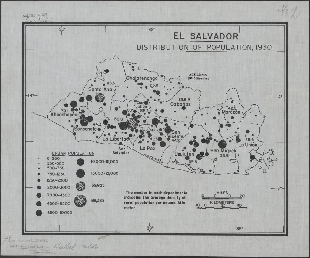
Another way of placing population information over a base map is to add circles over different regions where the size of the circle represents population size at that location. An example is “El Salvadore Distribution of Population, 1930”, a map created by German geographer Leo Waibel around 1940. The legend of this map states how much “urban population” is indicated by circles of each size, with the smallest dots indicating villages of 0-250 people, and the largest (which look like a globe) representing a city of 89,385, presumably San Salvador. Viewers can quickly see both the comparative size of El Salvador’s cities and their locations and distribution across the country.
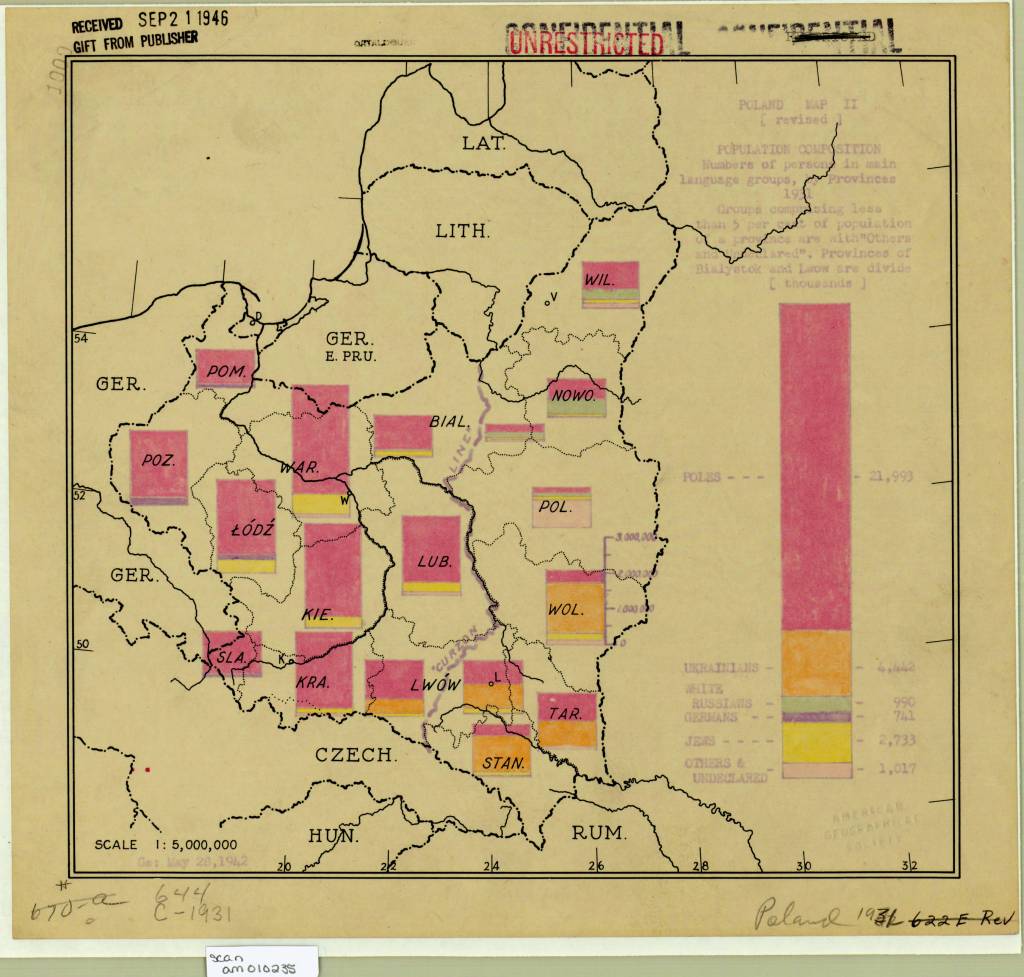
Similarly, bar graphs can be used to convey information about the population of different sections of a country or region. An example is “Poland map II (revised) population composition numbers of persons in main language groups by provinces 1931” created by the US Army in 1942 to document ethnic and language groups in Western Poland during the war. The map includes one large bar graph for the country’s total population on the right, and smaller bar graphs indicating what percentage of citizens of various regions speak Polish, Ukrainian, Russian, German Yiddish, etc. While we might wonder about the mapmakers’ conflation of language and ethnicity in their labels, the bars offer a quick, visually arresting way to grasp what groups were concentrated in different areas of Poland.
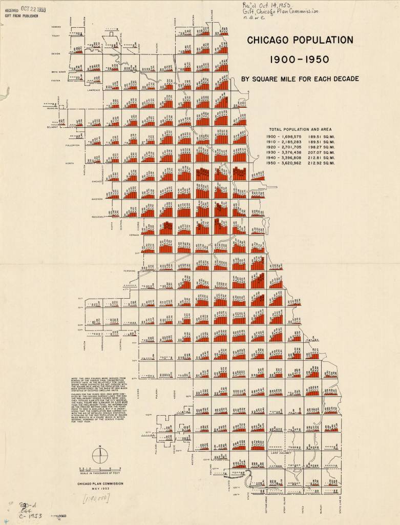
Bar graphs layered over base maps are also a good way to indicate changes in population over time. For example, the Chicago Plan Commission created this map in 1953 to document what regions of Chicago experienced population growth between 1900 and 1950, and which experienced shrinkage. The map is scaled so that there is room within each square mile of the city to include 6 bars, each labelled with that square miles’ populations in 1900, 1910, 1920, 1930, 1940, and 1950. Not only is it clear from this map what areas of the city are industrial rather than residential (such as the regions around Lake Calumet which have ‘0’ population all 5 decades!), it can also be presumed that the city of Chicago could use this data to predict which neighborhoods were in declining and which were growing, and then propose infrastructure initiatives to address those changes.
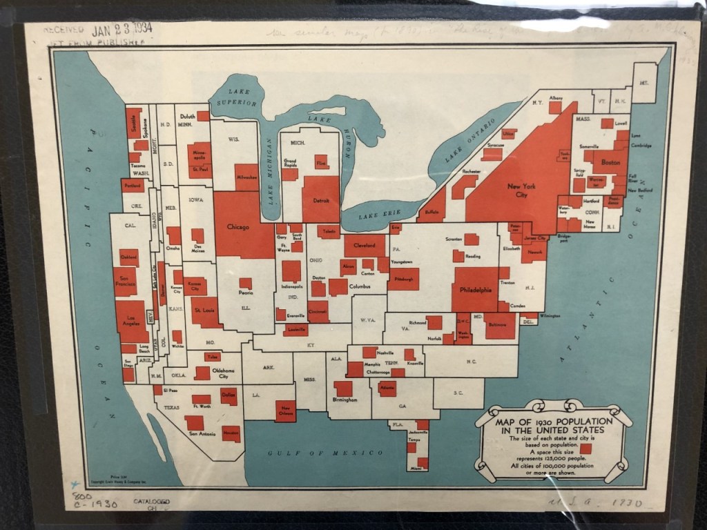
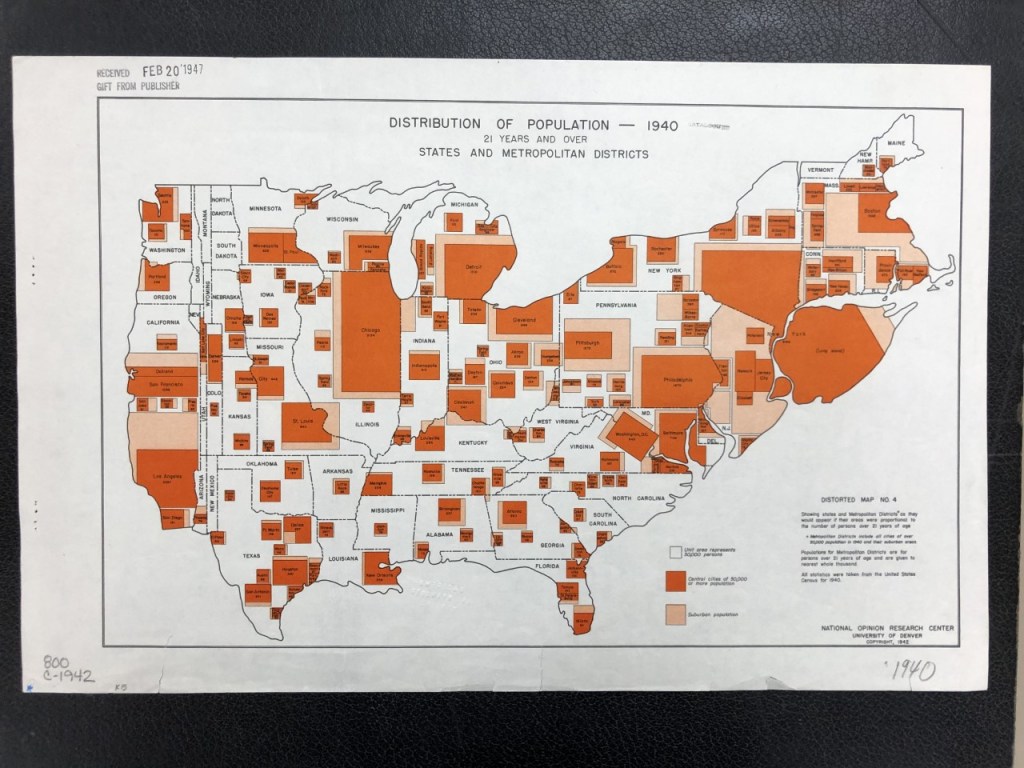
However, not all population maps use base maps. Some re-shape geographic space to convey the population information they’re meant to contain, with the cities, states, or regions with the most population taking up more of the map’s space than those with less population. This type of map is called a ‘cartogram’, and the AGSL’s collection includes multiple examples of cartograms where geographically small but densely populated spaces are represented much larger than their geographically-large but sparsely-populated neighbors! For example, consider the narrowness of western states like Wyoming on this map of the 1930 US population made by Erwin, Wasey & Company, Inc., or the massive size of Long Island in the National Opinion Research Center’s map of the distribution of population in 1940!
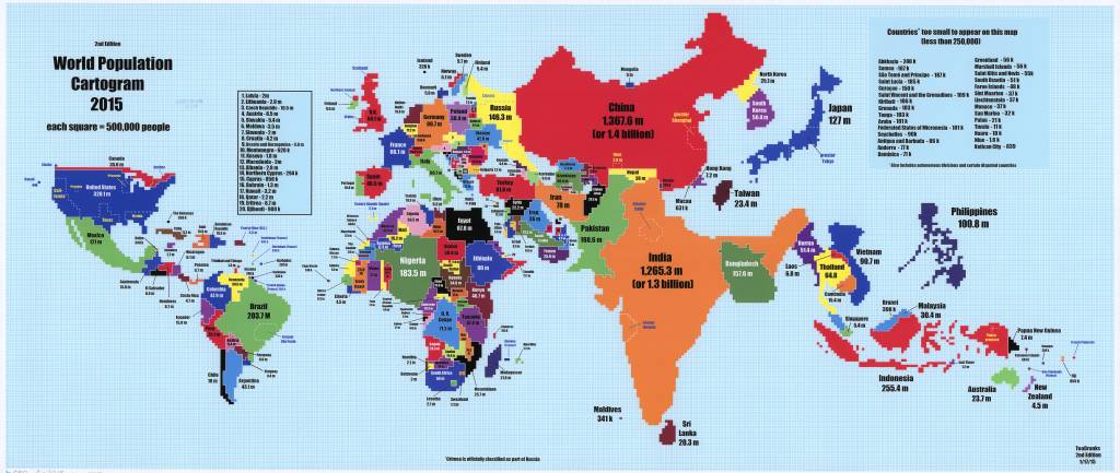
Mapmakers today still use cartograms to map population. In 2015, a Reddit user called TeaDranks made a cartogram of the world’s population on a graph where each square represents 500,000 people. Countries like Canada and Russia become narrow, while countries like India and China take up much more space than in a more standard projection. This cartogram even includes a shout out to Wisconsin, which is made up of 11 squares,
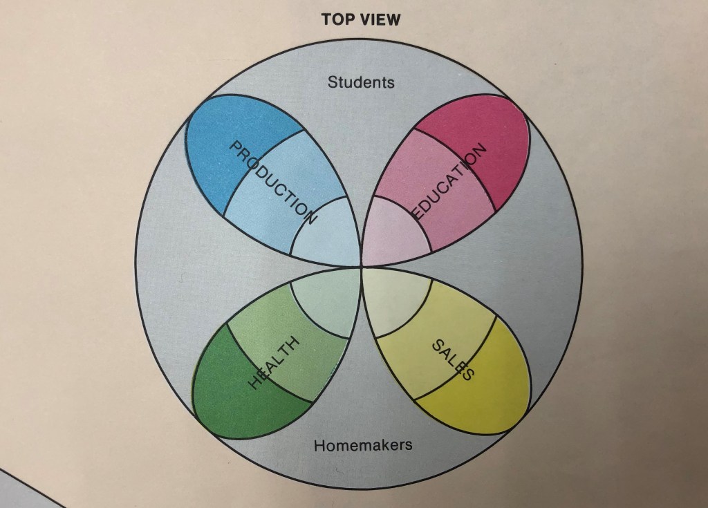
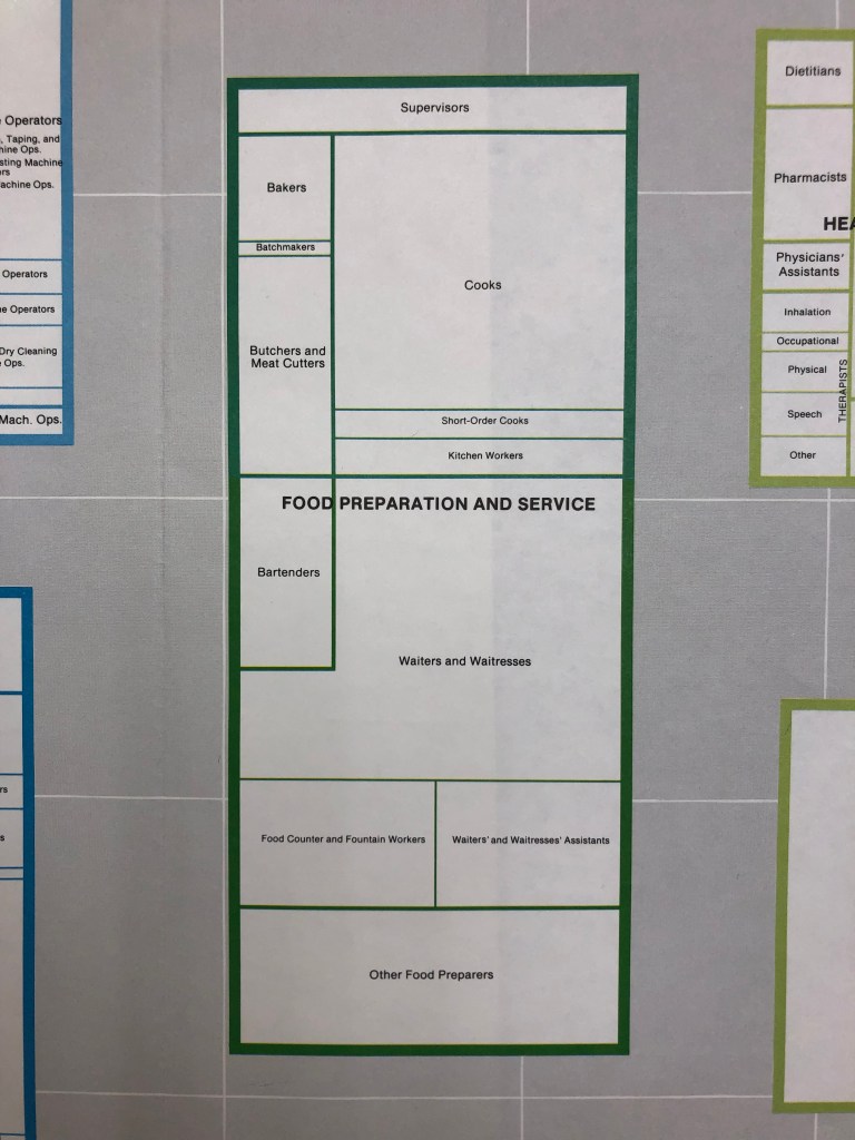
Finally, mapping some population data requires creating entirely new spatial conception of the world. One example is the “World of Work” map created in 1984 by the Regional Planning Council based on the 1980 census of the Baltimore area, an ambitious map which plots the different types of work done in Baltimore and the number of people doing each kind. To map this information, the Council created a globe of the working world that is entirely conceptual. Just as Earth’s globe has been divided up into hemispheres and regions, the planners have divided the World of Work into quadrants, strati, and sections dedicated to different kinds of work and types of workers as pictured below. Each type of employment has been mapped onto this projection of work, and then further broken down into the job titles included in that sphere, with the more common jobs taking up more space and the less-populous ones taking up less. The “Food Preparation and Service” sector is depicted below as an example, with “Waiters and Waitresses” as the largest occupation in this area and “Batchmakers” being the smallest. The full “World of Work” is 59″x36″and is available for viewing in person at the AGSL.

No matter how you map information about population in a given place, some information will be left out or minimized. Each method of mapping populations discussed above offers unique and concise ways to see and understand data, but it is also worth considering what kind of data has been excluded from a population map and how additional information or context might have been obscured by the way it represents data.
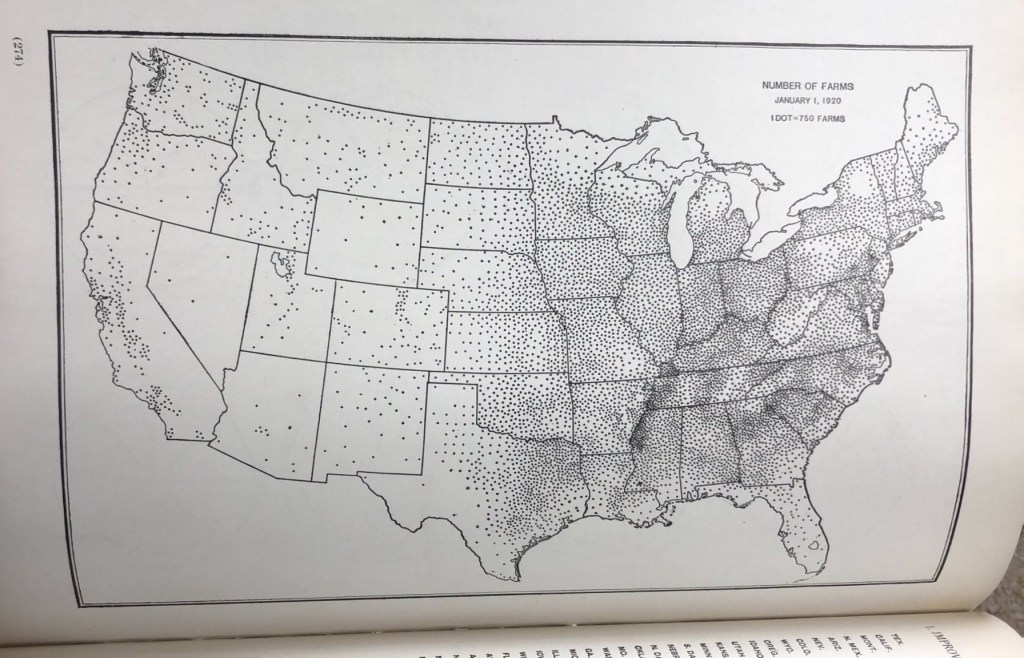
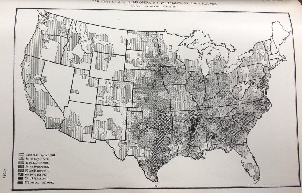
For example, compare the two maps below about farming based on the 1920 US Census. The first includes a dot for every 750 farms in a given location, and it would be easy to look at this map alone and conceive of the western half of the US as thriving farmland full of farmers tilling the soil to support their families and feed the nation at the same time. However, examining the second map from the same book tells a slightly different story. This map has shaded parts of the US based on what percentage of farmers are tenants (as opposed to farm-owners). With this additional layer of data, we can see that a significant portion of America’s farms in 1920 were being labored on by sharecroppers or hired labor (particularly in the south), groups which we know were often taken advantage of and kept in perpetual poverty by landowners. The idyllic farm families we might have imagined based on the first map alone are, in reality, less common than we might think. While both maps offer valuable insight into farming in 1920 America, the information provided by each is limited, and so each map is strongest when examined together.