maps
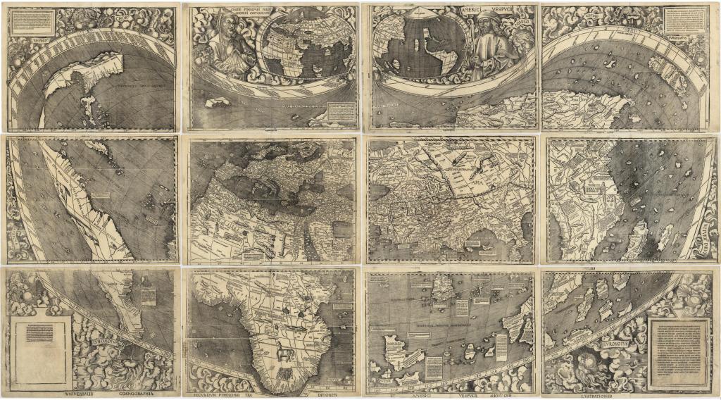
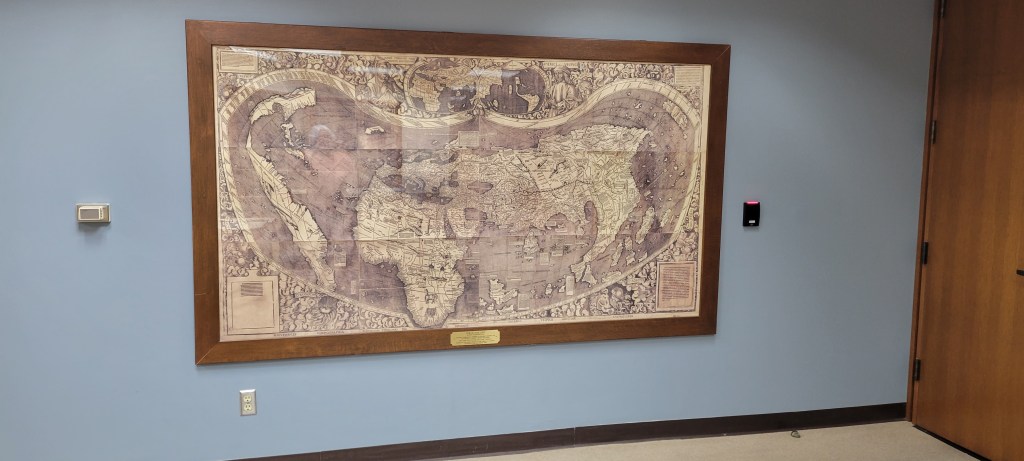
Naming of America
Perhaps many of you have seen the Waldseemüller’s 1507 world map reproduction hanging on the wall in the AGSL but do you know the story of the naming of America? Here is a blog from the Library of Congress, the owner of the original, manuscript Waldseemüller’s 1507 world map discussing mapping and the naming of the northern and southern continents in the Western Hemisphere.
“The story of the naming of America has been told before – not surprisingly considering the object central to the story, Martin Waldseemüller’s 1507 world map, is one of the most important treasures in the Geography and Map Division. The name was bestowed by the mapmaker to show his support for Amerigo Vespucci’s argument that the recently-discovered shores were indeed a separate continent (or two, depending on your preference). Into one of the woodblocks, roughly in what’s today northern Argentina, Waldseemüller had carved the name “America,” and from my perspective five hundred years later, it appears to have stuck.”
Click here to read the rest of the story … https://blogs.loc.gov/maps/2023/07/southern-lands-explorers-and-bears-oh-my/?loclr=eamap
Flowers, birds and trees of the United States

This map, illustrated by Jacob Bates Abbott, is a charming map of the United States showing state birds, trees and flowers.
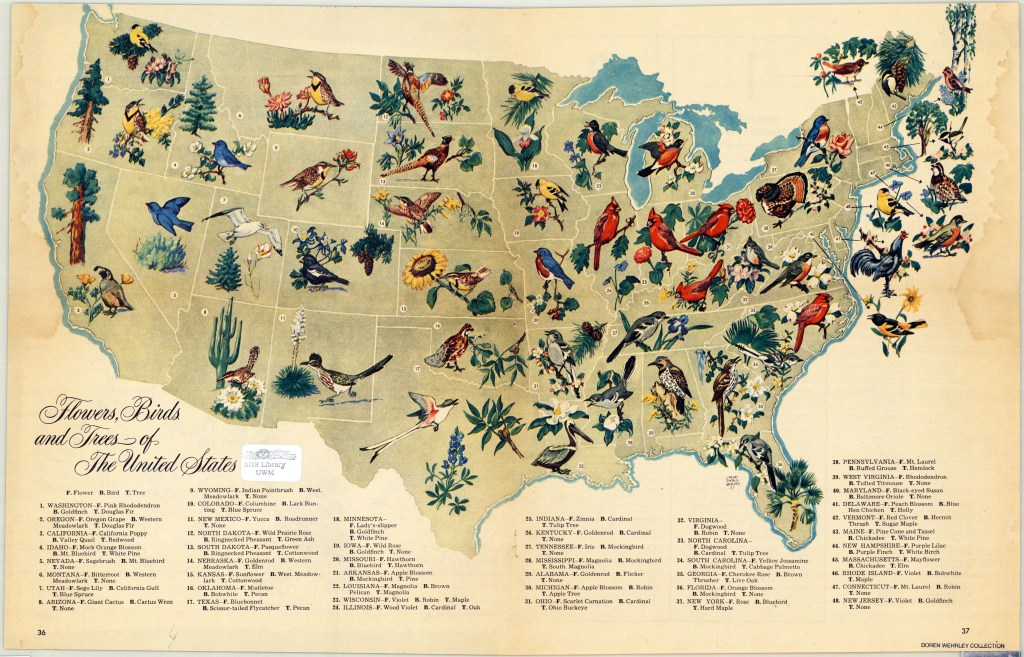
It appeared in a 1948 edition of the biweekly, general interest magazine named Look. Look magazine was published between 1937 and 1971 and was a direct competitor of Life magazine that ran from 1937 to 1972. Stanley Kubrick, Margaret Bourke-White and Normal Rockwell are among the illustrators and photographers that worked at Look magazine.
The map was presented to the AGSL as part of an extensive donation from Doren F. Wehrley, a military veteran and Milwaukee area dentist.
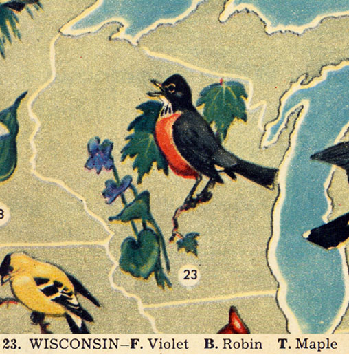
Click here to view this map in the AGSL Digital Map Collection.
Mapping Population
By Anna Rohl
What’s the best way to share population information? After a national census, how can the data collected be represented in a way that actually helps people understand it? How can information about a given place be connected to that place’s physical location?
Over the years, people have tried to answer these questions with many different approaches to mapping population information, each with their own strengths and weaknesses.
One approach is to use a base map (the fundamental lines of natural features or national borders that all the other information on a map is built on top of) and add colors to it. Different shades or intensities of color can then indicate different percentages or quantities of a given category of people, as indicated by the map’s legend. This method of mapping population is visible in “The ‘Graphic’ Statistical Map of Ireland” created by William Leigh Bernard in 1886. This map includes various small maps of Ireland which share information about the population’s education, religion, income, and agriculture. In each map, counties have been assigned a number and corresponding color saturation based on the appropriate measures for each type of information being mapped, ranging from “number of persons per square mile” to “Rateable [sic] Valuation of Property” to “proportion per cent. of Roman Catholic Population” in each county on the map.
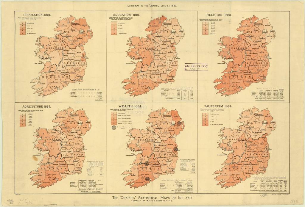
https://collections.lib.uwm.edu/digital/collection/agdm/id/1281/rec/4
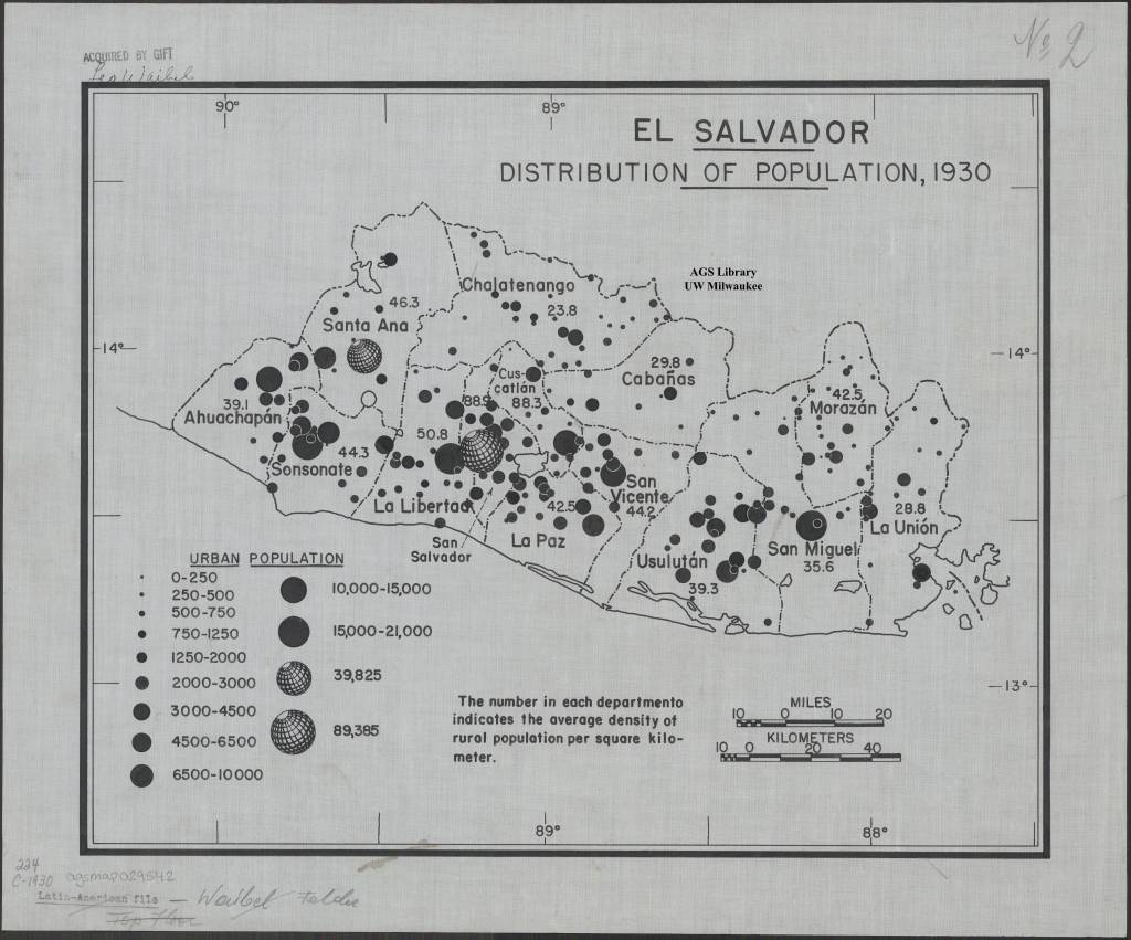
Another way of placing population information over a base map is to add circles over different regions where the size of the circle represents population size at that location. An example is “El Salvadore Distribution of Population, 1930”, a map created by German geographer Leo Waibel around 1940. The legend of this map states how much “urban population” is indicated by circles of each size, with the smallest dots indicating villages of 0-250 people, and the largest (which look like a globe) representing a city of 89,385, presumably San Salvador. Viewers can quickly see both the comparative size of El Salvador’s cities and their locations and distribution across the country.
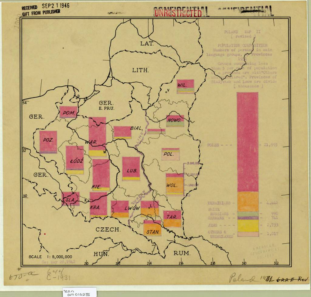
Similarly, bar graphs can be used to convey information about the population of different sections of a country or region. An example is “Poland map II (revised) population composition numbers of persons in main language groups by provinces 1931” created by the US Army in 1942 to document ethnic and language groups in Western Poland during the war. The map includes one large bar graph for the country’s total population on the right, and smaller bar graphs indicating what percentage of citizens of various regions speak Polish, Ukrainian, Russian, German Yiddish, etc. While we might wonder about the mapmakers’ conflation of language and ethnicity in their labels, the bars offer a quick, visually arresting way to grasp what groups were concentrated in different areas of Poland.
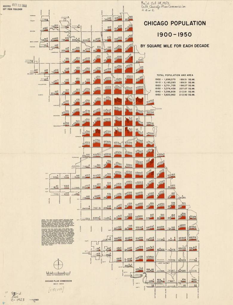
Bar graphs layered over base maps are also a good way to indicate changes in population over time. For example, the Chicago Plan Commission created this map in 1953 to document what regions of Chicago experienced population growth between 1900 and 1950, and which experienced shrinkage. The map is scaled so that there is room within each square mile of the city to include 6 bars, each labelled with that square miles’ populations in 1900, 1910, 1920, 1930, 1940, and 1950. Not only is it clear from this map what areas of the city are industrial rather than residential (such as the regions around Lake Calumet which have ‘0’ population all 5 decades!), it can also be presumed that the city of Chicago could use this data to predict which neighborhoods were in declining and which were growing, and then propose infrastructure initiatives to address those changes.
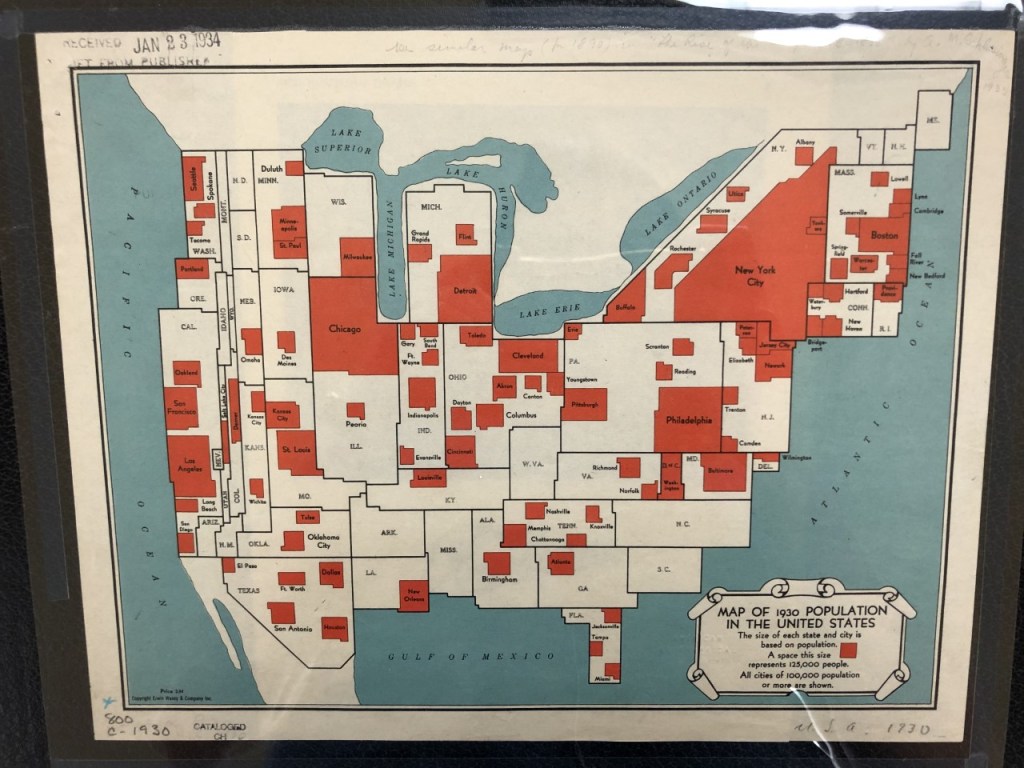
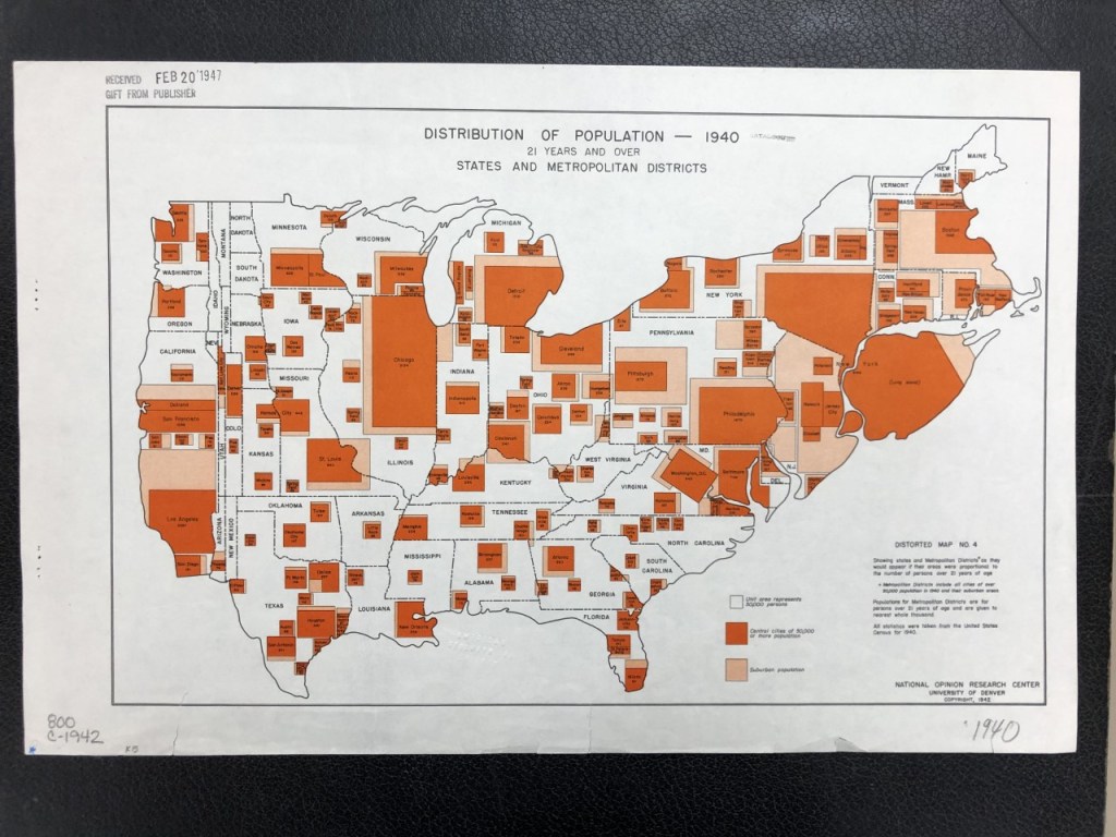
However, not all population maps use base maps. Some re-shape geographic space to convey the population information they’re meant to contain, with the cities, states, or regions with the most population taking up more of the map’s space than those with less population. This type of map is called a ‘cartogram’, and the AGSL’s collection includes multiple examples of cartograms where geographically small but densely populated spaces are represented much larger than their geographically-large but sparsely-populated neighbors! For example, consider the narrowness of western states like Wyoming on this map of the 1930 US population made by Erwin, Wasey & Company, Inc., or the massive size of Long Island in the National Opinion Research Center’s map of the distribution of population in 1940!
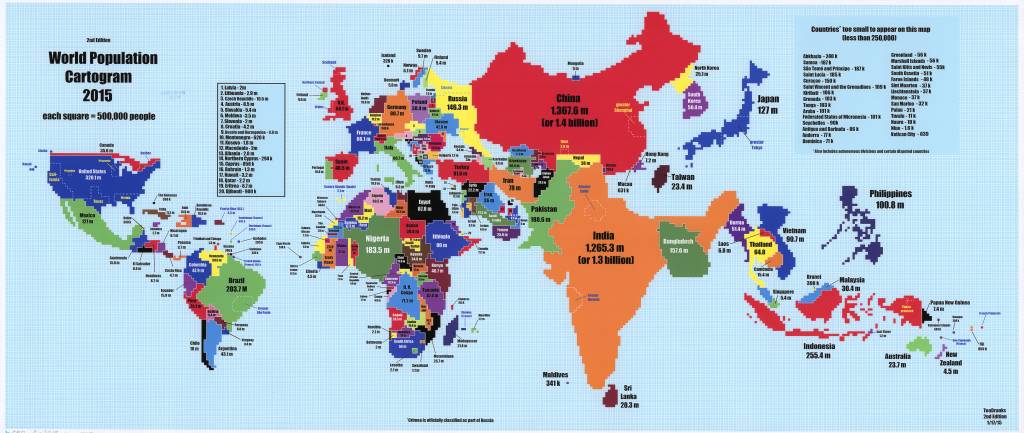
Mapmakers today still use cartograms to map population. In 2015, a Reddit user called TeaDranks made a cartogram of the world’s population on a graph where each square represents 500,000 people. Countries like Canada and Russia become narrow, while countries like India and China take up much more space than in a more standard projection. This cartogram even includes a shout out to Wisconsin, which is made up of 11 squares,
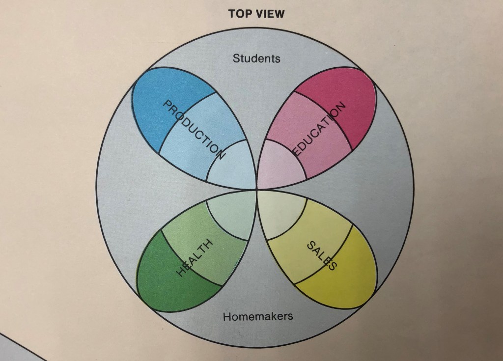
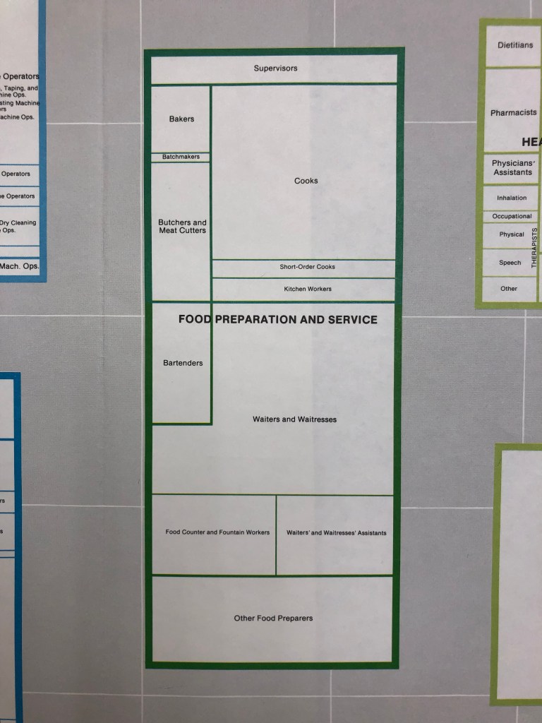
Finally, mapping some population data requires creating entirely new spatial conception of the world. One example is the “World of Work” map created in 1984 by the Regional Planning Council based on the 1980 census of the Baltimore area, an ambitious map which plots the different types of work done in Baltimore and the number of people doing each kind. To map this information, the Council created a globe of the working world that is entirely conceptual. Just as Earth’s globe has been divided up into hemispheres and regions, the planners have divided the World of Work into quadrants, strati, and sections dedicated to different kinds of work and types of workers as pictured below. Each type of employment has been mapped onto this projection of work, and then further broken down into the job titles included in that sphere, with the more common jobs taking up more space and the less-populous ones taking up less. The “Food Preparation and Service” sector is depicted below as an example, with “Waiters and Waitresses” as the largest occupation in this area and “Batchmakers” being the smallest. The full “World of Work” is 59″x36″and is available for viewing in person at the AGSL.

No matter how you map information about population in a given place, some information will be left out or minimized. Each method of mapping populations discussed above offers unique and concise ways to see and understand data, but it is also worth considering what kind of data has been excluded from a population map and how additional information or context might have been obscured by the way it represents data.
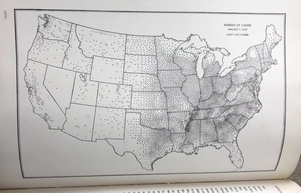
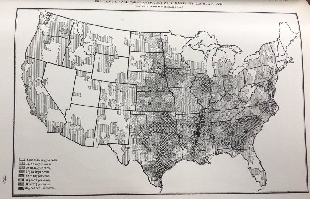
For example, compare the two maps below about farming based on the 1920 US Census. The first includes a dot for every 750 farms in a given location, and it would be easy to look at this map alone and conceive of the western half of the US as thriving farmland full of farmers tilling the soil to support their families and feed the nation at the same time. However, examining the second map from the same book tells a slightly different story. This map has shaded parts of the US based on what percentage of farmers are tenants (as opposed to farm-owners). With this additional layer of data, we can see that a significant portion of America’s farms in 1920 were being labored on by sharecroppers or hired labor (particularly in the south), groups which we know were often taken advantage of and kept in perpetual poverty by landowners. The idyllic farm families we might have imagined based on the first map alone are, in reality, less common than we might think. While both maps offer valuable insight into farming in 1920 America, the information provided by each is limited, and so each map is strongest when examined together.
Looking Back to the Golden Age of Pictorial Map-Making
By Lillian Pachner
Pictorial maps are a unique genre of map that highlights the geographic features of a region with illustrations. These illustrations may be of people, buildings, landmarks, plants, animals, or any number of concepts that can be represented on a map. Besides representational illustrations, these maps often include ornate compass roses, decorative boarders, and intricate cartouches. Often, pictorial maps do not take themselves too seriously, as they regularly have an air of whimsy or humor. Although the focus of a pictorial map is the illustrations, these maps also usually include text which expands on the information presented by the pictures. Pictorial maps are not usually meant to be used for navigational purposes. Rather, they are frequently used to promote tourism, or to commemorate historical events or eras. Many pictorial maps were created for and loved by children given their often brightly colored and stylized illustrations, but they are assuredly not only enjoyed by younger demographics.
By the late eighteenth and early nineteenth centuries, Americans began to view maps differently than they had in the past. Before this era, maps were mostly associated with scientific and navigational tools, despite decorative maps being a very old concept. Soon, maps became associated with the visual arts as well. Maps, of course, never lost their purpose as a tool, so throughout the eighteenth and nineteenth centuries, functionality and aesthetics both became integral factors in map-making. Pictorial maps as we know them today were born out of this intersection of cartographic science and decorative art.
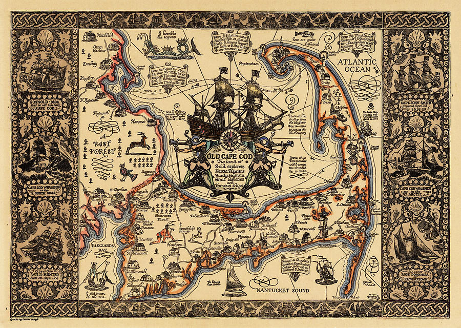
The Golden Age of Pictorial map-making in the United States lasted from about the mid to late 1920s through the 1950s. Some of the “big name” map makers of that time were Jo Mora, Coulton Waugh, Frank Dorn, and Ernest Dudley Chase. Coulton Waugh’s Map of Old Cape Cod, as seen below, is one of the most well-known pictorial maps in America. The works of some of these creators are represented in the AGSL collection.
Pictorial maps truly entered the American mainstream in the 1930s-1950s when both the LA Times and the San Francisco Examiner began dedicating entire pages to pictorial maps made by newspaper staff Charles Hamilton Owens (LA Times) and Howard Burke (San Francisco Examiner). Owens, by far the more prolific of the two artists, reached his peak of popularity during World War II. From February of 1942 through August of 1945, the LA Times published about two-hundred full page pictorial war maps in color, all drawn by Owens. This brought several pictorial maps into the homes and hands of almost every United States citizen.
Although pictorial maps are most often associated with the modern era, they date all the way back to the beginnings of Western cartography. For example, Joan Blaeu’s 1662 World Map has several illustrations representing the Hellenic Pantheon. Early modern cartography utilized an abundance of map decorations, especially in the boarders and margins. These illustrations, while being predecessors to those of the pictorial golden age, serve a different purpose than their modern counterparts. While the illustrations in the pictorial maps play an active role in communicating the purpose and contents of the map, these earlier illustrations are, for the most part, purely decorative. They sometimes have very little relation to the subject of the map that they inhabit. The medieval mappamundi is an early iteration of pictorial map. The oldest and most well-known map in the AGSL collection, the Leardo (below), is a mappamundi. It includes illustrations of landmarks and structures in their approximate locations and has an ornate decorative boarder which consists of the saints’ calendar, and various other illustrations of angelic figures and animals. The Leardo would have been a decorative item, and would not have been a sufficient navigational tool, making it closely related to its modern pictorial successors. One may be familiar with the American Geographical Society’s participation in the #MapMonsterMonday social media trend. Maps with these monsters, while not being pictorial maps as we know them today, have these pictorial elements. These map monsters are the ancestors to the modern pictorial illustration.

Pictorial maps can serve many purposes and represent endless themes. Besides war maps, there are Pictorial maps that tell stories and histories, show locations of tourist traps, and even document fictional journeys. For example, Edward Everett Henry’s 1956 map titled The Voyage of the Pequod from the Book Moby Dick by Herman Melville (below), recounts the narrative from the famous novel. Henry had a predilection for fictional pictorial maps, as he also created the 1960 map, The Virginian: From America’s First “Western” Novel Written by Owen Wister, another map based on a novel. Stephen J. Hornsby is one of the leading experts on pictorial maps, and one of the most prolific authors on the subject. Hornsby says that, while there are things, such as accurate navigation, that a pictorial map commonly does not provide, they include certain elements and themes that a more traditional map cannot such as memory, history, emotion, fun, humor and pride of place/region.

Reading List
“About Pictorial Maps.” George Glazer Gallery Antiques. Accessed December 28, 2022. https://www.georgeglazer.com/wpmain/about-pictorial-maps/.
Brückner, Martin. “Maps, Pictures, and the Cartoral Arts in America.” American Art 29, no. 2 (2015): 2–9. https://doi.org/10.1086/683346.
Cosgrove, Denis. “Maps, Mapping, Modernity: Art and Cartography in the Twentieth Century.” Imago Mundi 57, no. 1 (2005): 35–54. http://www.jstor.org/stable/40233956.
Miller, Greg. “Geography Isn’t Sacred in the Playful World of Pictorial Maps.” Culture. National Geographic, May 3, 2021. https://www.nationalgeographic.com/culture/article/geography-playful-world-pictoral-maps.
Picturing America: The Golden Age of Pictorial Maps. 2017. Video. https://www.loc.gov/item/webcast-7930/.
“The Golden Age of American Pictorial Maps.” The Golden Age of American Pictorial Maps | Osher Map Library. Accessed December 28, 2022. http://oml01.doit.usm.maine.edu/exhibitions/pictorial-maps.
New titles in the AGSL Fall 2022
Undreamed shores: five women who sought out the world / Dr. Frances Larson, 2022
Call Number: (AGS) GN20 .L37 2021
Geographical knowledge and imperial culture in the early modern Ottoman Empire / Emiralioğlu, M Pinar, 2014
Call Number: (AGS) DR486.E45 2014
Encounters in the New World: Jesuit cartography of the Americas / Mirela Slukan-Altic, University of the Chicago Press, 2021
Call Number: (AGS) GA401.S59 2021
Citizens and rules of the world: the American child and the cartographic pedagogies of empire / Mashid Mayar, 2022. The University of North Carolina Press
Call Number: (AGS) G76.5.U5.M39 2022
Mapping Nations – narrating maps: concepts on the world in the Middle Ages and the early modern period / Ingrid Baumgärtner, 2022. Medieval Institute Publication
Call Number: (AGS) GA221 B386 2022
Kaarten die geschiedenis schreven : 1000 jaar wereldgeschiedenis in 100 oude kaarten (Maps that Made History: 1000 Years of World History in 100 Old Maps) / Martijn Storms, 2022. Lannoo Publishing
Call Number: (AGS) (Folio) G1030 S85x 2022
The politics of mapping / Bernard Debarbieur, 2022
Call Number: (AGS) GA102.3 .P655 2022
The diagram as paradigm: cross-cultural approaches / Jeffrey F Hamburger, David J. Roxburgh and Linda Safran, 2022 Dumbarton Oaks Research Library and Collection
Call Number: (AGS) NC715 D529 2022
Sassy planet: a queer guide to 40 cities, big and small/ Harish Bhandari, 2021.
Call Number: (AGS) HQ75.25 B495 2021
Iceland: the essential guide to customs & culture / by Thorgeir Freyr Sveinsson, 2021
Call Number: (AGS) DL326 S8 2021
Fifteen Icelandic swimming pools, aka, A gay guide to swimming in Iceland / by Liam Campbell , 2020 Published in association with Elska Magazine
Call Number: (AGS) HQ75.26 I2 C36x 2020
111 places in Milwaukee that you must not miss / by Michelle Madden , 2022
Call Number: (AGS) F589 M63 M33x 2022
Our gay history in fifty states / by Zaylore Stout , 2020 Wise Ink Creative Publishing
Call Number: (AGS) HQ76.8 U5 S775x 2020
LGBTQ+ Vegas travel guide & map / by Gay Vegas , 2019 Gay Vegas
Call Number: (AGS) HQ75.26.N3 L43 2019
Handbook of LGBT tourism and hospitality: a guide for business practice / by Jeff Guaracino , 2017 Harrington Park Press
Call Number: (AGS) HQ75.25 G833 2017
In her footsteps: where trailblazing women change the world Contributors: Alexis Averbuck [and 34 others], 2020 Lonely Planet Global Limited
Call Number: (AGS) CT3202 I53X 2020
No simple solutions: transforming public housing in Chicago / by Susan J. Popkin, 2016 Rowman & Littlefield
Call Number: (AGS) HD7288.78 U52 C465 2016
Widow of the ice: the women that Scott’s Antarctic expedition left behind / by Anne Fletcher, 2022 Amberley Publishing
Call Number: (AGS) G874 F55x 2022
Atlas of Design volume 6/ North American Cartographic Information Society, 2022
Call Number: GA101 .A85x 2022
MAPS & ATLASES
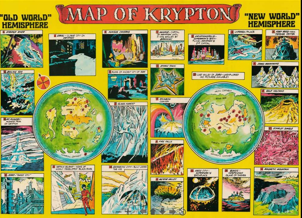
Map of Krypton / National Periodical Publications, 1973
Call Number: (AGS) 999 A-1973
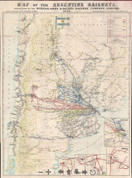
Map of the Argentine railways / presented by the Buenos Aires & Pacific Railway Company, 1925.
Call Number: (AGS) 251 D-1925
Election atlas of India : parliamentary elections 1952-2019 : 1st Lok Sabha to 17th Lok Sabha : updated January 2022
Call Number: (AGS) (FOL) At.430 C-2022
Map of Calhoun County, Texas / W.C. Walsh, Commissioner of the Genl. Land Office, 1879.
Call Number: (AGS) 882-c .C34 E-1879
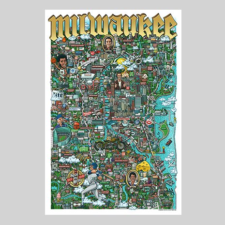
Milwaukee / Mario Zucca.
Pictorial map of Milwaukee with a hidden brat challenge
Call Number: (AGS) 893-d .M54 M-2022
The atlas of human rights: mapping violations of freedom around the globe / by Andrew Fagan, 2010 University of California Press
Call Number: (AGS) At.050 C-2010b
Ukraine, Moldova road map / Freytag & Berndt, 2019.
Call Number: (AGS) 686 A-2019
Leardo Mappamundi 1452
Giovanni Leardo, Venice, 1452 Mappamundi (Map of the world)
The oldest world map held at the AGS Library is the Leardo Mappamundi. This is one of three known world maps signed and dated by the fifteenth century Venetian cartographer, Giovanni Leardo. The two others, that are similar but not identical, are located at the Biblioteca Comunale in Verona, Italy and the other at the Museo Civico in Vicenza, Italy.
The map was originally presented to the American Geographical Society of New York by Archer M. Huntington. Huntington was a long time member of the Society, serving as President from 1907-1911. Huntington donated this manuscript map to the AGS of NY in 1906 after having paid just under $2,000. Since the transfer of the AGS of NY research library to the University of Wisconsin-Milwaukee, the Leardo map has been veiwed by researchers and the public. In 2008, it taveled to the Field Museum in Chicago for the Maps: Finding our place in the World exhibit and later at the Walter’s Museum in Baltimore, Maryland. In preparation for this exhibit, the map underwent some slight restoration and reframing.
Description of the Map
The map depicts the parts of the world known to Europeans in the late Middle Ages. It is considered the finest example of a medieval mappamundi preserved in the Western Hemisphere.

Following a common convention of medieval mapping, Jerusalem (A) is placed at the center of the tripartite world consisting of Asia, Europe and Africa, the three known continents. These are, in turn, encircled by the ocean.
The map is “oriented” with east and the Terrestrial Paradise(B) at the top, Asia in the upper half (C), Europe at the lower left (D), and Africa to the right (E). The shapes of the Mediterranean Sea (F) and of western Europe are surprisingly well drawn and easily recognizable, most likely being based on the portolan sea charts of the time. In addition to names derived from Ptolemy’s Geographia, the names, especially those related to eastern Europe, were supplemented by Marco Polo’s travel accounts.
With the exception of the aptly colored Red Sea (G), the seas are uniformly blue. Land areas are the natural color of the bleached parchment except for a vivid red region in the far south (H) bearing the inscription “Dixerto dexabitado per caldo” (desert uninhabited due to heat) and a drab brown waste in the far north (I) marked “Dixerto dexabitado per fredo” (desert uninhabited due to cold).
All three of Leardo’s maps have a similar feature — a series of rings surrounding the circular map and constituting an elaborate calendar. These ten concentric circles present data by which one can determine the dates of Easter for ninety-five years from April 1, 1453 to April 10, 1547; the names of the months (J), and the day, year, and minute when the sun enters each sign of the zodiac; the phases of the moon; the dates on which Sunday falls in various months and years; the length of respective days; and saints’ days and festivals (K). Winds blowing from the points of the compass are shown by eight faces around the edge of the central disk. The corners of the map are occupied by figures representing the four evangelists: the lion for St. Mark (L), the bull for St. Luke (M), the angel for St. Matthew (N), and the eagle for St. John (O) .
View the Leardo map through the AGS Library Digital Map Collection
Riding the Rails through Wisconsin
By Lillian Pachner
The beginning of the rail age in North America is marked by the construction of the Baltimore & Ohio Railroad in 1827. Quickly, cities across the young country saw the benefit of being connected by rail. In particular, Milwaukee’s city boosters (people whose job it was to essentially “promote” a city to outsiders), immediately recognized that the emerging national network of railroads would provide local farmers, craftsmen, and manufacturers with access to a larger market. If Wisconsin wanted to keep up with the surrounding cities, it would have to build a railroad.
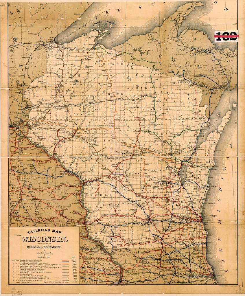
Wisconsin’s first railroad was the Milwaukee and Mississippi railroad. Construction for this line began in 1847. This railroad was originally called the Milwaukee and Waukesha Railroad. It was the first passenger line to connect Milwaukee with Waukesha. The construction of this railroad was part of the attempt to connect Milwaukee with the Mississippi River. The construction for the second rail line, the Lacrosse and Milwaukee Railroad, began in 1852.
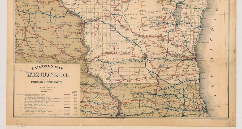
While Milwaukee never became a giant rail-based metropolis like Chicago or St. Louis in the late 1800s, Milwaukee was still able to make its name as a decently large rail-hub. Though the banking crisis of 1857 meant that railroad construction was slow going for a time, banker Alexander Mitchell’s emergence in the industry marked an uptick in Milwaukee’s rail building.
Alexander Mitchell, along with his business partner and mentor George Smith, both Scottish Immigrants, made a large part of their respective fortunes during the Banking Crisis of 1837, twenty years earlier. Mitchell served as secretary for Smith’s company, The Wisconsin Marine and Fire Insurance Company Bank. The company’s insurance charter allowed them to circulate certificates of deposits as if they were currency (these deposit slips were called “George Smith’s Money”), which allowed them to amass a fortune while actual banks were failing. Though the legality of this practice is dubious at best, Mitchell became the wealthiest person in the state by 1860.
Mitchell’s fortune allowed him to supplement and restructure Milwaukee’s existing railroads. He organized the Milwaukee and St. Paul Railway, and other rail construction projects that connected and renamed some of the existing lines. Mitchell’s work helped Milwaukee grow into a hub for wheat shipment in the Midwest. For a time, it rivaled even Chicago on this front.
The map above, created by Allan Connover in 1887, (the year of Mitchell’s death) shows the major rail lines going through Wisconsin at the time. This is one of several rail maps available for viewing at the American Geographical Society Library (AGSL) in the Golda Meir Library on Campus. Several of these maps may also be viewed online through the AGSL Digital Collection.
The AGSL is open Monday-Friday, 9 a.m. to 4:30 p.m., on the third floor of the Golda Meir Library at UWM’s campus.
Map Citation:
Connover, D. Allan. Railroad Map of Wisconsin / Prepared for the railroad commissioner by Allan D. Conover C.E. [Map]. 1:760,320. 1 in. = 12 miles. 1887. Link to map on Digital Collection
Sources Cited:
Campbell, Stephen. “Panic of 1837.” The Economic Historian. November 12, 2020
Grant, Roger H. “Railroads”. Encyclopedia of Milwaukee. 2016.
Harding, Bethany. “Alexander Mitchell.” Encyclopedia of Milwaukee. 2016.
Leonard, David Blake. A Biography of Alexander Mitchell 1817-1887. Madison, WI: University of Wisconsin, 1951.
Langill, Ellen. “Banking Industry”, Encyclopedia of Milwaukee. 2016.
Smith, Alice Elizabeth. “George Smith’s Money.” Wisconsin: State Historical Society of Wisconsin, 1966.
Maps at the Bottom of the Ocean
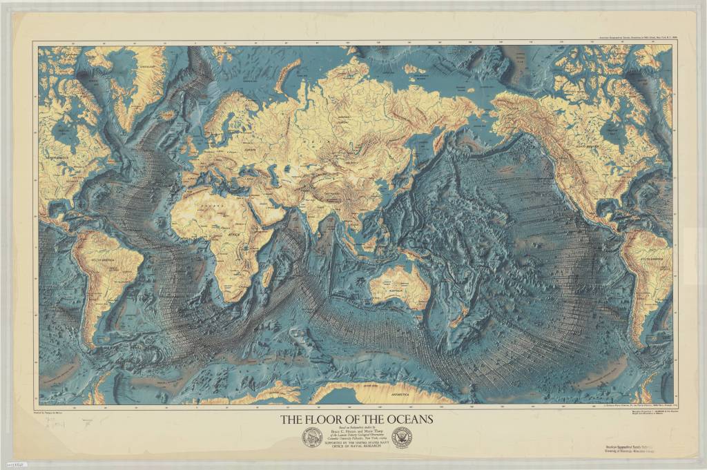
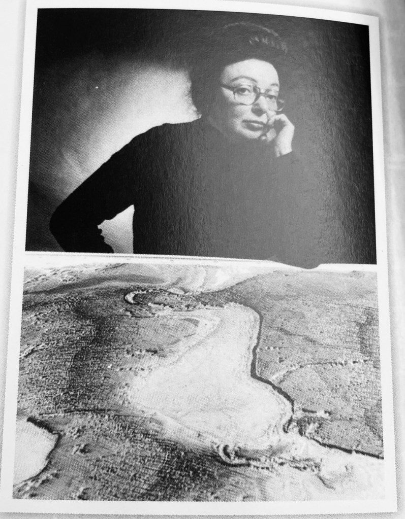
By Brendan Dooley
As March marks International Women’s History Month, it seems an appropriate time to reflect on the contributions of AGS member Marie Tharp (1920-2006). Before Tharp’s research and attention to detail in plotting soundings from colleagues, we might still be in the dark regarding the topography of the ocean floor, plate tectonics and a formalized idea of Pangea.

Tharp was a multi-talented researcher and true renaissance learner who had multiple minors, majors and graduate degree paths under her belt, including being an accomplished drafter which led to her work in mapping the oceans’ floors.
This barely scratches the surface of her accomplishments though, and you can learn much more about her here at a “Washington Post” story about her life, through books at every level in the AGSL circulating collection (like Theater of the World: The Maps That Made History, Ocean Speaks, and Women in American Cartography), some of her maps digitized in the AGSL collection here and more.
The AGSL is open Monday-Friday, 9 a.m. to 4:30 p.m., on the third floor of the Golda Meir Library at UWM’s campus.
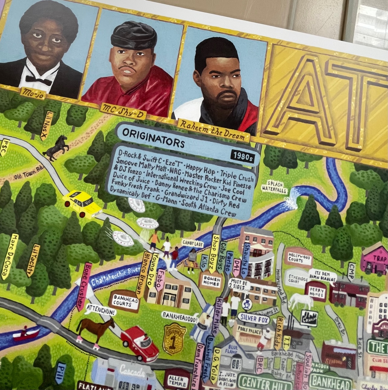
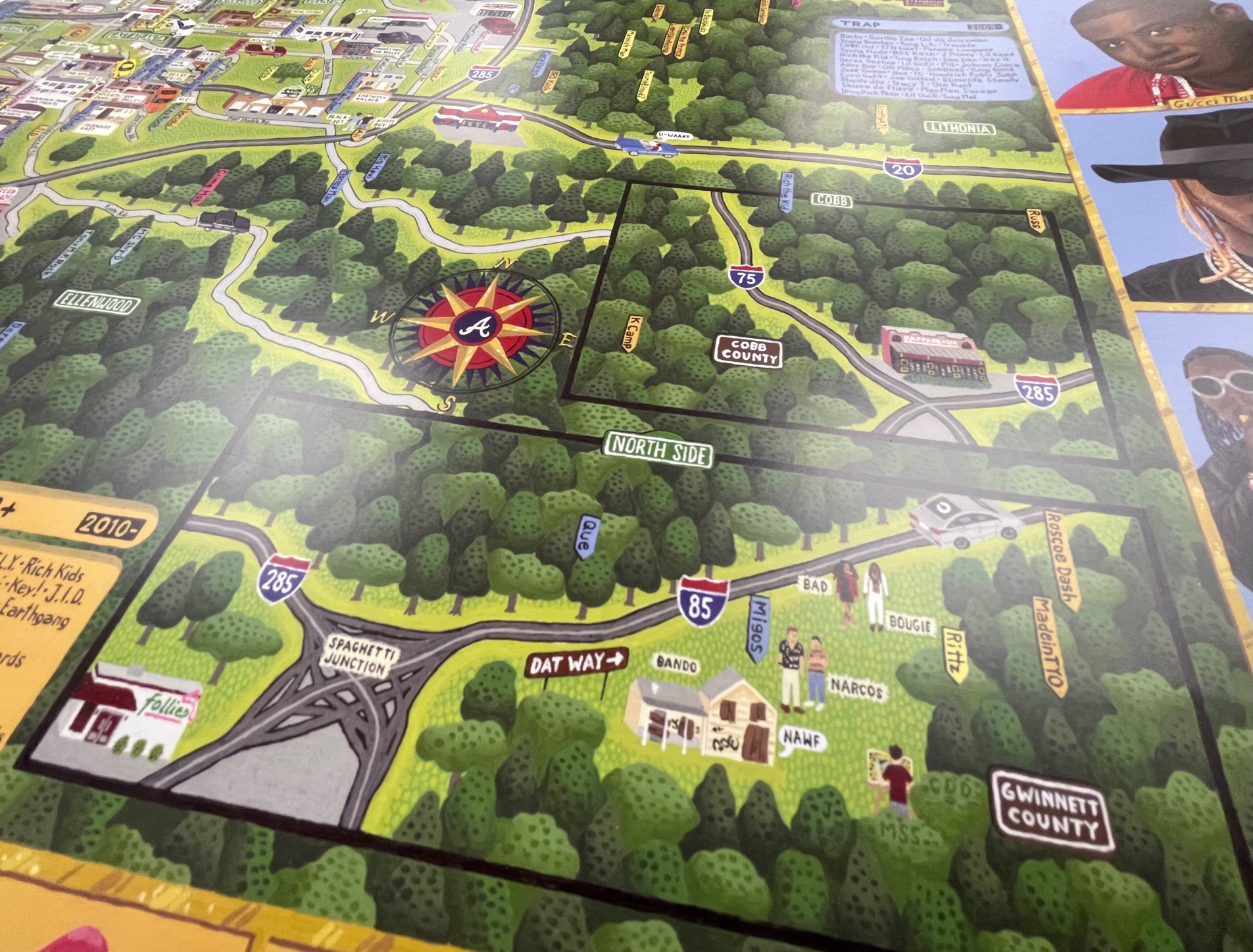
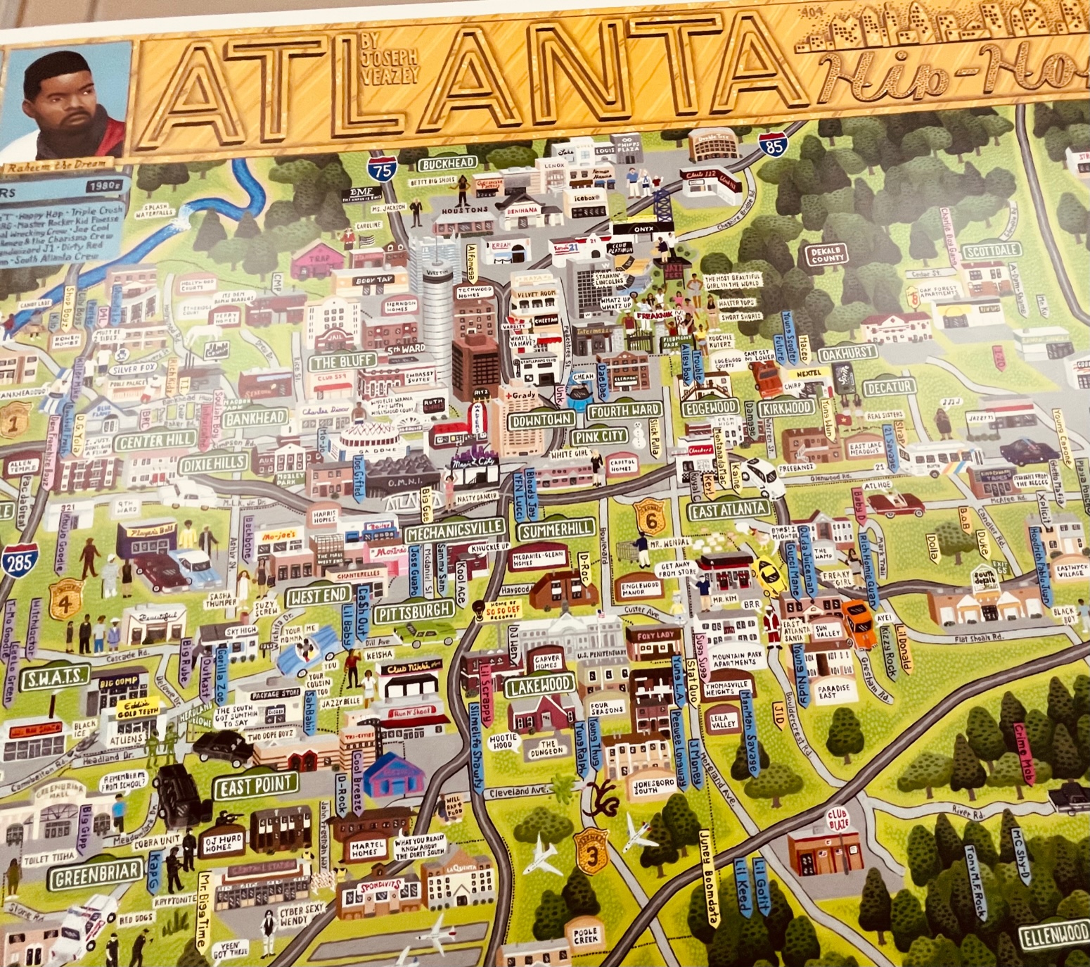
From Hip-Hop to Hope
By Brendan Dooley
Recently arriving in the American Geographical Society Library, the “Atlanta Rap Map” is a tribute to the hip-hop influences of, in and around Atlanta, Ga., that documents the region’s artists and their works. The map shows artist locales as well as lyrical influences within, and lists major and minor performers and their works throughout with a border of painted face images.
Compiled, created and sold by Veazey Studio, the company said the 24” x 36” map was painted by hand in acrylics and includes anything “literally ‘put on the map’ by being mentioned in a hit song (from classic underground staples, to local hits, to worldwide chart toppers) or an influential album. The research took over a year, as older artists were uncovered, and hundreds of albums were listened to in their entirety.” (Now that’s my kind of research …)
Veazey Studio said proceeds from its sales of the Atlanta Rap Map will benefit HOPE Atlanta, a charity striving “to help Georgians avoid homelessness and hunger.”
You can come up to view the Atlanta Rap Map in the AGSL Monday-Friday, 9 a.m. to 4:30 p.m.

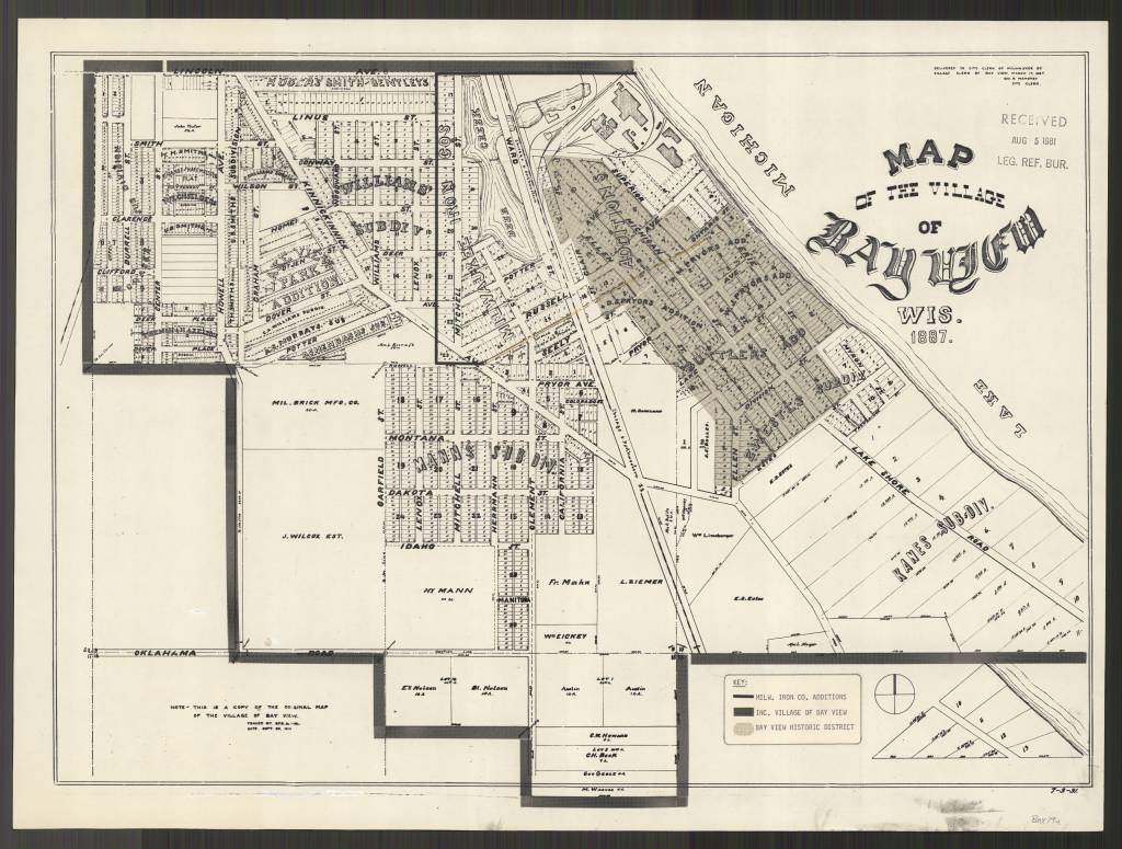
MILWAUKEE MUNICIPAL RESEARCH CENTER MAP COLLECTION
Beginning in 2020, the American Geographical Society Library partnered with the Milwaukee Municipal Research Center (MRC) to provide online access to over 250 maps. This online map collection features maps created by city departments and includes subject areas of the city’s historic geographical boundaries and annexations, current and former aldermanic districts (known as wards prior to 1972), Census tracts, neighborhoods, land use, redevelopment planning, transportation and population. The collection has both historical maps dating back to early 1800s as well as more modern maps dating into the 2000s. The technical work was done by two UWM SOIS students, Samantha Dickson and Lillian Pachner, who uploaded the files and created ContentDM metadata.
In addition to finding these 250+ maps in the American Geographical Society Library Digital Map Collection online, all of them can be used on site at the Milwaukee Municipal Research Center (MRC), located in the basement level of the Zeidler Municipal Building, 841 N. Broadway. Their hours are 8:00 am – 4:45 pm, Monday-Friday.
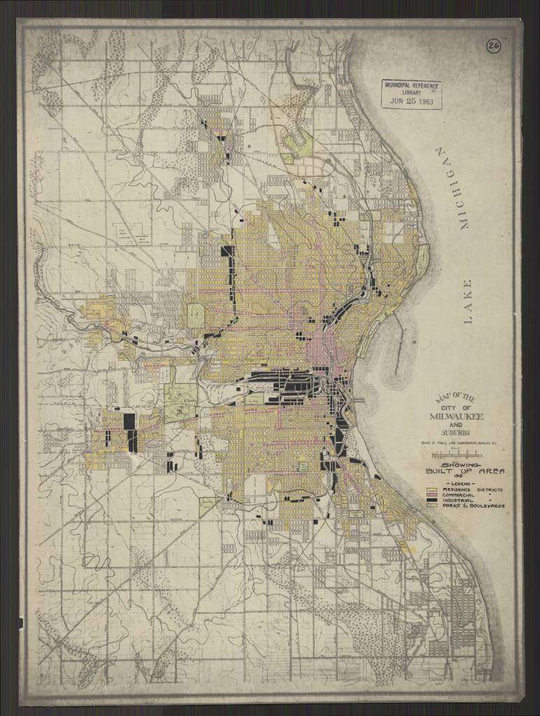
Milwaukee Wis. Annotated title: Showing Built Up Area 1919
https://collections.lib.uwm.edu/digital/collection/agdm/id/25616/rec/130
https://collections.lib.uwm.edu/digital/collection/agdm/id/25578/rec/150
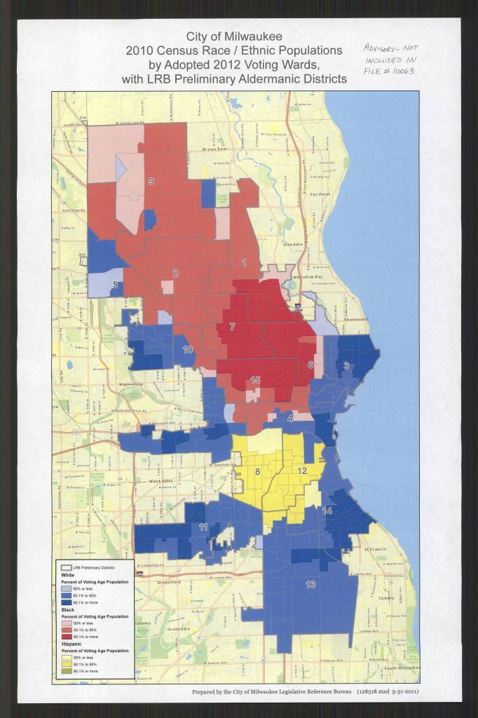
by Adopted 2012 Voting Wards, with LRB Preliminary Aldermanic Districts /
Prepared by the City of Milwaukee Legislative Reference Bureau
https://collections.lib.uwm.edu/digital/collection/agdm/id/25684/rec/135
