Map Collection
The 1931 Wadham Road Map
by Judy Aulik
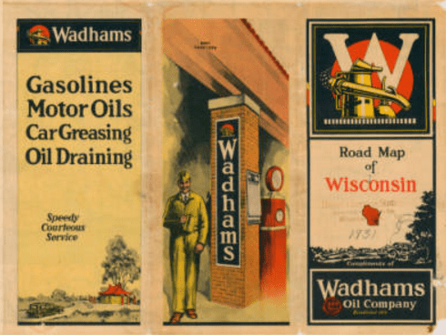 One of the author’s favorite oil companies to issue road maps is Wisconsin’s own Wadham Oil Company. Founded in 1888, early on it specialized in oils and greases: gasoline had a very limited market in the day. As highways were built and auto travel became commonplace, an obvious place to advertise was on the road maps nearly every traveler carried.
From the beginning of its gasoline marketing, Wadham produced a superior product called “straight run gasoline,” i.e., the hydrocarbon fraction obtained strictly by distilling petroleum. Compared to other fractions such as kerosene and heating oils, the gasoline suited to automotive use was rare in many oil feedstocks. Petrochemical tricks such as catalytic cracking and reforming were yet to come into use. Therefore, Wadham had to charge a small premium for its gasoline, considered to be a premium product. Indeed, the original gas was designed for a colder climate, and before the mid-1920s, was lead-free.
Wadham capitalized on its reputation by featuring images of country club life and fancy autos on its map covers. Its stations were distinctive even before architect Alexander C. Eschweiler designed his famous “Pagoda” gas stations, outstanding in their exotic nature, yet blending harmoniously in Wisconsin towns and cities.
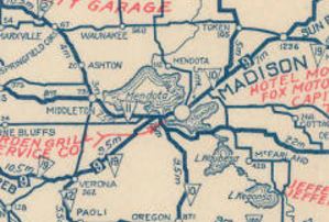
By the time this map was issued in 1931, Wadham had been purchased by Vacuum Oil Company, precursor to Socony-Vacuum (which eventually became Mobil Oil, and culminated in ExxonMobil) However, the first three map issues under the new parent remained truer to the Wadham red, black, and yellow color scheme than to its new parent’s. Some Road Map Collectors Association members would debate whether the map shown is a Wadham map or a Milwaukee Journal Tour Club 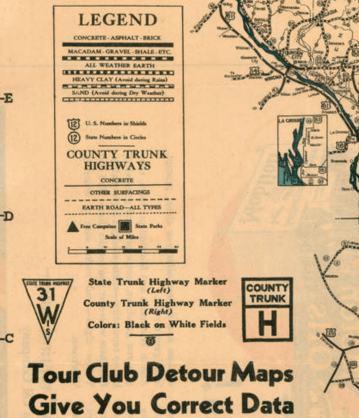 map issue. It was obtainable at the Tour Club’s Branch Stations. Fewer would opine that, as the cartographical information is that from the Wisconsin State Highway Commission, it should be considered a state official map.
Wadham’s first reported map was a 1925 issue, which was issued inside a small cardstock cover. At this point, Wadham gasoline stations were part of a Wisconsin Independent Oil Jobbers Association, and photographic evidence shows limited use of the association’s spread eagle trademark and signage. The next map considered by the RMCA to be a Wadham issue dates to 1932. The 1933 map used Langwith cartography; the 1934 cartographer is unknown; and the remainder, issued from 1935-1940, used General Drafting cartography, as did the Socony-Vacuum maps of the era. By 1935, the Mobil Pegasus had replaced the chemical industry imagery of the Wadham signage.
Does anyone else know of Wadham maps from the 1926-1930 range? If so, the author would like to know of their existence in detail.
View this map at UWM’s AGSL Digital Map Collection
Road Maps in Transition: 1920-1925
by Judy Aulik
Wisconsin officially numbered and sign posted its highways between 1916 and 1918, following the state trunk highway system (STH) designed by A.R. Hirst. Illinois followed in 1918 with its first round of state bond highways (SBI), and Michigan began its M system in 1919. After a five year gap, when Rand McNally resumed publishing road maps in 1917, later coupled with a proprietary, rudimentary, coated cardboard road marking system and an arbitrary space saving numbering system, it resulted in a peculiar set of road maps with five distinct highway designations, including the blazed trails, such as the Lincoln Highway. Had Rand McNally chosen the detail allowed by Wisconsin’s unusual county trunk highway lettering systems, it would have had six!
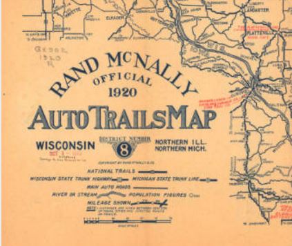
The Wisconsin State Historical Society has digitized maps of this era, as they have unquestionably passed out of copyright. Wisconsin, northern Michigan, and northern Illinois comprise District No. 8 in the Auto Trails Map series. Cartographer John Brink had an entry in a company contest which won him $100. His big idea: make a clearer highway map by numbering the major roads and trails, using a map legend which assigns a Rand McNally route number to each trail.
However, the decluttering concept fell by the wayside as his employer began to sell advertising, primarily for garages and hotels. printed in red in the clear space left.
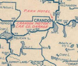
Clearly, the extra information could prove helpful to the auto tourist. However, Brink’s Rand McNally route numbers, in white on a dark rectangle, generally conflicted with the route numbers used by the states. For example, the National Parks Pike, its eastern terminus in Madison, was designated as No. 9 on the Rand system; STH 19 (designating the highway as the 9th longest in Wisconsin) from Madison west; and blazed in red, black, and white for the National Parks Pike. After 1926, the Federal Highway system, which took over the best state routes, cleared up the confusion. The No. 9 route east of the capital city eventually became US 151; plus STH 19 west, on into Iowa (Primary Route 19; also the National Parks Pike), US 18.
Other highways the Federal Highway System also subsumed included SBI 4, which became US 66; a westerly stretch of the Yellowstone Trail in north central Wisconsin, which became US 10; and the mother of all renamings: the Ulysses S. Grant Memorial Highway (ca. 1915), which became SBI 5 (ca. 1918-1967), which also was co-blazed as the poorly publicized and long forgotten Atlantic-Yellowstone-Pacific Trail (1923, per the Iowa DoT) in northern Illinois, which was taken over by US 20 (ca. 1938, now Business US 20 in segments). Confusing, yes, but that’s why road maps and highway history are so fascinating!
Sources:
http://cdm15932.contentdm.oclc.org/cdm/ref/collection/maps/id/14541
https://iowadot.gov/autotrails/atlantic-yellowstone-pacific-highway
Special thanks to the AGSL guest blogger, Judy Aulik. With an extensive road map collection of her own, Judy Aulik has served as past President of the Road Map Collectors Association, an organization founded in 1996. Now boasting a membership of several hundred in the US, Canada, and Europe, the club publishes a quarterly newsletter, has a website, Facebook page, and hosts an annual “Road Map Expo.” Judy is a retired Adult Services Librarian with a PhD from UW-Madison. She recently spoke to the Wisconsin Map Society about the history of the Milwaukee Journal Tour Club, and its influence on highway signage and mapping.
French influence on US land development
by Sam Balistreri-Daum
A couple months back, while cataloging the British Admiralty charts in our nautical charts collection, I noticed along the coast and riverbanks of Georgetown, Guyana (then British Guyana) from 1938 and 1939 a series of parallel lines running perpendicular to the shores with names written between each line.
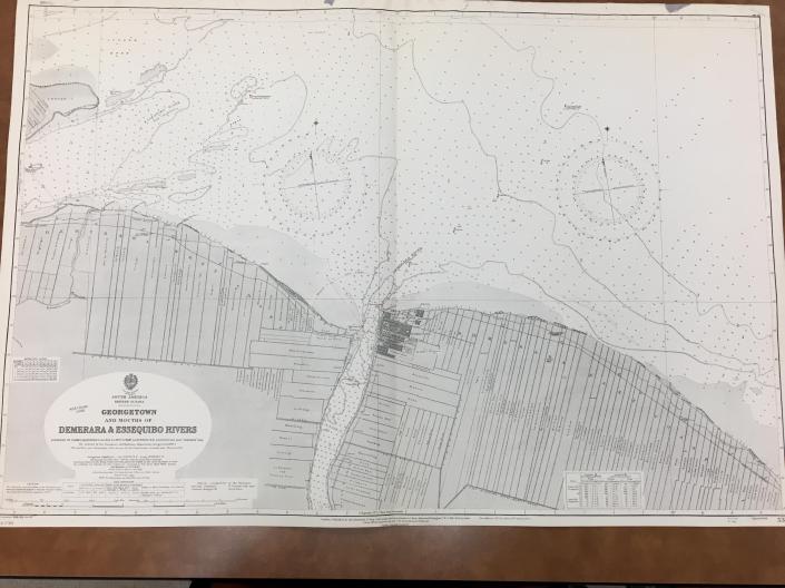
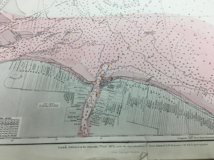
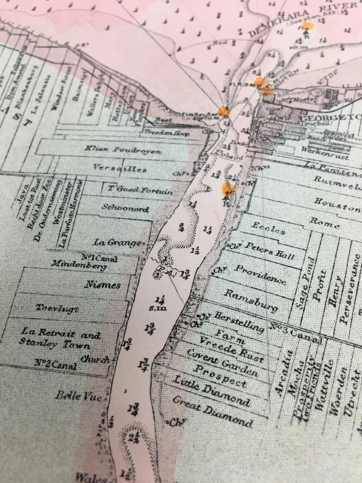
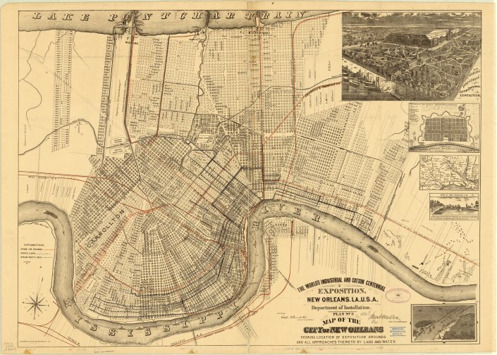
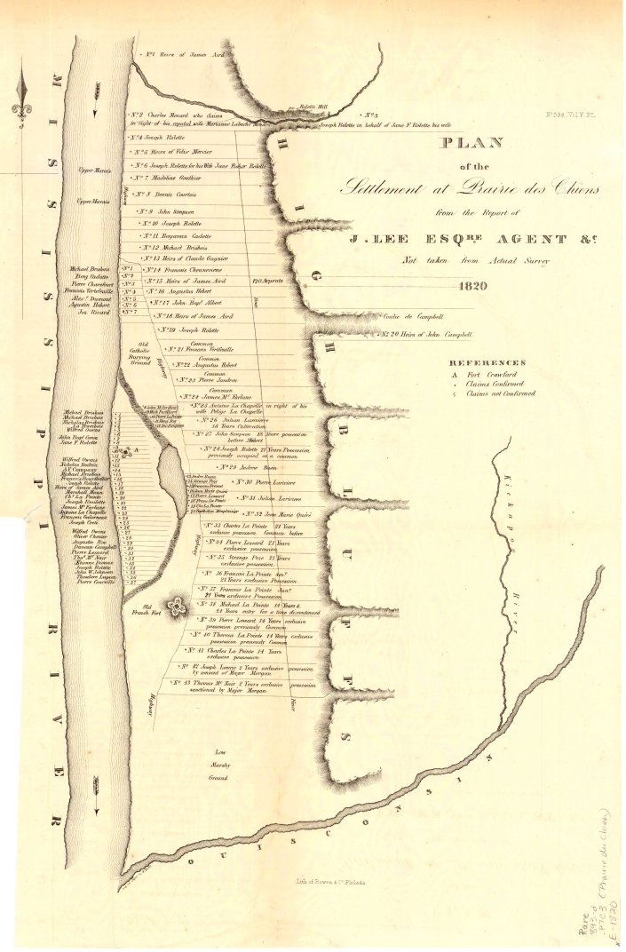
The long, narrow strips of land depicted on these 20th Century British charts are actually an interesting form of human geography called “long lots” or “ribbon farms” that come from the semi-feudal seigneurial system used by the French to administer their agricultural land in the colonies of North and South America. In this system, families would farm long narrow strips of land and pay rent under an agreement with the local seigneur or lord. The main advantage for farmers under this system was waterfront access for transportation and living in close proximity to neighboring farms while still having plenty of land. Some long lots were a few hundred feet wide while being miles deep. While the system was relatively outdated and was not always administratively maintained in the New World (especially once territory came under the control of another government such as the British), we can still see evidence of long lots on maps throughout the 19th and 20th Centuries and even in today’s satellite imagery. In the AGS Library Digital Map Collection it did not take long to find examples in both New Orleans (1884) and Prairie du Chien (1820) to find more examples of long lots:
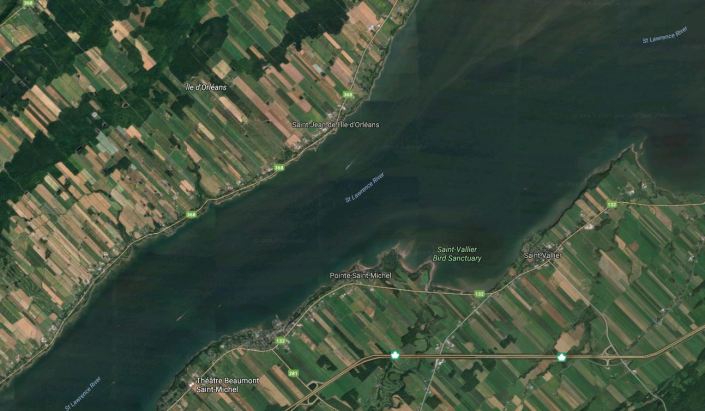
Long lots are even visible today in satellite imagery near Quebec City along the St. Lawrence River. This image was taken from Google Maps:
These maps show us just one example of the many things that maps can tell us about our world and about ourselves. These maps and many more are available at the AGS Library and online in the digital collections. If you’d like to read more about long lots and the seignieurial system, the following websites were useful in gathering additional information for this post:
Michigan State Univeristy: Long Lots: How they came to be:
http://geo.msu.edu/extra/geogmich/long_lots.html
Wikipeida.org: “Ribbon Farm”:
https://en.wikipedia.org/wiki/Ribbon_farm
View the New Orleans map in the AGS Library Digital Map Collection
View the Prairie du Chien map in the AGS Library Digital Map Collection
Cartographic Craftsmanship
by Sam Balistreri-Daum
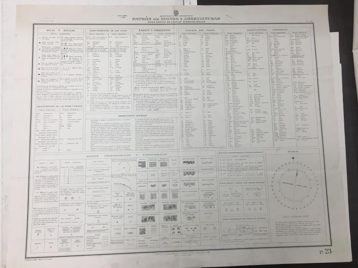
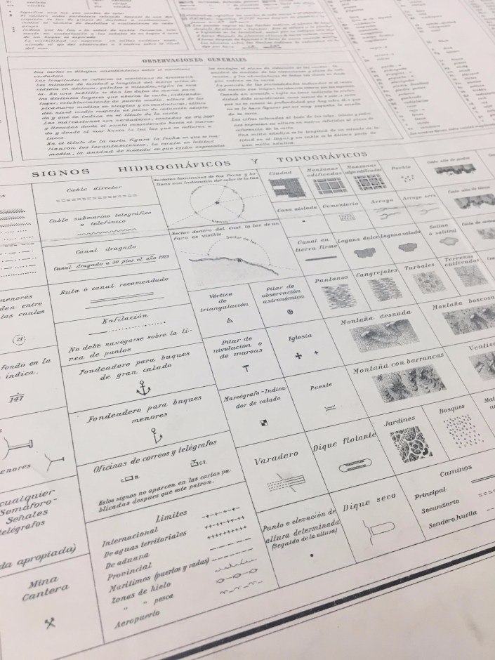
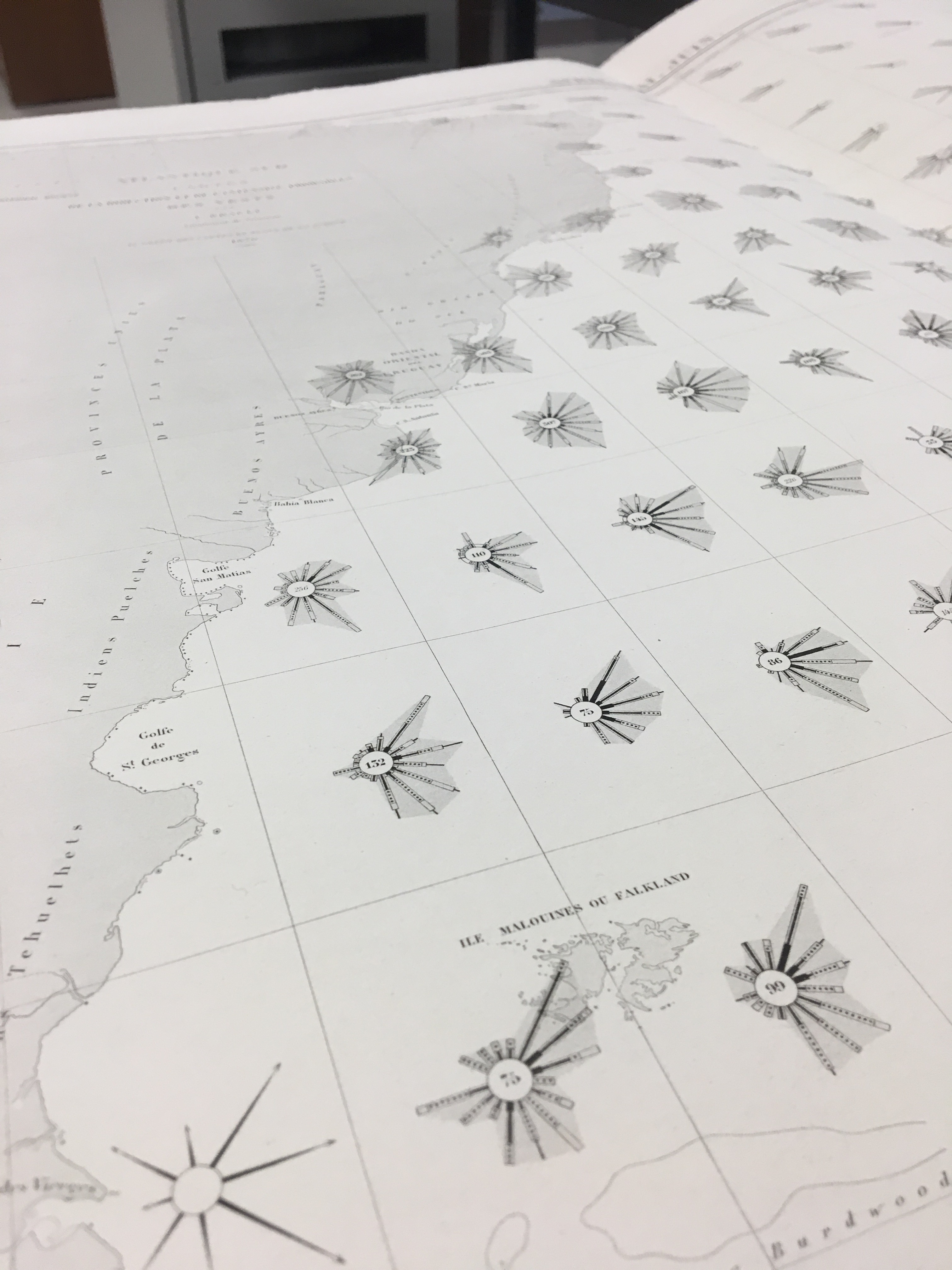
One aspect of the 19th and 20th Century nautical charts that continues to amaze me is the craftsmanship. I am currently working on the AGS Library’s set of Argentinian charts. Working with charts in a variety of languages means learning the various nuances of how the language is used in cartography, especially abbreviations. One abbreviation that had us scratching our heads for a little while was “dib.”, which we would see in the bottom right margin of the sheet accompanied by a name. I later found that this stood for dubujado or drawn and was again impressed by the level of craftsmanship and precision that is involved in cartography, especially in the days before computers.

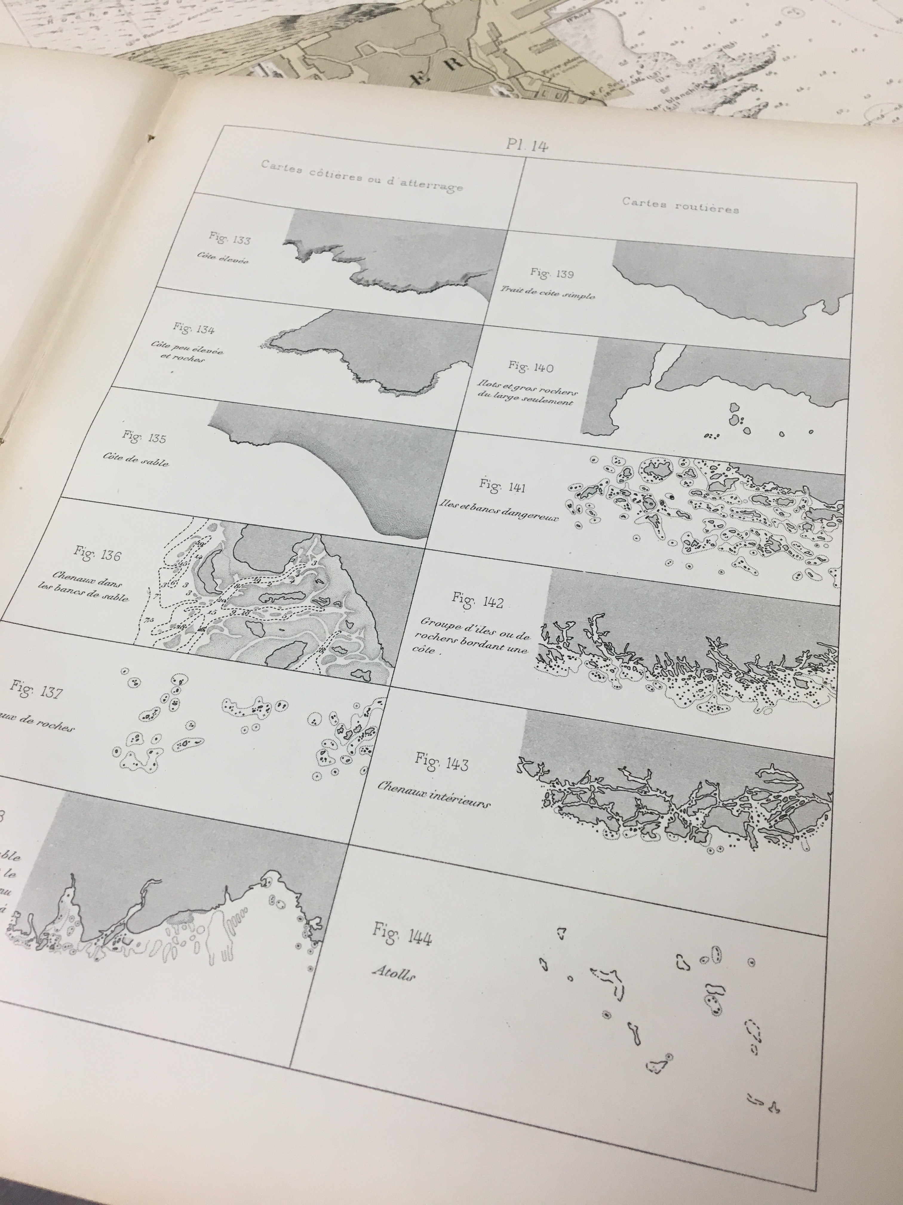
While cataloging the Argentinian charts I came across a chart containing keys for abbreviations, signals and topographic and hydrographic symbols used in the drawing of the charts in the series. This is a reference guide for those who would use the charts. Note the variety of styles that were done by hand before maps were engraved and then printed (click the image for an enlarged view).

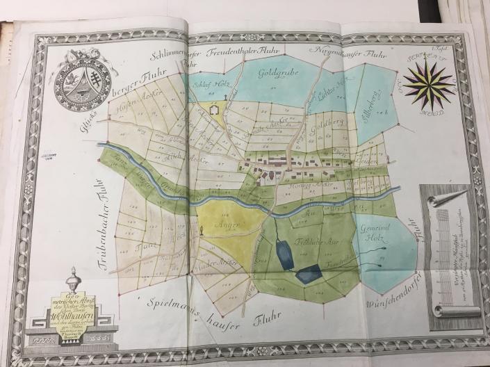
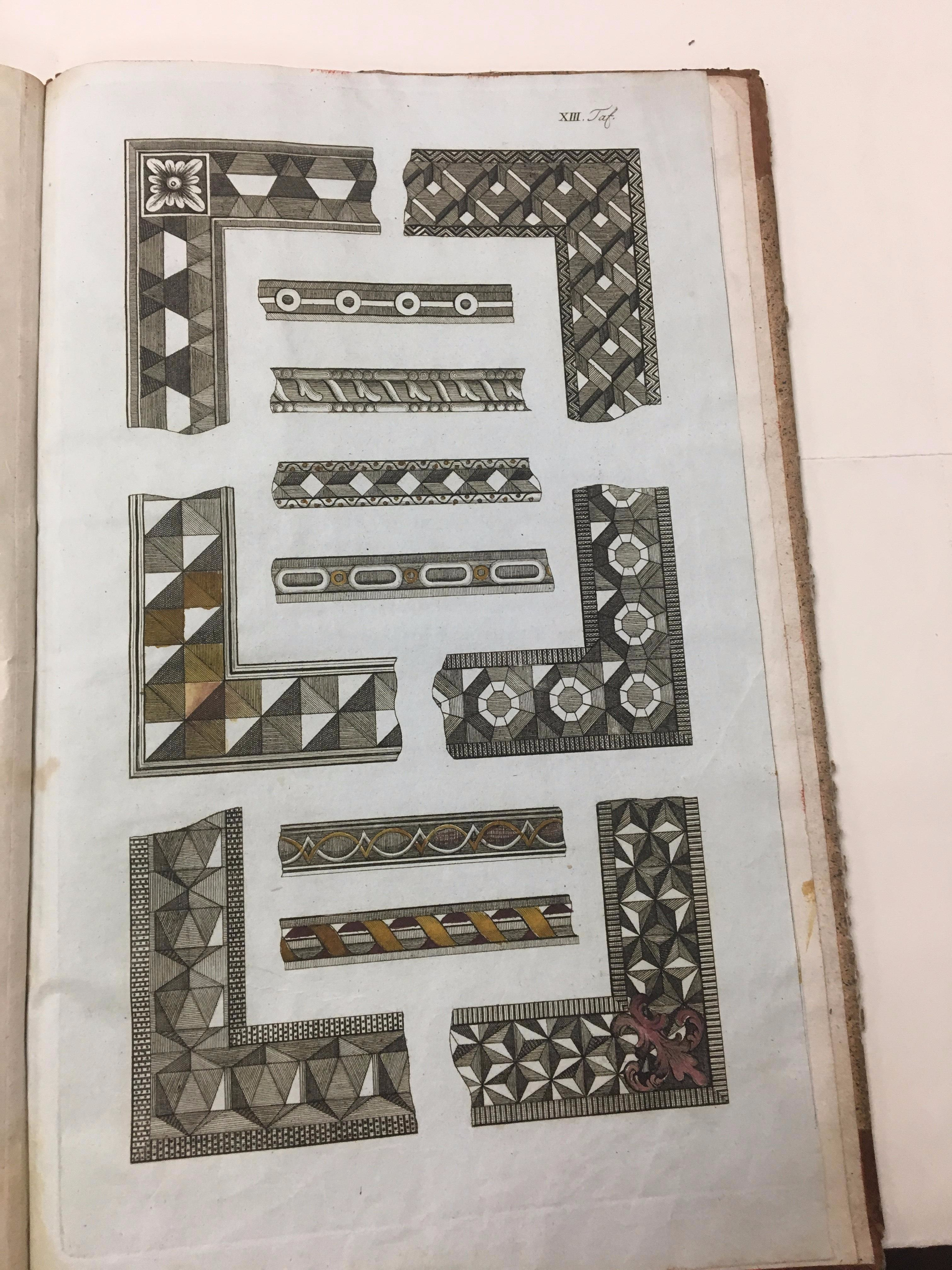
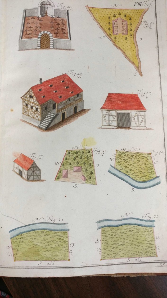
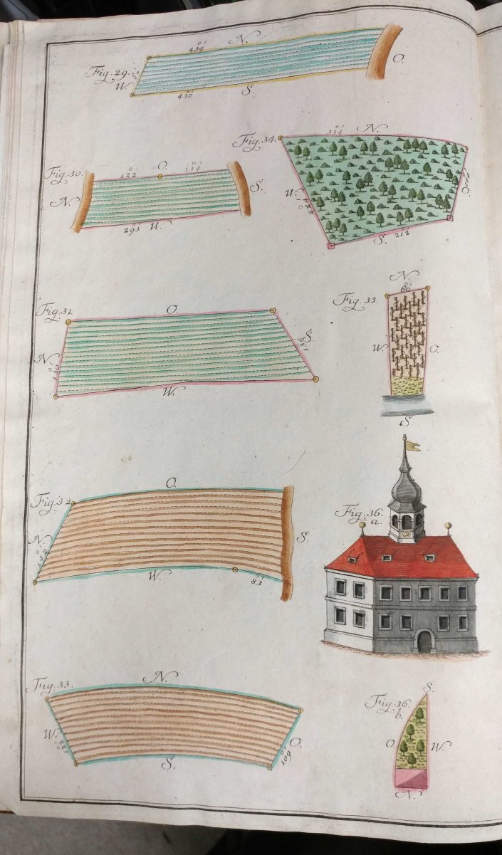
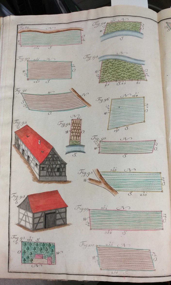
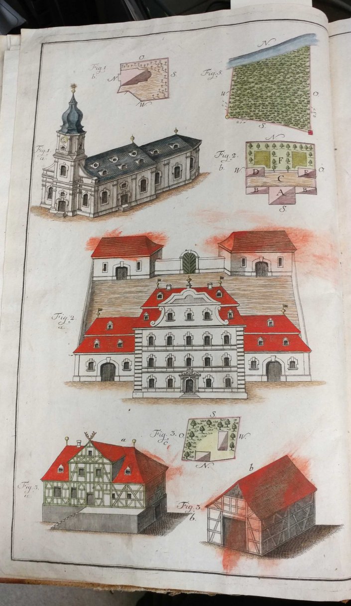
…And now for something different but related. How did a cartographer learn the skills necessary to draw maps? For an example of this we turn to the Practischer Entwurf eines neu zuerrichtenden Urbariums (1792). The book contains practical illustrations of (fictional) maps meant as a “how to” guide for cartographic drawing. This volume contains beautiful colored examples of cartography, but perhaps the most fun are the fictional places depicted on the maps. One map features such locations as Schmaltz Aecker (lard lands), Hader Aecker (discord lands) and a section labeled Anger that despite translating to “green” is actually colored in yellow.

French nautical charts at the AGSL
by Sam Balistreri-Daum
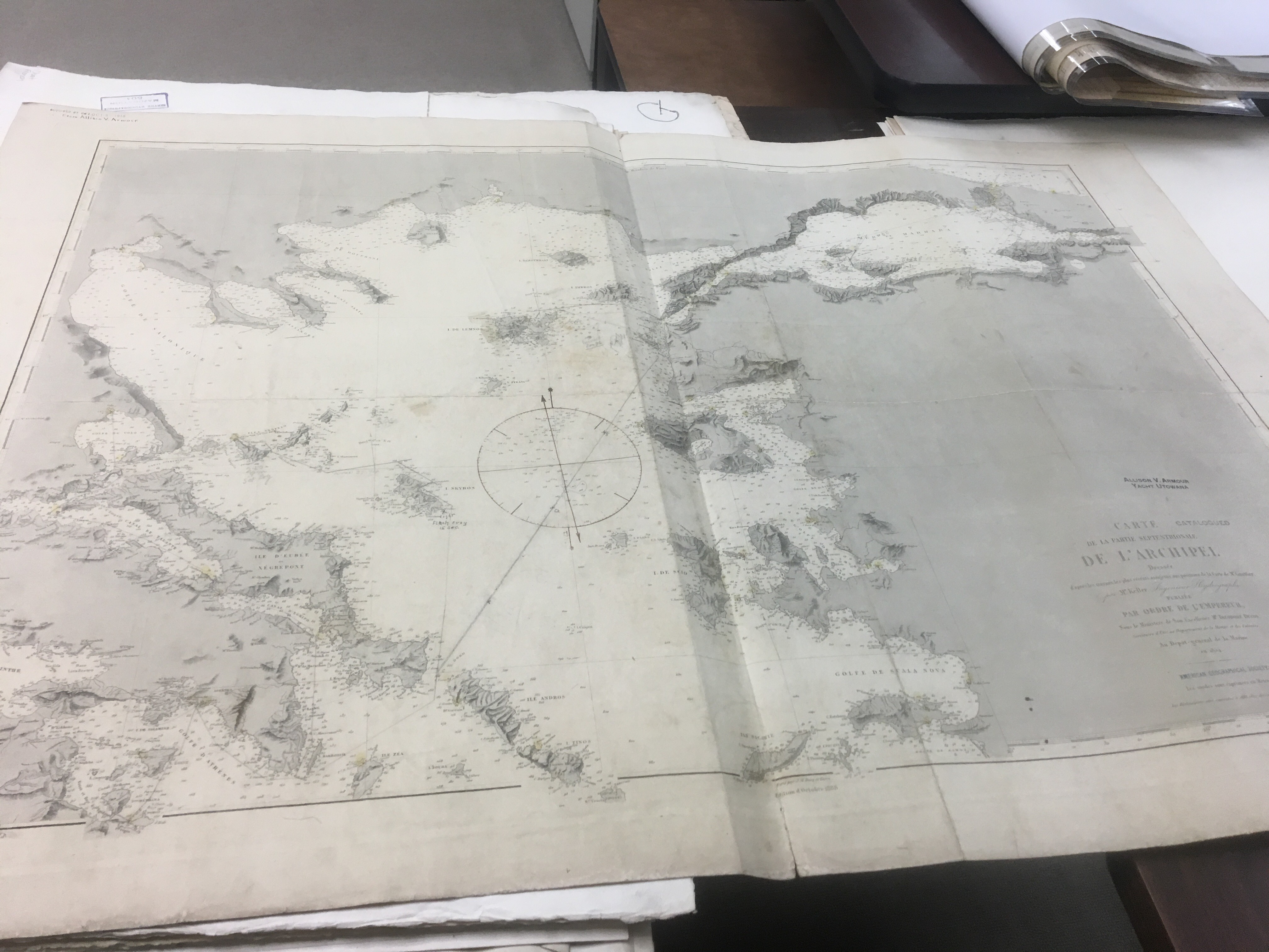
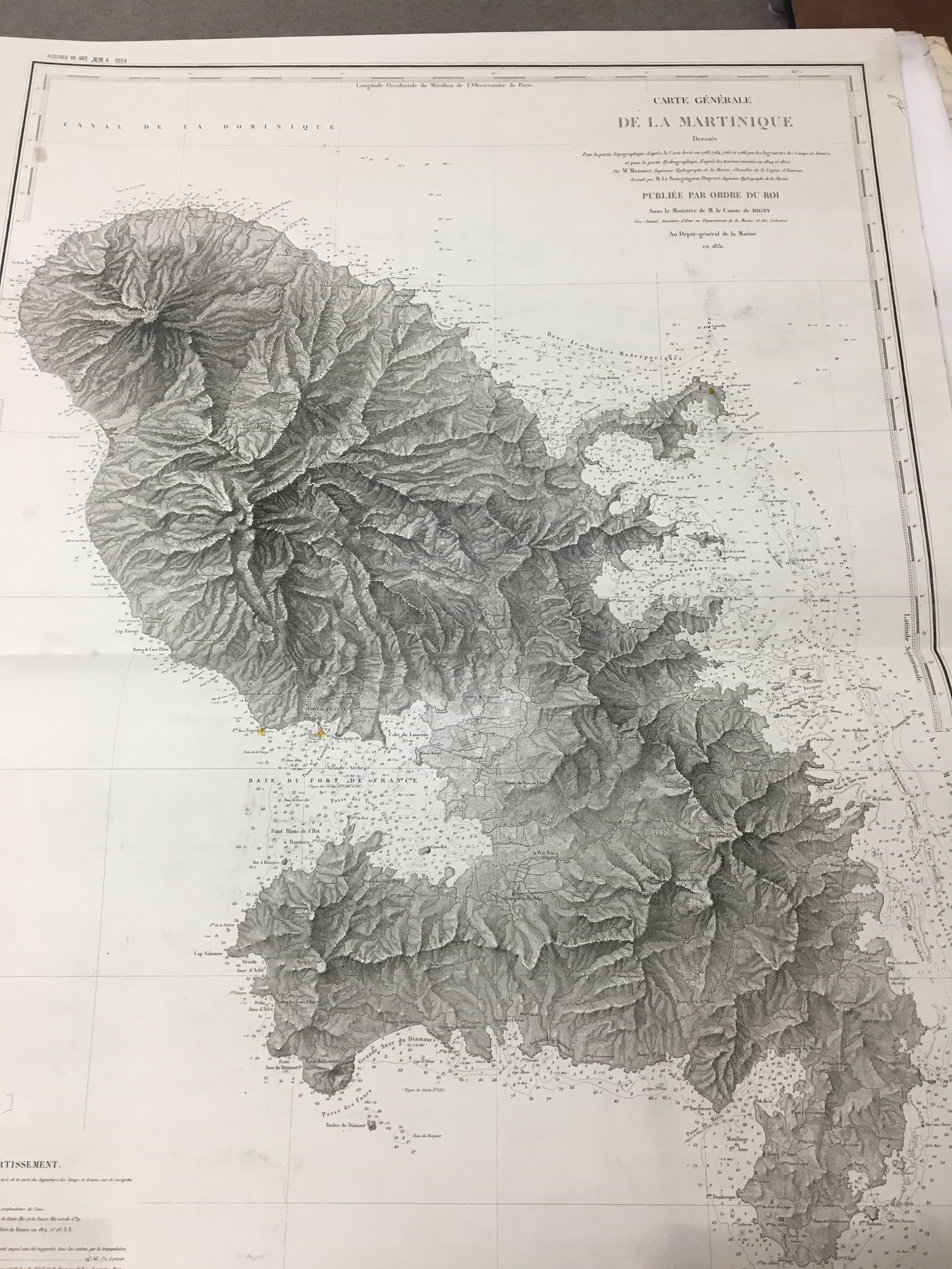
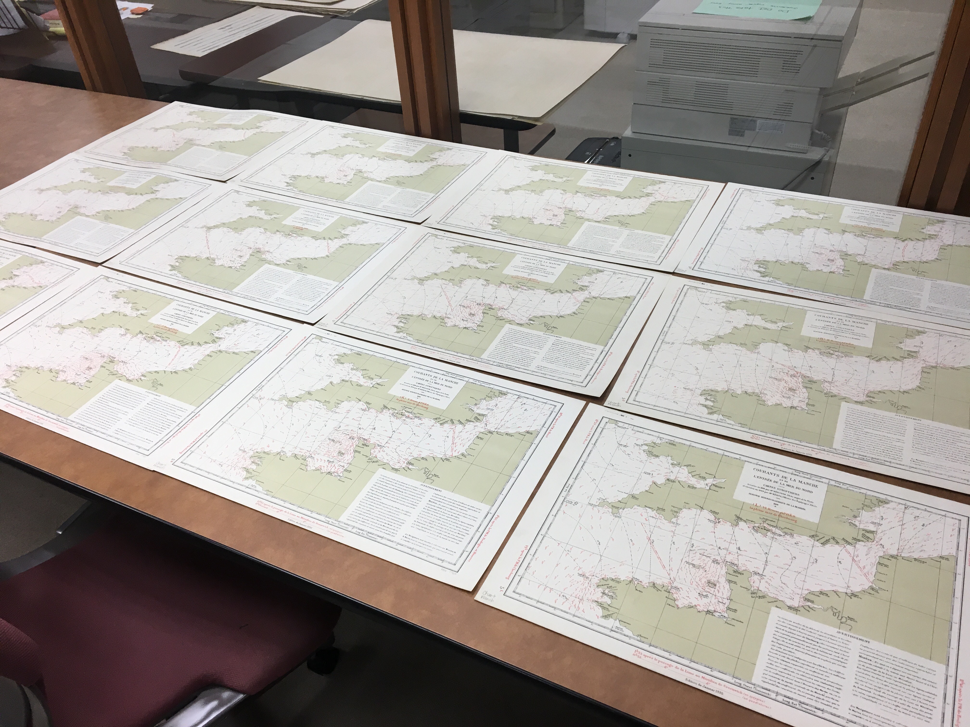
I have been working as an intern here at the American Geographical Society Library for the past few months, and my work is focused on indexing and cataloging 19th and 20th Century nautical charts. These charts originate in various countries consisting of hydrographic surveys from around the globe. This has been an amazing project to be involved with and I would like to share my progress on the French nautical charts created by the Service hydrographique de la Marine and its predecessor, the Dépôt des cartes et plans de la Marine.
The Service hydrographique de la Marine (today the Service hydrographique et océanographique de la Marine or SHOM) is an office of the French Ministry of Defense, established in 1720. While there are obvious military and strategic implications for the creation of detailed nautical charts, the Service Hydrographique also provided a public service by making accurate charts available to navigators sailing for business and recreation. (Wikipedia) The collection of French nautical charts at the AGSL features charts from around the world including South and Central America, Southeast Asia, Africa, the Polar Regions, the Pacific Islands and Europe as well as world maps and various tidal and atmospheric charts.
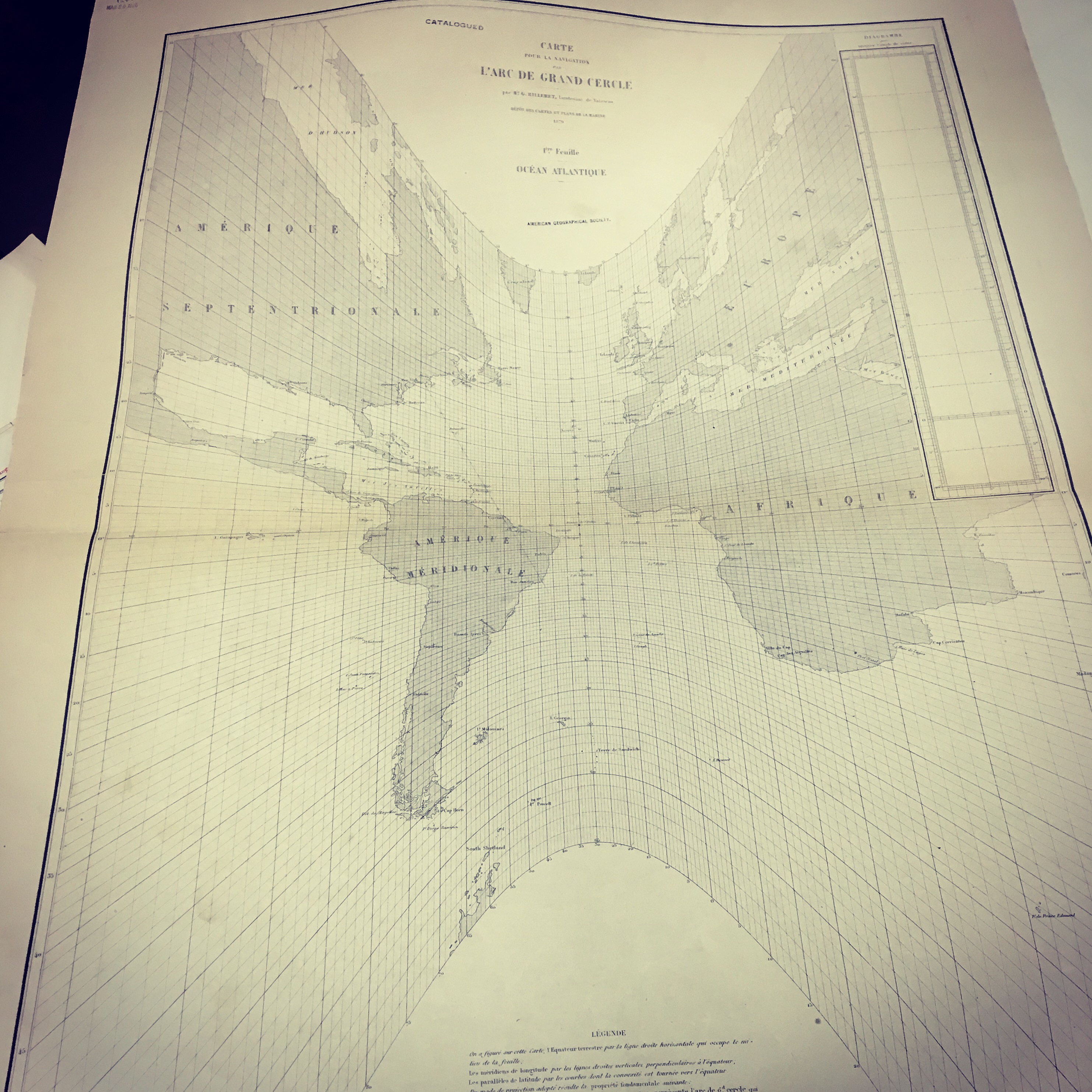
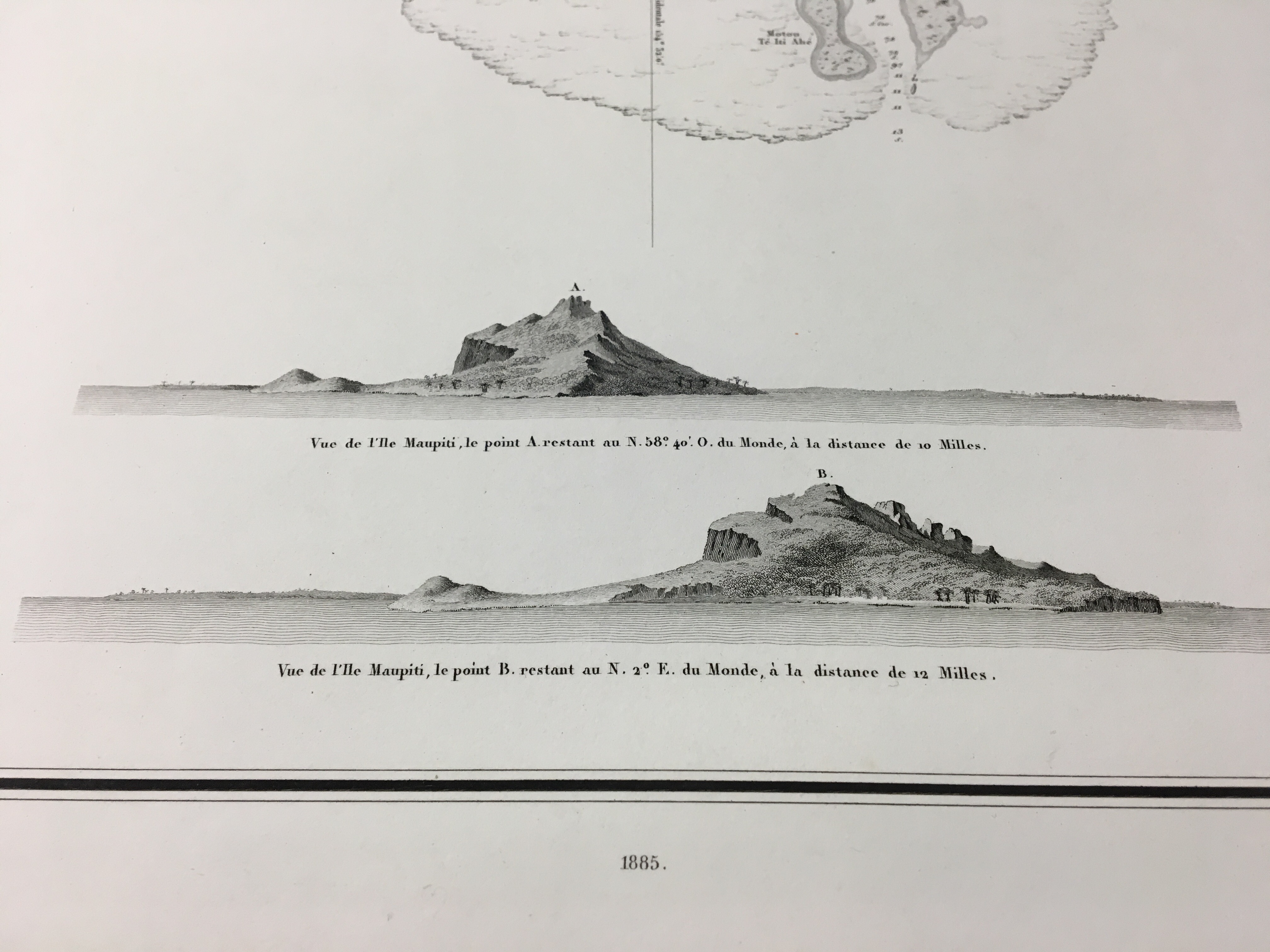
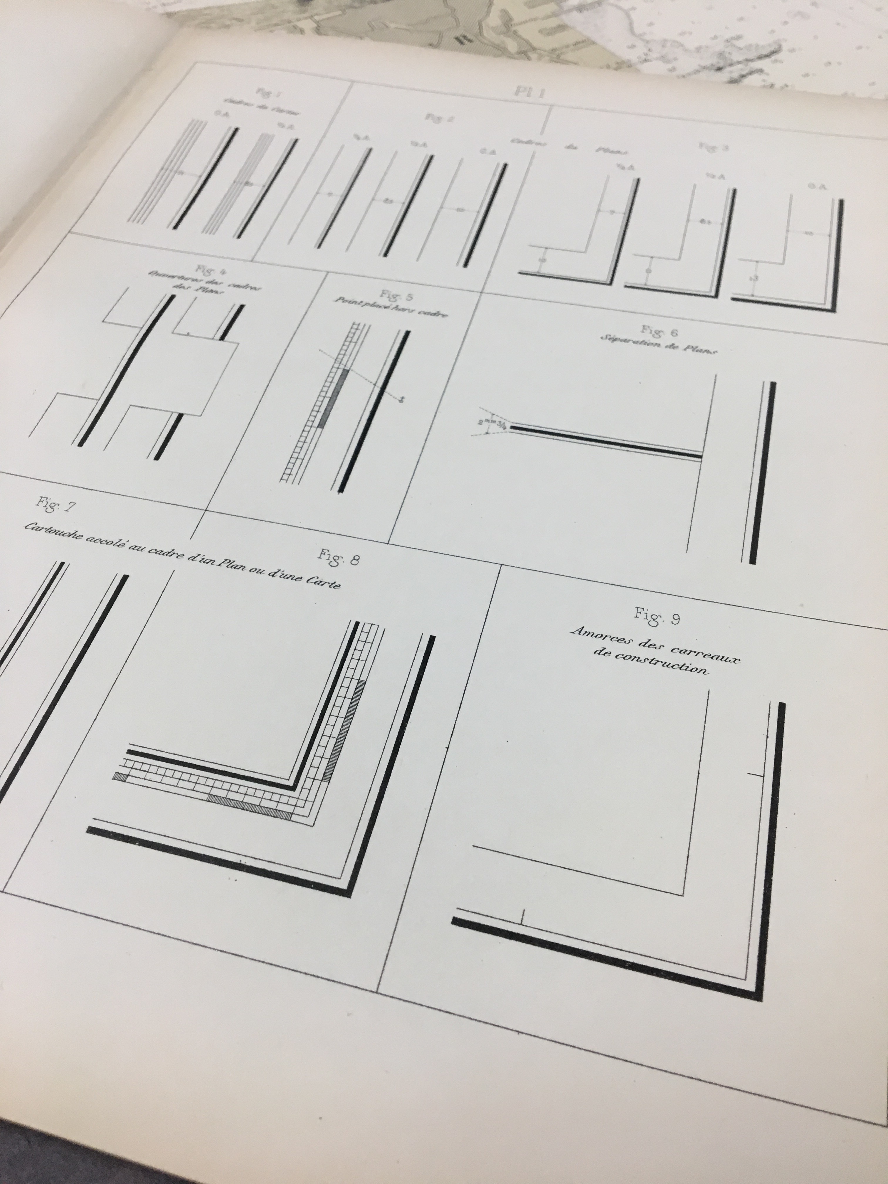
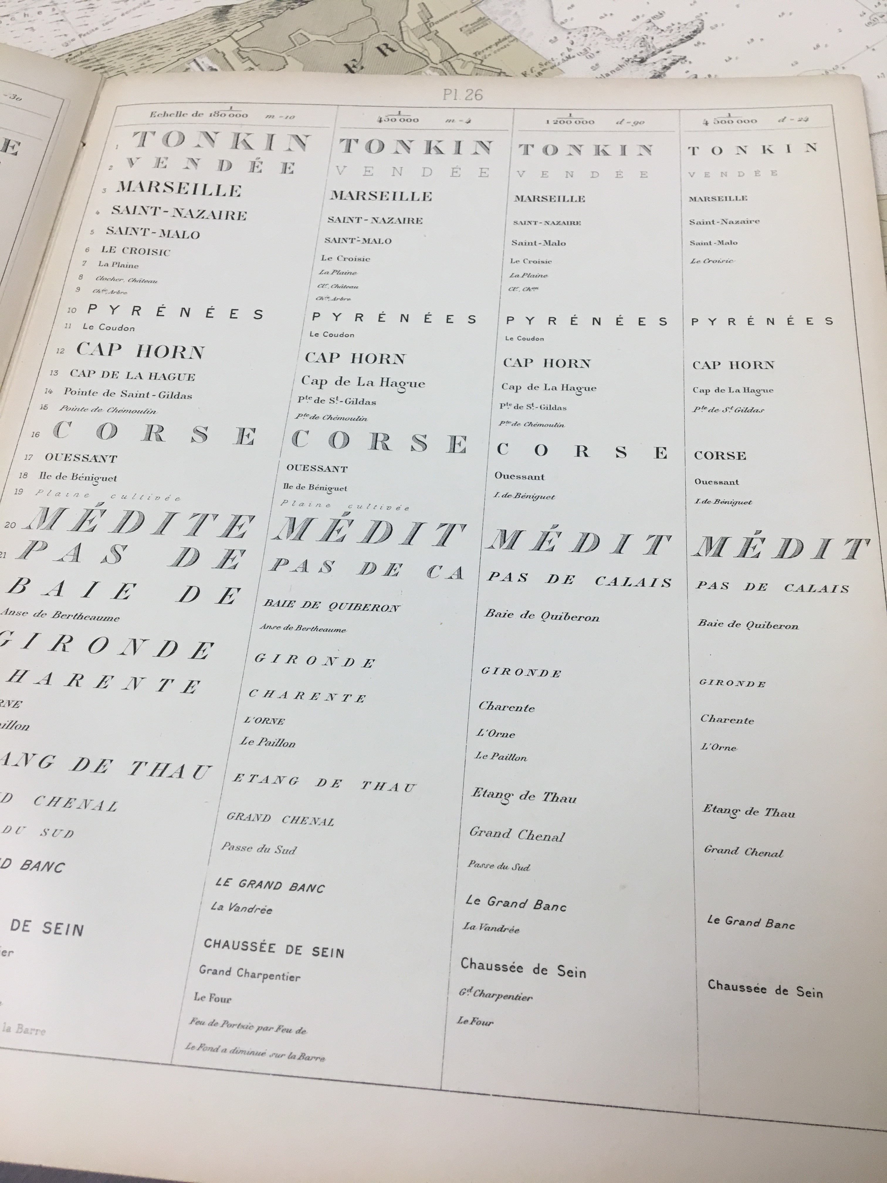
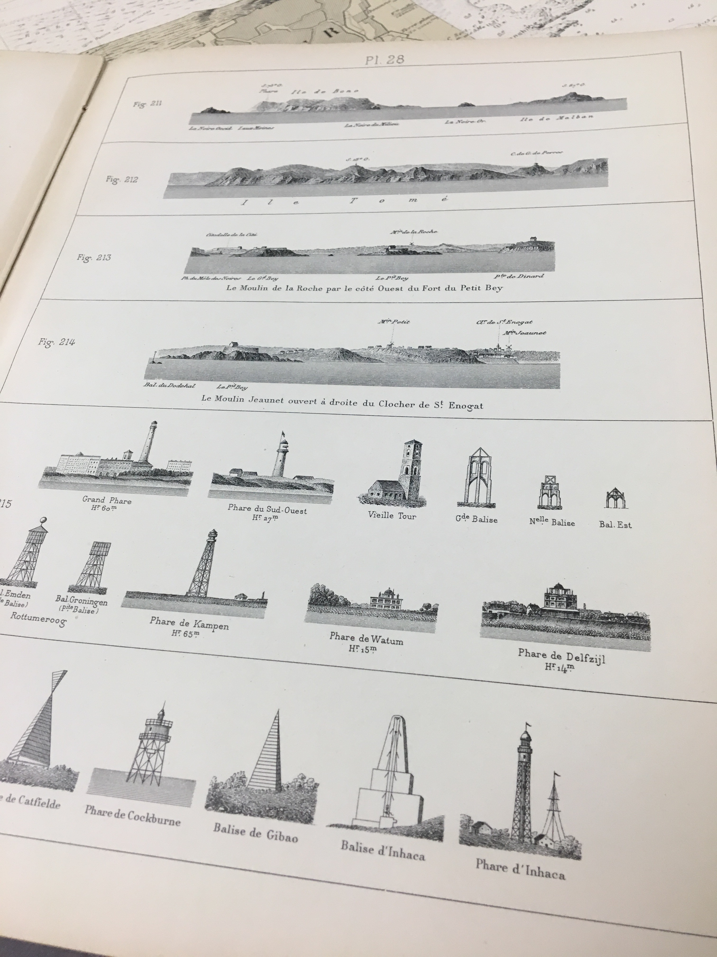
The charts themselves are remarkable not only in their accuracy but in the standards employed in their presentation. The charts are printed using a method called intaglio printing, where the detail of the map itself is etched on a hard surface, such as copper, inked, and then pressed to paper. The AGSL collections also features a guide to the design and creation of these charts entitled Dispositions Générales Relatives aux Cartes et Plans (1914).
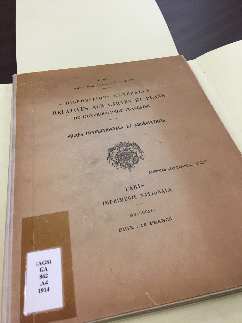
Dispositions Générales Relatives aux Cartes et Plans (1914).
This guide was helpful in understanding the structure and format of nautical charts from the presentation of scale, terminology and printing methods. Here are a few formatting examples from among the many that are included in this great resource.
Hubbard Park was once an outdoor beer garden and amusement park
by Angie Cope
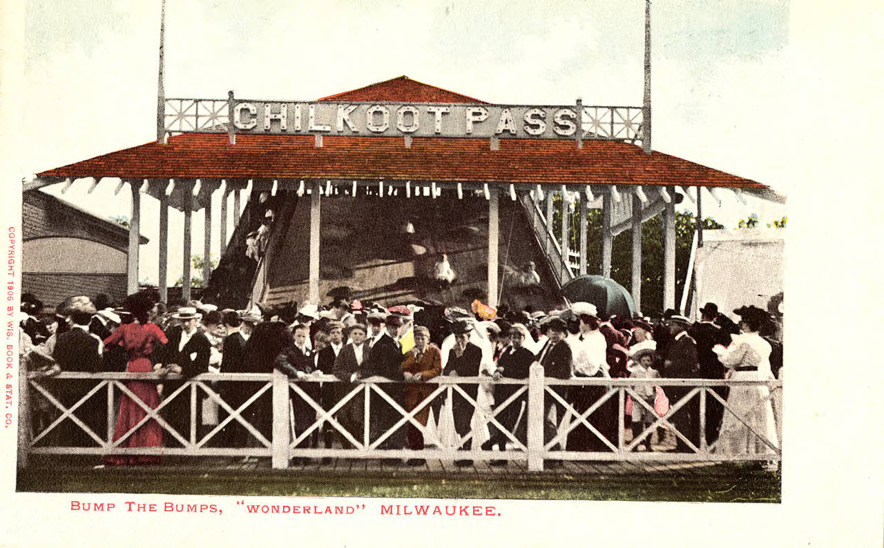
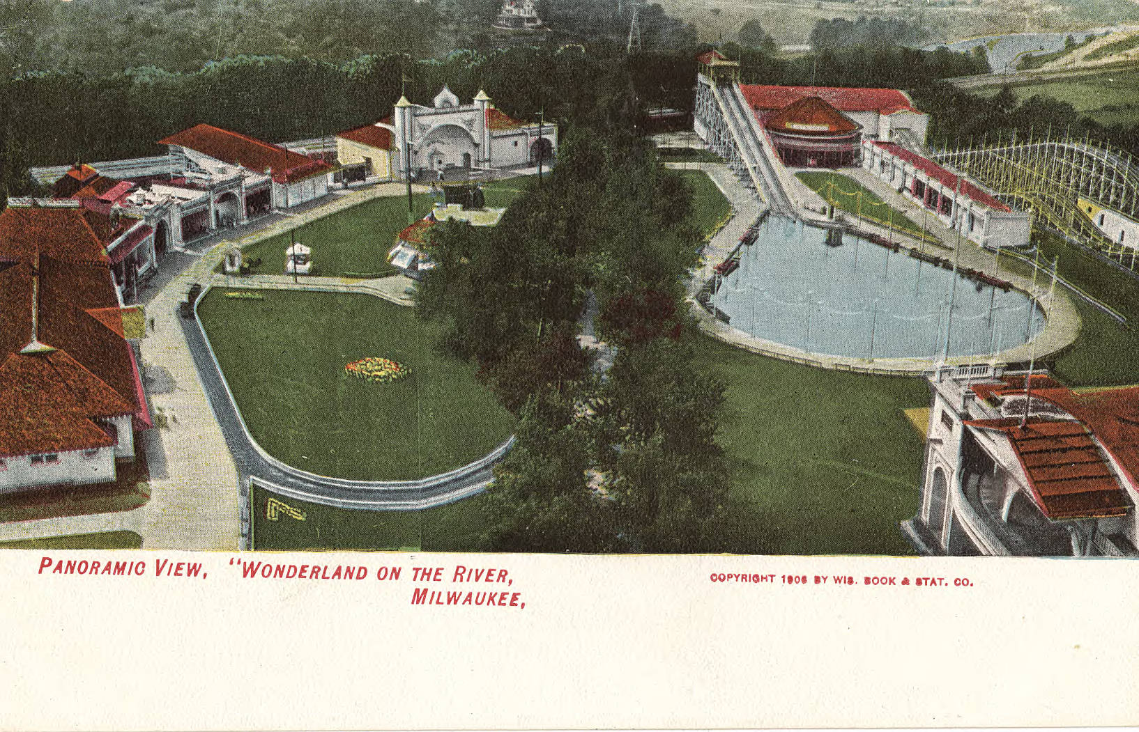
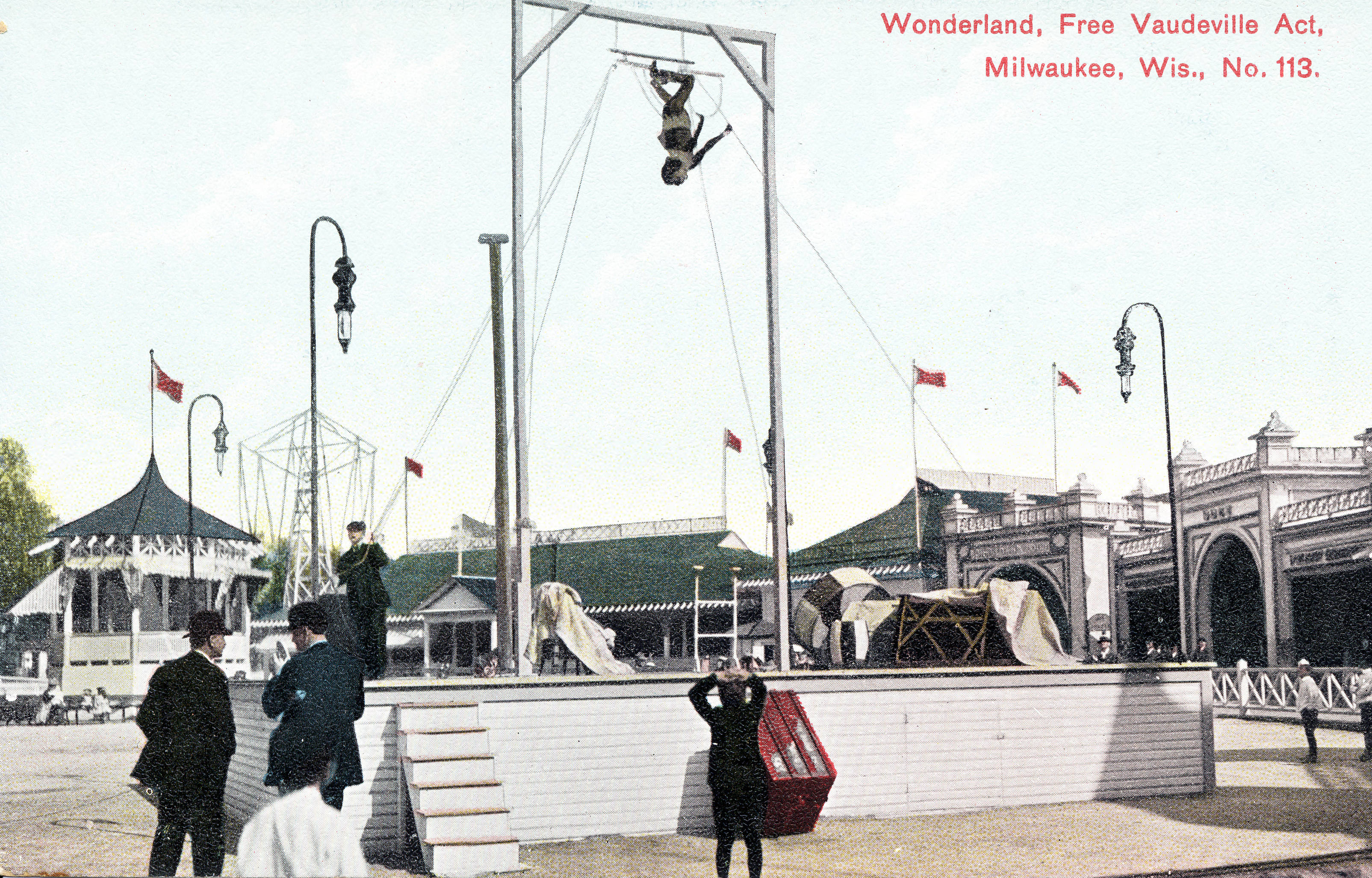
” … Ravenna Park was a private amusement emporium and was the last in a series of predecessors to Hubbard Park, a retreat on the east bank of the Milwaukee River in Shorewood. It started when F.A. Lueddemann opened his farm to the public in 1872. Otto Zwietusch, a soda-water maker and inventor, bought Lueddemann’s-on-the-River the next year fir $9,000 and turned it into his Mineral Springs Park. In 1900 it was sold again, to become Coney Island, an amusement park complete with a roller coaster. But Coney Island lasted only three years. It was revived in 1905 as Wonderland, and its owners added a Ferris wheel and a tower covered with electric lights. In 1909, R.W. Hopkins changed Wonderland into Ravenna, adding movies, a miniature railroad and a “laughing gallery.” Milwaukeeans reached the amusement park via the suburban railroad and later on streetcars. In 1916 it was divided into three parts: today’s Hubbard Park, a residential neighborhood adjacent to it and Electric Co. streetcar yards off Edgewood and Oakland Aves., which now is the site of an apartment complex for the elderly.” – Milwaukee Public Library Digital Collections –
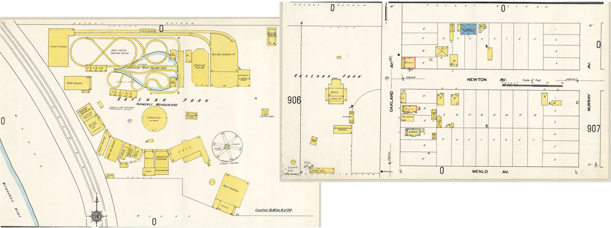
To view this Sanborn map in more detail at the UWM Libraries Digital Collections.
Here are some postcards from the UWM Archives Digital Collections that depict the amusement park as it was …
Native American Mapping of the Belcher Islands
by Angie Cope
This map is the central object in the story of how geographical knowledge was passed from an Inuk man named Wetalltok to a non-native explorer. In an article in the Geographical Review in 1918, Robert J. Flaherty (1884–1951) recounted the story of how, while he was searching for iron ore deposits on the east coast of Hudson Bay, Canada, Wetallok explained the intricacies of the bay’s island system and shared with him this remarkably accurate Eskimo map, which Flaherty reproduced in the article.
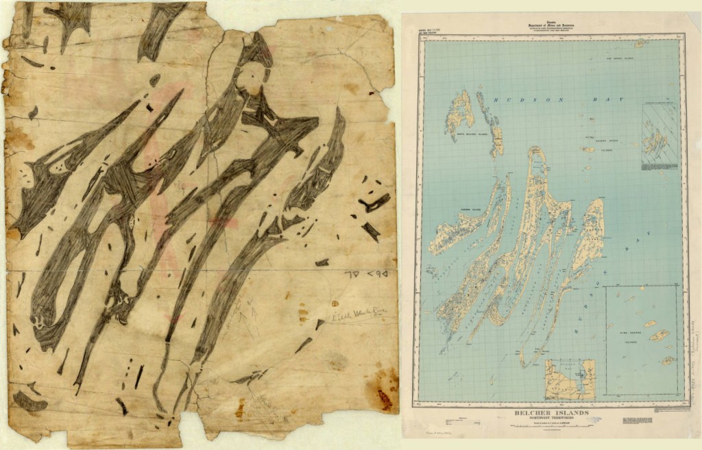
Flaherty later became a director and producer whose first film, Nanook of the North (1922), was one of the best known documentaries of the silent-era. Flaherty also told the story of his encounter with Wetallok in his 1924 book, My Eskimo Friends: “Nanook of the North.” Recent historians of cartography, notably G. Malcolm Lewis in Cartographic Encounters: Perspectives on Native American Mapmaking and Map Use, and Lewis and David Woodward in History of Cartography, also have used the map as an example of indigenous cartography.
The map is drawn with pencil on the back of a missionary lithograph. Notations are in English and Inuktitut syllabics. Flaherty’s annotations include “Little Whale River” [with arrow], “Whale River” [with arrow], and “3 days = dogs = app. 70 miles.”

Click here to view the map in the AGS Library Digital Map Collection
Creating a school wall map in 1913
This print shows three building views of Justus Perthes’ Geographische Anstalt in Gotha, Germany. The illustrations show the process used in the creation and printing of Justus Perthes school wall maps in 1913.
View this item in the AGS Library Digital Map Collection
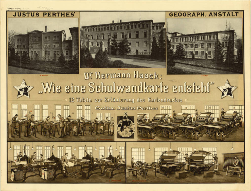
Points identified in red are indexed in: Wie eine Schulwandkarte entsteht : eine Führung durch die lithographischen Werkstätten von Justus Perthes’ Geographischer Anstalt / von Hermann Haack, 1913 (viewable here: http://uwm.edu/libraries/agsl/schulwandkarte/ )
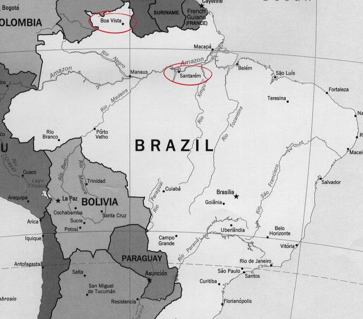
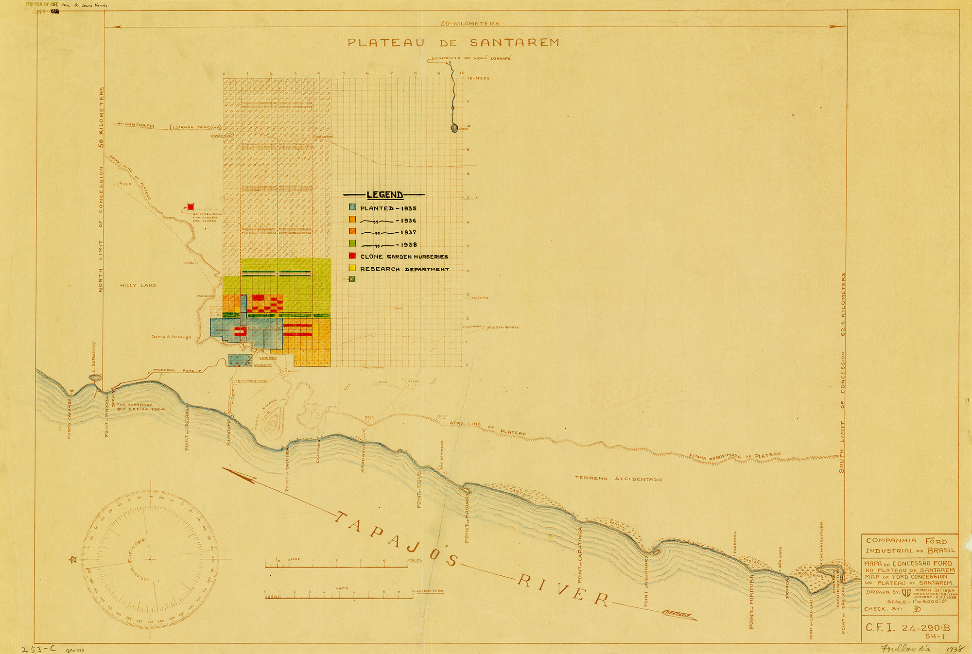
Fordlandia, Brazil
by Angie Cope
I’ve worked at the AGS Library for over a decade and I am still amazed to find materials on nearly every topic. A couple years ago I caught the last 15 minutes of the PBS television special on Henry Ford (available online). Among Ford’s successes and failures was mention of his Utopian community built in the Amazon rainforest. Returning to work, I checked the map drawers to see if I could find any maps of Fordlandia.
Sure enough, I discovered three annotated, blueline print maps dontated to the AGS in 1939 from Dr. Lewis Hanke. Hanke was a preeminent Latin American historian who corresponded with the AGS while researching his Handbook of Latin American studies.
The Fordlandia story generally goes like this …
In 1927 Henry Ford purchased 2,471,000 acres of land in the Amazon rainforest from the State of Para, Brazil. Ford ambitiously hoped to free his company’s dependence on foreign rubber by starting a rubber plantation. This first concession of land was in the north of Brazil at Boa Vista.
Clearing of the land began in 1929 and production problems ensued almost immediately. Ford had relocated employees from the U.S. to run the plantation and hired local workers as labor. Personnel issues ranged from illness and homesickness to rebellion. The city was modeled after Dearborn, Michigan and had a power plant, library, golf course, barber, hospital, and housing for employees. Ford expected residents would enjoy leading a wholesome American lifestyle, eating hamburgers and living in homes similar to those in Dearborn. Quickly, local workers protested working conditions. Among their grievances was working 8 hours during the heat of the day when they were accustomed to working early-morning and late-evening shifts. Conditions became so bad that workers rioted.
________________________________________________
In addition to personnel issues, Ford’s engineers lacked knowledge of growing rubber trees. Seeds were planted too closely together making them easy prey for tree disease and pests. Before long, most of the trees died.
By 1934, the State of Para exchanged 695,586 of the original acres for an equal-sized waterfront area 30 miles south of Santarem. The original area, named Boa Vista, was never used as a plantation again but was used as a research station and laboratory for many years.
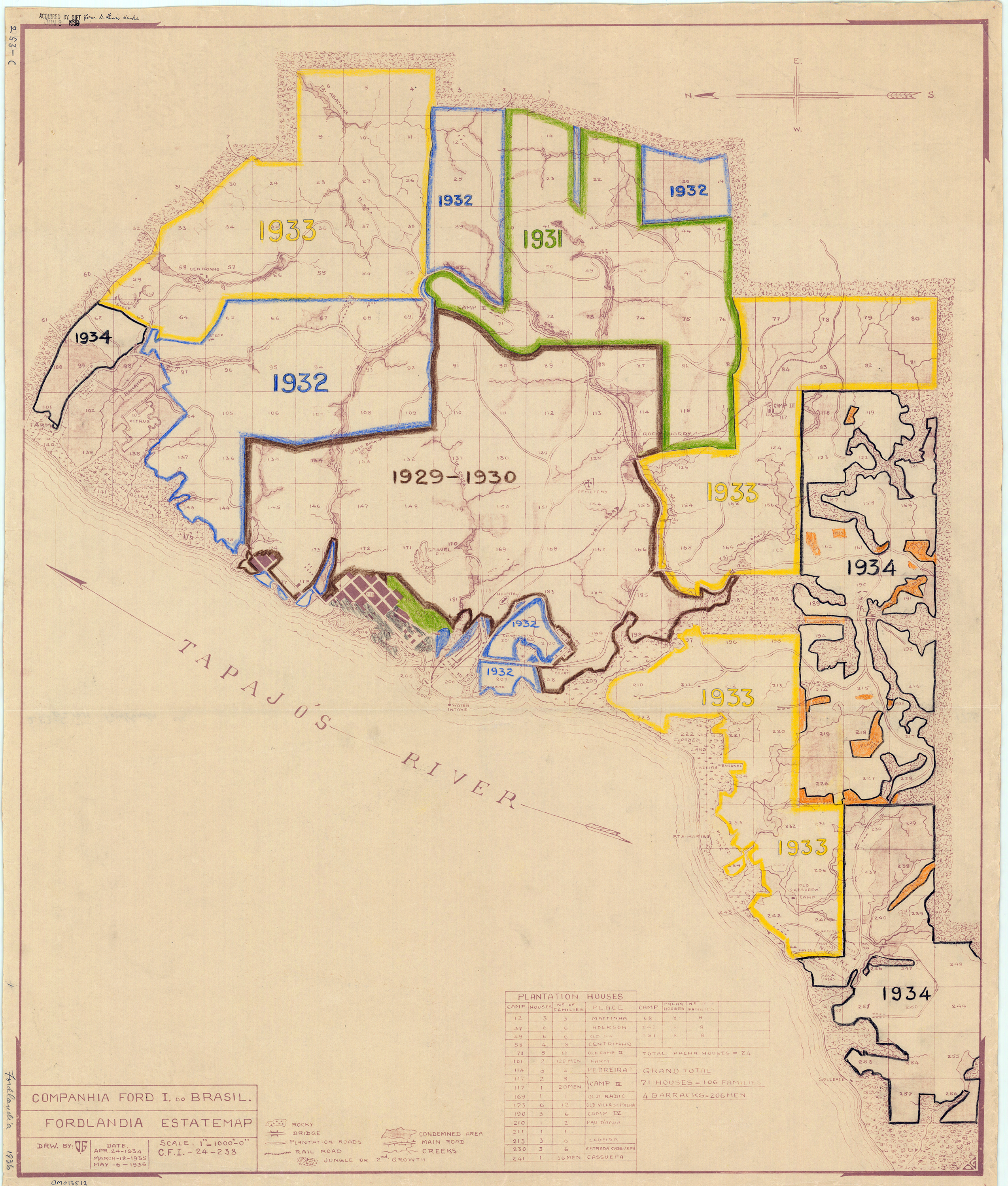
The new site of Belterra, with flatter topography, offered better conditions for producing rubber and allowed the use of machinery. However, a drop in demand for rubber and high costs of production made Belterra economically unfeasable for Ford. Eventually the plantation was sold to the Brazilian government.
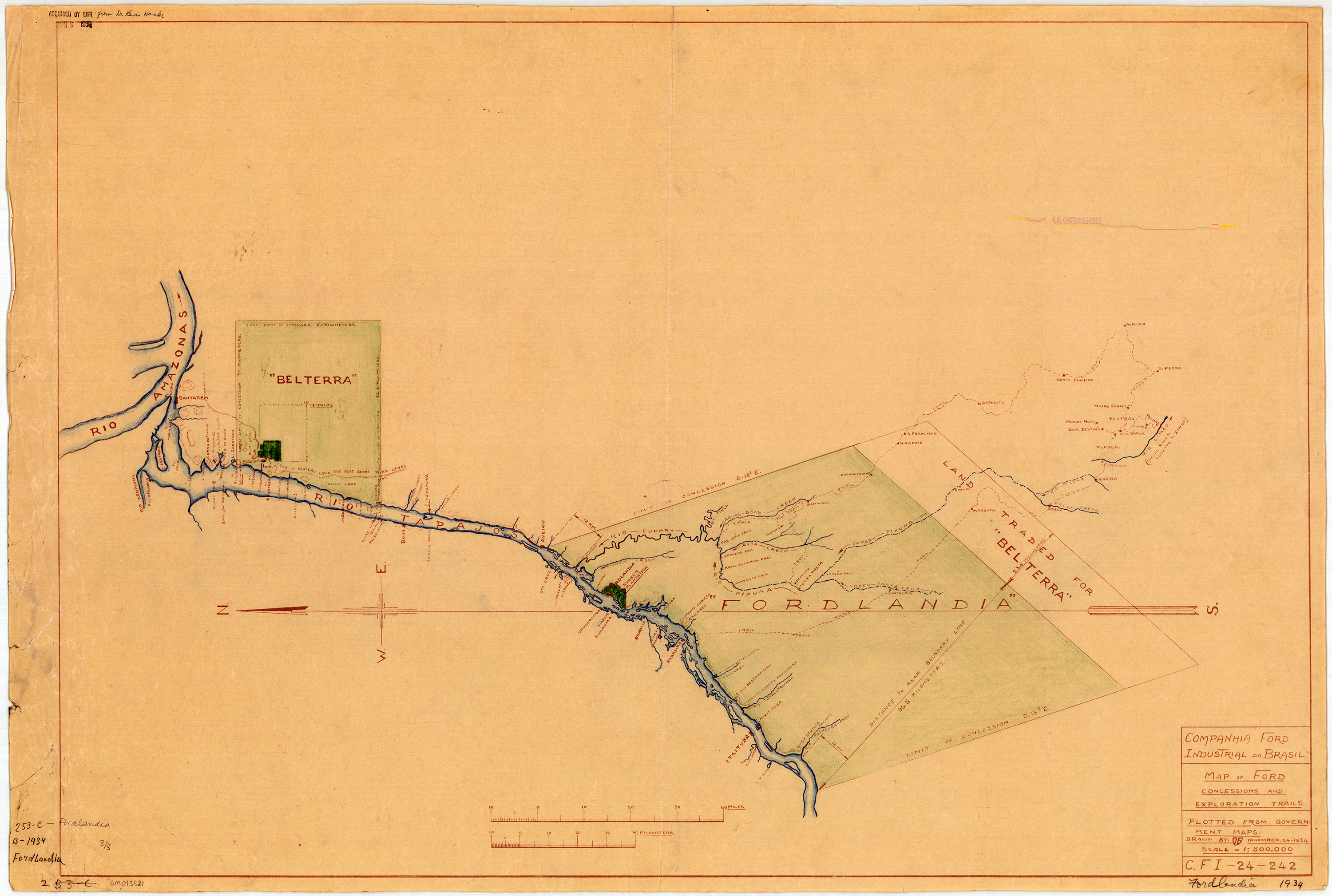
Returning to my observation that the AGS Library has items on nearly every topic, I also enjoy how any map in the collection can distract the user in a dozen different directions. Whether writing about Lewis Hanke, the donor of the 3 Fordlandia maps, or simply researching the annotations – there is so much of interest to consider. Who annotated the maps? Who gave them to Hanke and why? What was Hanke’s relationship to the AGS of NY? Who is the O.G. cited as the draftsman of the maps?
There are many other great internet sites and books if you’d like to find out more about Fordlandia.
Historic images from the Benson Ford Research Center can be seen here.

The Ruins of Fordlandia (from “Damn Interesting” blog) by Alan Bellows is quite good
Fordlandia : the rise and fall of Henry Ford’s forgotten jungle city (2009) by Greg Grandin is a great read. (Description and review: http://www.popmatters.com/review/126045-fordlandia-by-greg-grandin/)
July 28, 2016 Update
Susan Dykes, the AGSL Metadata Specialist, recently discovered 43 photographs held at the AGS Library from Robert S. Platt in Fordlandia.
You may view them here:
http://collections.lib.uwm.edu/cdm/search/searchterm/fordlandia/field/all/mode/all/conn/and/order/title/page/1
Click here for information on the Robert S. Platt collection
- ← Previous
- 1
- …
- 7
- 8
