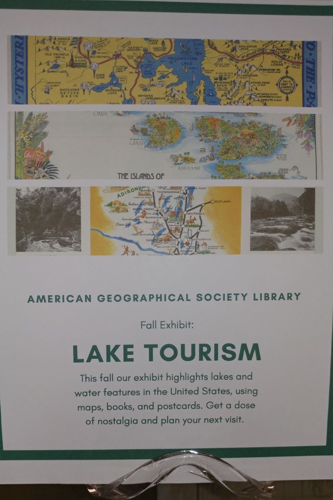
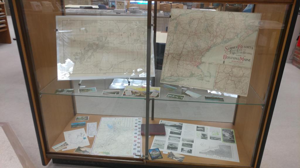
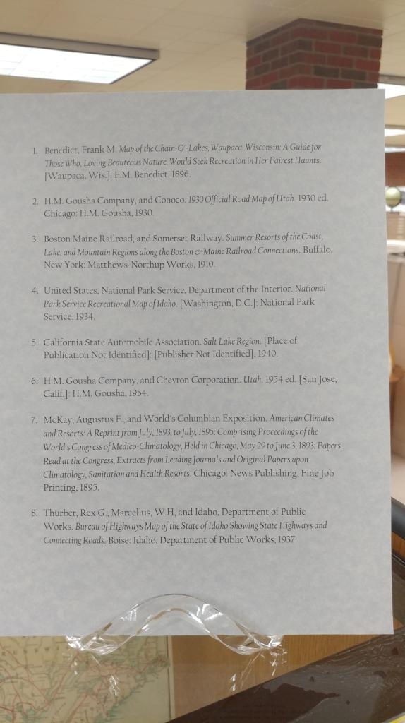
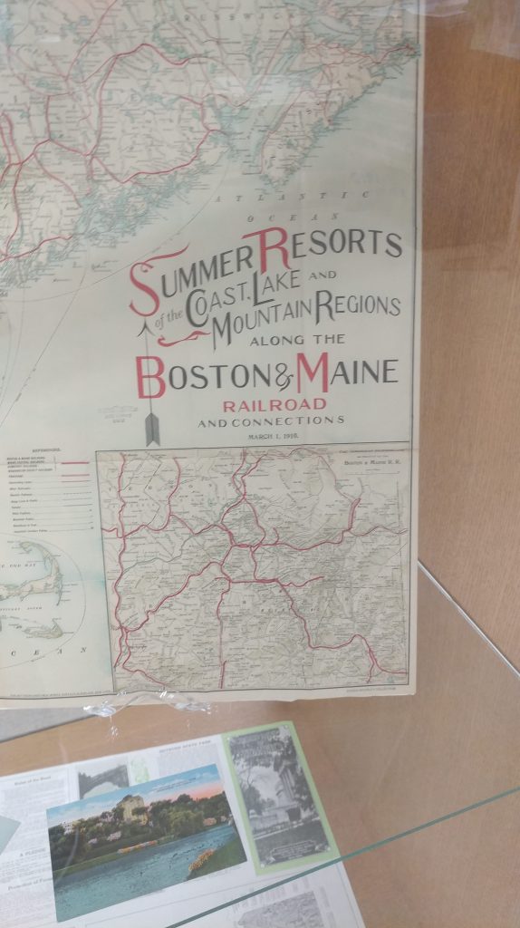
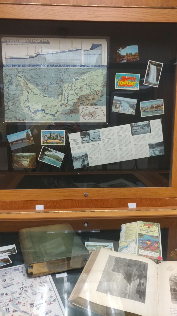
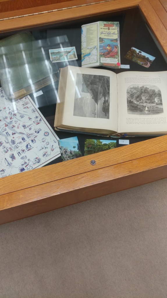
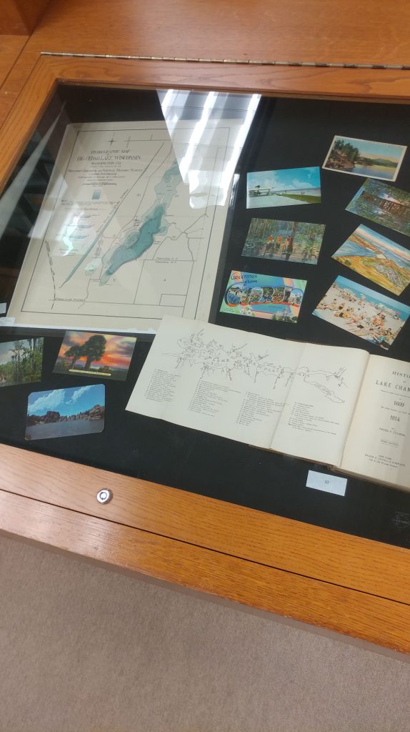
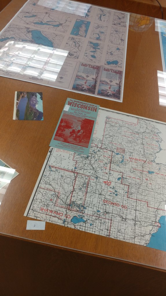
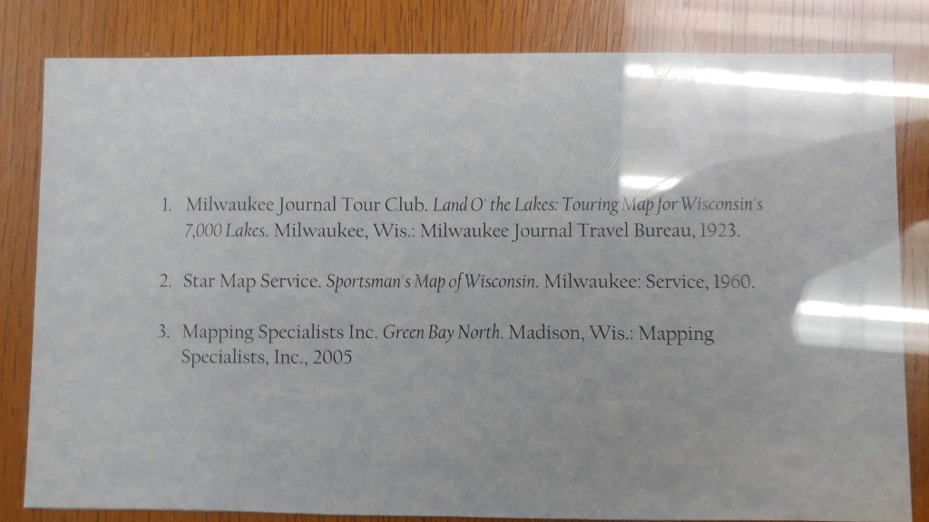
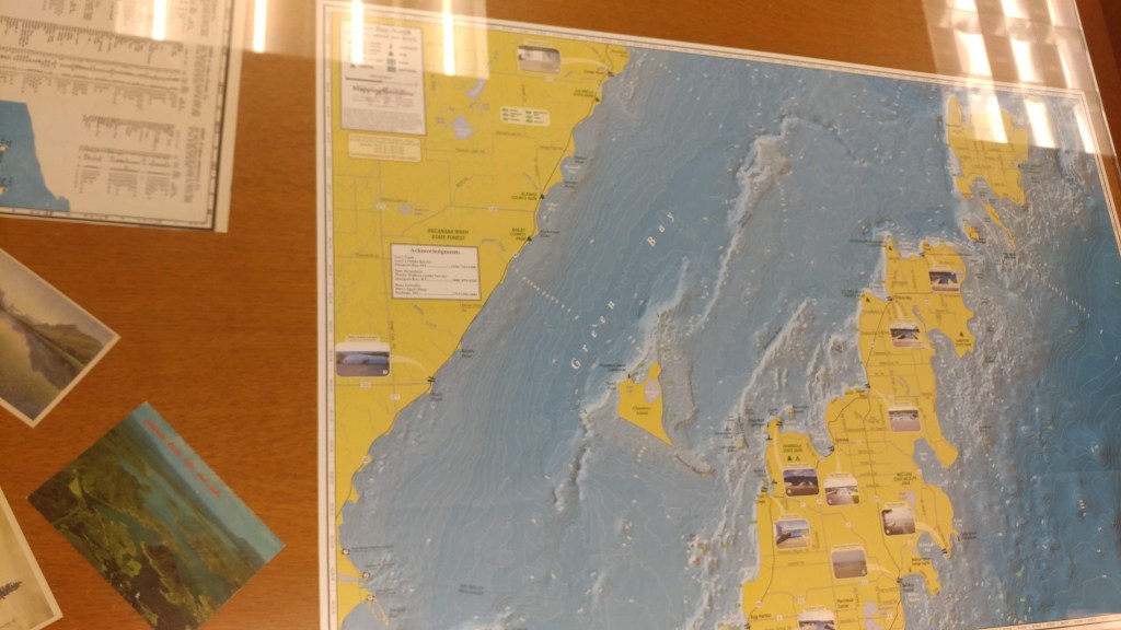
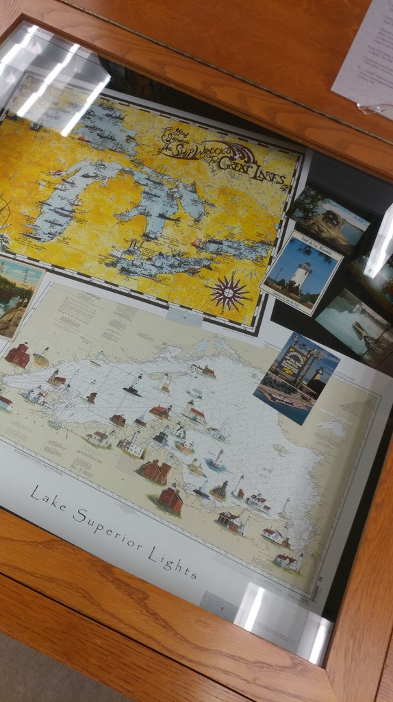
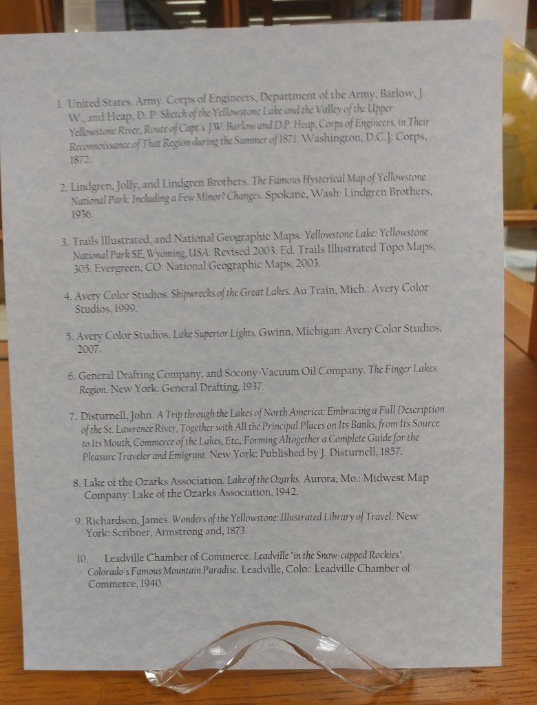
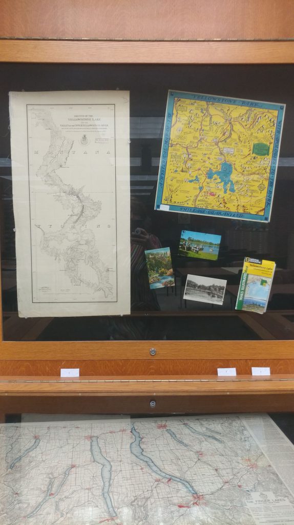
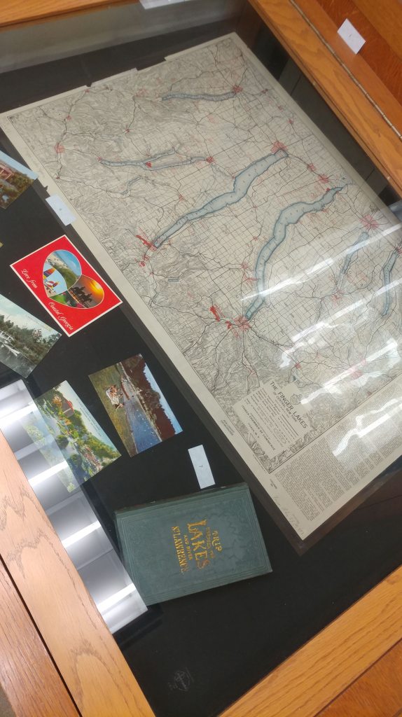
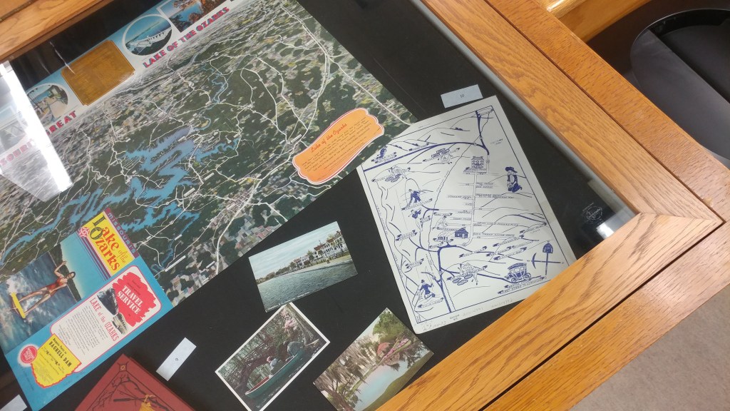
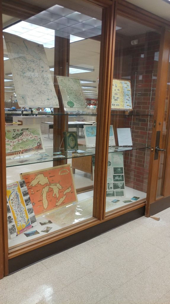
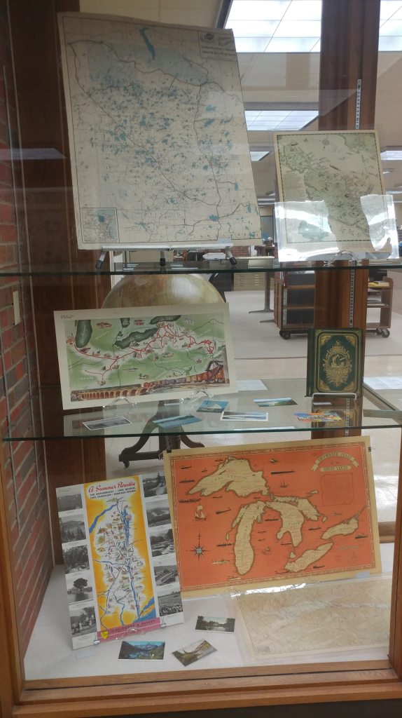
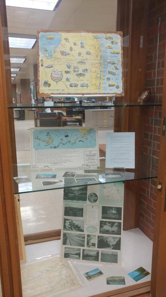
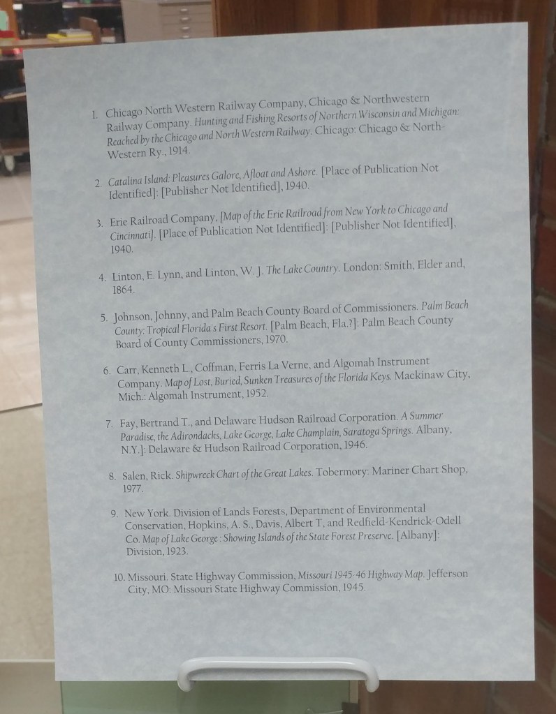
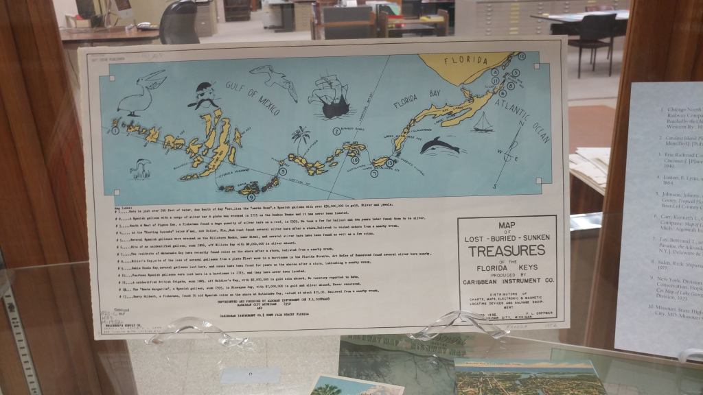
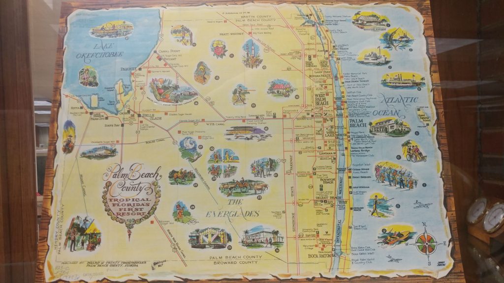
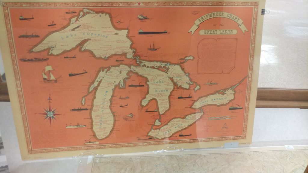
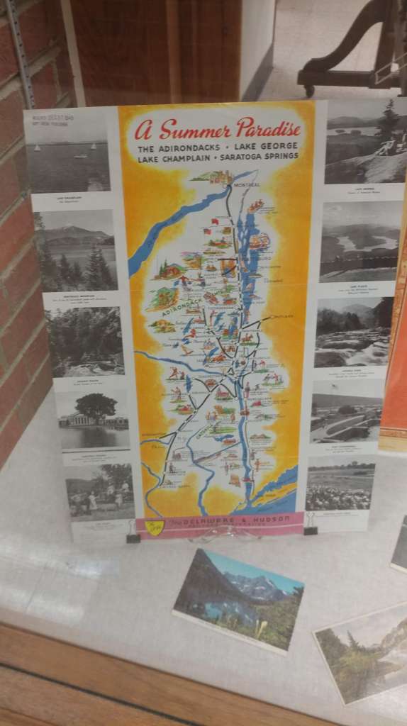
maps
Lake Tourism Exhibit
by Angie Cope
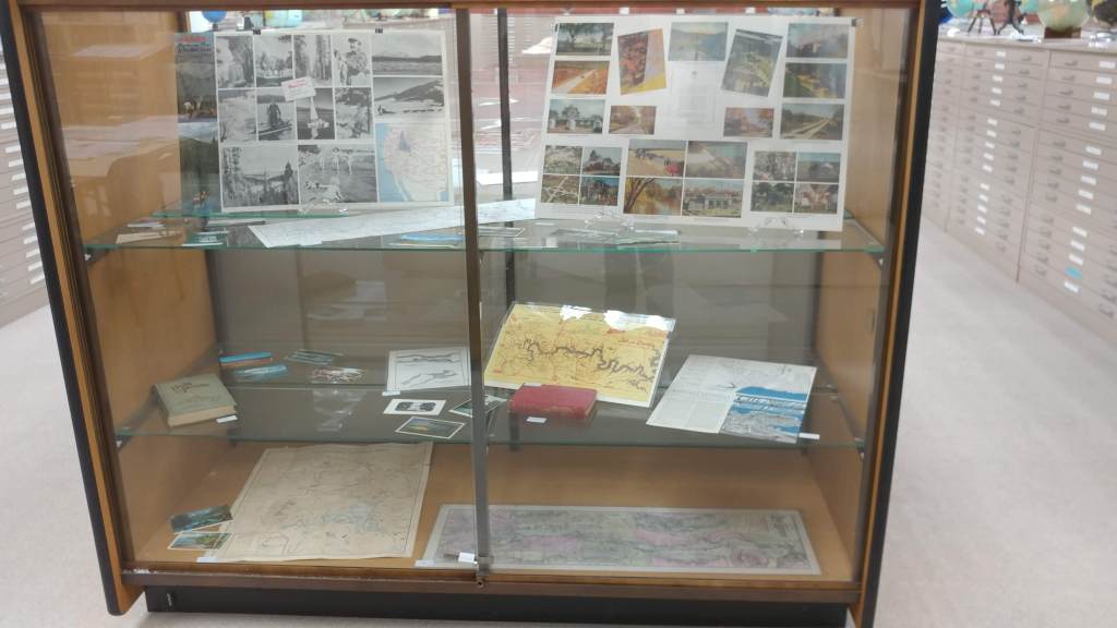
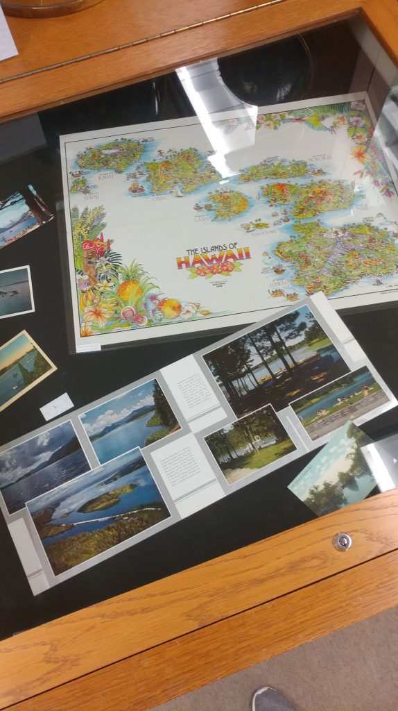
Here is a closer look at the Fall exhibit curated by Georgia Brown, Graduate Student Intern at the AGS Library. The fall exhibit highlights lakes and water features in the United States using maps, books and postcards.
“A New World of Pleasure”: The 105th Anniversary of the Panama Canal
By Lauren Maddox
On August 15, 1914 the United States officially opened the Panama Canal. It took thirty-three years for the construction to come to fruition; France began building the Canal in 1881, but were unable to carry the project forward. Workers were dying and the engineers hit roadblock after roadblock. The United States took over the project in 1904.
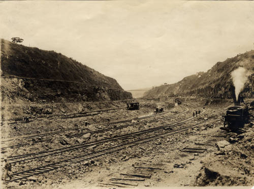
Click the link to see “Railroad Tracks at the Panama Canal Zone” 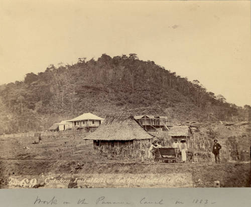
Click the link to see “People Working on the Panama Canal.” 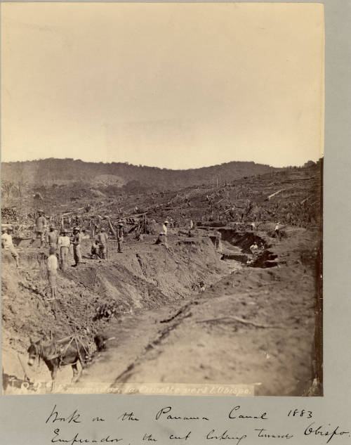
Click the link to see “Work on the Panama Canal 1883.”
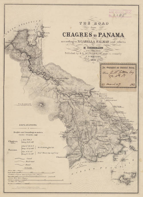
Click the link to see 1851 Map of the Road from Chagres to Panama with Proposed Canal Route in our Digital Collections
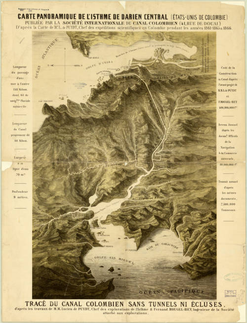
Click the link to see the 1866 French Map of the Isthmus in our Digital Collections
European colonists have had ideas about the Panama Canal since 1513; Vasco Nunez de Balboa crossed the Isthmus of Panama and wondered about a water-passage shortcut for ships crossing the Atlantic and Pacific. But imagination ran past ability, and the technology needed for such an undertaking would not be developed until the 19th century. France began the initial efforts. The project was led by canal engineer Ferdinand de Lesseps. But amid the disease and trouble financing the project, they were only able to complete half of the canal. As soon as the project was abandoned, the US expressed interest in the picking it up again, but US involvement with the Panama Canal was unpopular at home. French failure to complete the project was disheartening and the Colombian government was unenthused about the idea of an American canal to say the least.
For the US to be granted the rights to continue work on the canal, some political finagling was required. Philippe-Jean Bunau-Varilla, a businessman and engineer who had financed the original attempt, stood to lose his investment if the canal was left unfinished. He began lobbying US lawmakers and encouraging Panamanian independence movements which would prevent Colombian interference with US building efforts. It didn’t hurt that the US maintained an active military presence during the building to discourage conflict. American engineers also moved away from the original plans for a sea-level canal and began work on a lock-controlled canal which would would help them avoid the building problems the French had. Advancements in healthcare for workers and a new focus on mosquito control also helped save workers from catching the diseases that had killed so many during French construction.
Click the link to see the 1877 Map of the Isthmus in our Digital Collections
The AGSL has an extensive collection of materials on the Panama Canal. Theodore Roosevelt, a longtime friend and council member of the AGS until his presidency forced him to resign, was a great proponent of the canal. And the one of AGS’s own directors, Isaiah Bowman, made several trips to South America during his doctoral work and beyond, and championed efforts to create a map of “Hispanic America” as part of the international map of the world. Bowman, a controversial figure who was a known antisemite, contributed a large portion of the AGSL’s records on the Panama Canal. His particular interest in South America made the way for revolutionary cartographic work in the area, and the continued AGS sponsored expeditions are named for him.
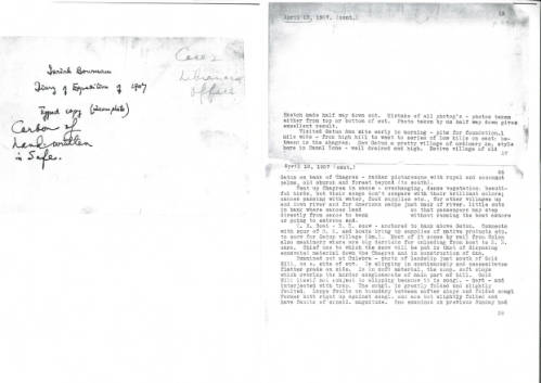
Click the link to see a Transcription of Bowman’s Diaries from his 1907 trip to Panama in our Digital Collections 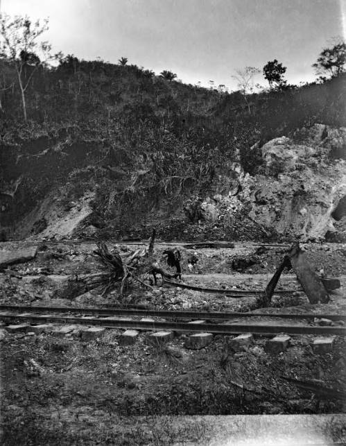
Click the link to see a Photo of Railroad Tracks built during Canal Construction, Taken by Bowman 1907 in our Digital Collections
Work on the lock-controlled canal began in 1904, when the US was officially granted the rights to build by the newly-independent Panamanians. The French ship Alexandre la Valley made the first test-crossing of the canal in January 1914. Construction began winding down; pop-up towns were demolished, workers were laid off, and more permanent governance of the canal was established. A grand opening celebration was planned– but when World War I broke out, the festivities were downsized to something more modest. On August 15, 1914 the SS Ancon made the first official crossing, marking the grand opening of the Panama Canal. No international officials attended the opening, so George Washington Goethals, engineer and first governor of the Canal Zone, tracked the ships progress by train. The AGSL has several maps of the Panama Canal before and after its opening. Since its first ship-crossing, the Panama Canal has only grown; Panama took ownership of the canal in 1977, new construction began in 2007, and annual traffic has risen to nearly a million crossings.
Highly Decorative World Map with Ancillary Map of Panama Canal, 1905 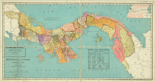
1910 Map of the Republic of Panama 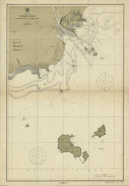
1911 Map of Canal Zones with Panama Road and Approaches to the Canal 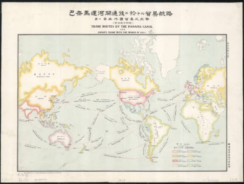
1911 Bilingual English and Japanese Map of Trade Routes by the Panama Canal 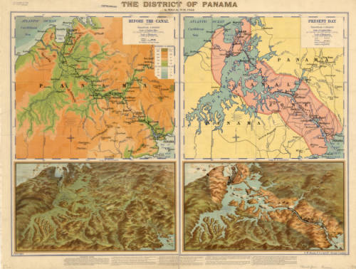
1915 Map of the District of Panama 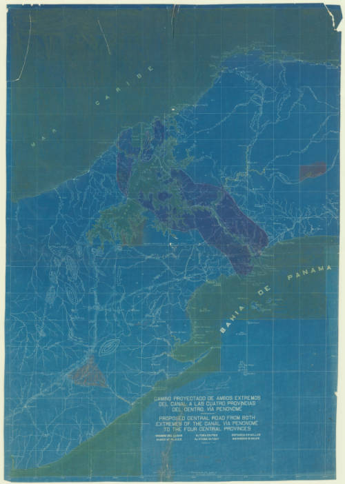
1922 Plans for a Main Road Across the Canal Route 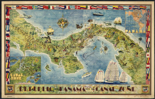
1941 Illustrated Map of the Republic of Panama and the Canal Zone 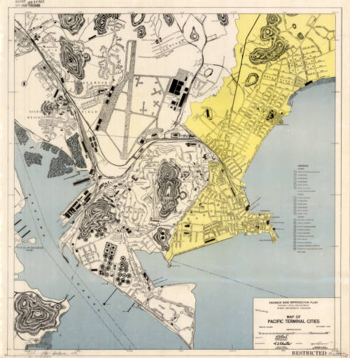
1947 Map of Terminal Cities in the Pacific 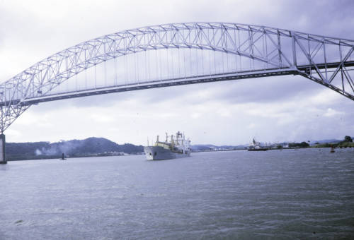
Harrison Forman’s Photo of the Bridge Across the Canal Entrance 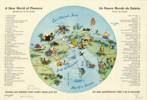
1950 “A New World of Pleasure: Crossroads of the World”
To the Lighthouse: Representations of Lighthouses on Maps
By Lauren Maddox
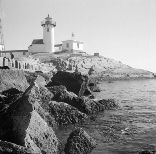
Click the link to see Clarence W. Sorensen’s photo of a lighthouse in Gloucester, c. 1934-1969 in our Digital Collections
Lighthouses have been guiding us home over the rough sea from our earliest maritime beginnings– but our understanding of lighthouses and how we represent them on maps and nautical charts has changed drastically since these beginnings. While references to early lighthouses exist, including Homer’s claim that Palamedes devised a system of lit beacons to guide sailors, the first “regularly maintained” lighthouse in antiquity was on Cape Incihisari. J. Saxby Wryde, however, claims in his British Lighthouses: Their History and Romance that the most celebrated lighthouses in antiquity were built 400 years after this. The Colossus at Rhodes was erected in 278 B.C. and destroyed by an earthquake in 224; the remains were sold as brass and carted away on camels by a merchant. In 270 B.C., the famous Lighthouse of Alexandria was constructed in honor of Ptolemy Philadelphus on a small island in the Bay of Alexandria.
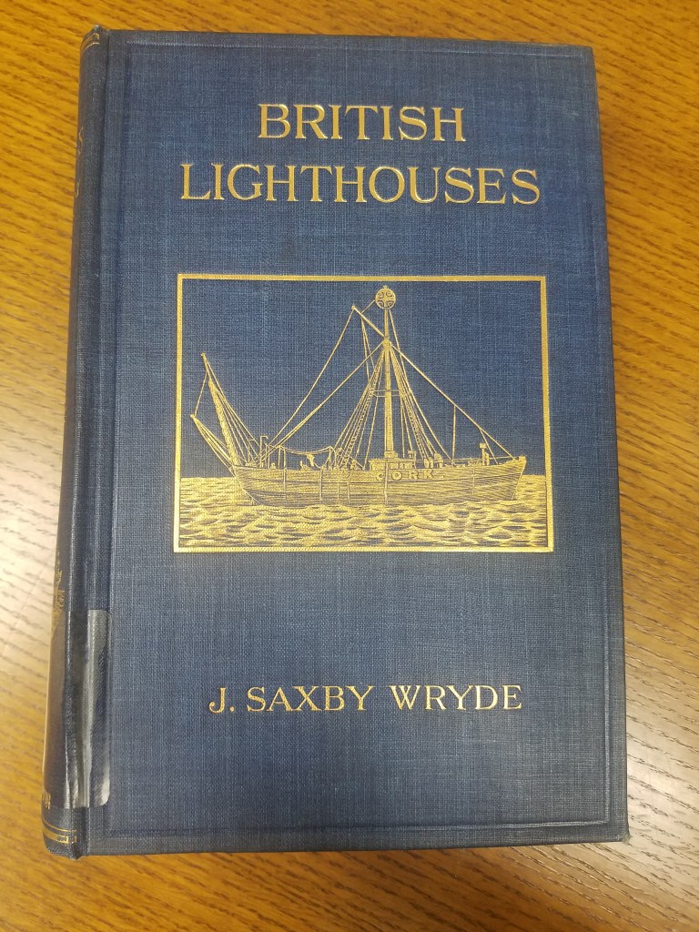
Click the link for details about the 1913 Edition of British Lighthouses 
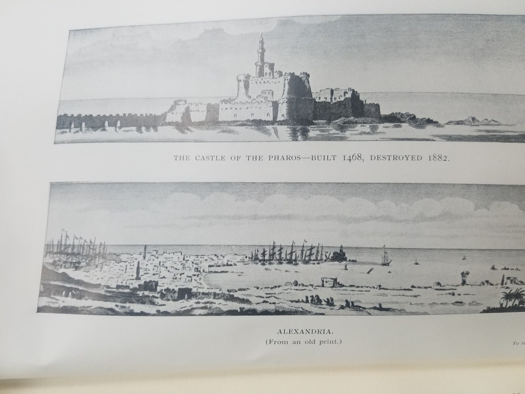
Illustration of the Lighthouse of Alexandria
The function of lighthouses has also evolved over the years; in antiquity, lighthouses were only expected to indicate the location of ports. Lighthouses as we understand them today act as warnings for boats approaching reefs and rocky shores. This understanding of lighthouses as way markers is reflected on ancient maps. The Lighthouse of Alexandria is depicted pictorially in Braun and Hogenberg’s 16th century atlas Civitates Orbis Terrarum–the lighthouse is given the same attention as the city’s obelisk or its ruins; its existence is simply recorded and labeled with a single word: pharus for lighthouse. The lighthouse has obviously done its job, though; ships are shown moving towards the lighthouse and the port it is indicating. One ship is even flying St. George’s Cross, the British flag used by crusaders that was later adopted as the national flag in Medieval England.
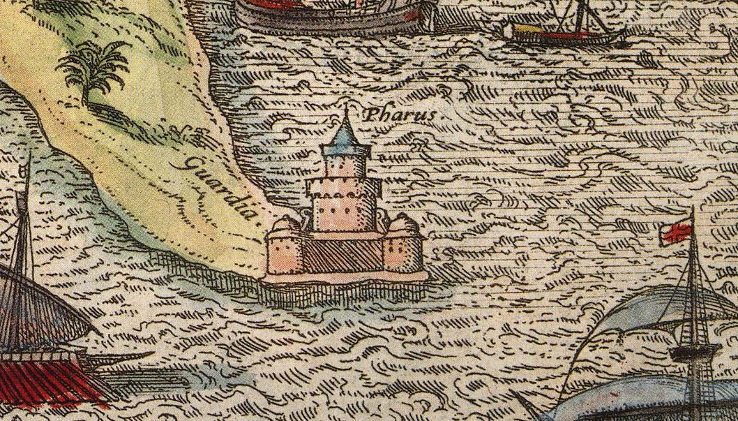
Click the link to see the Atlas the illustration of The Lighthouse of Alexandria is in 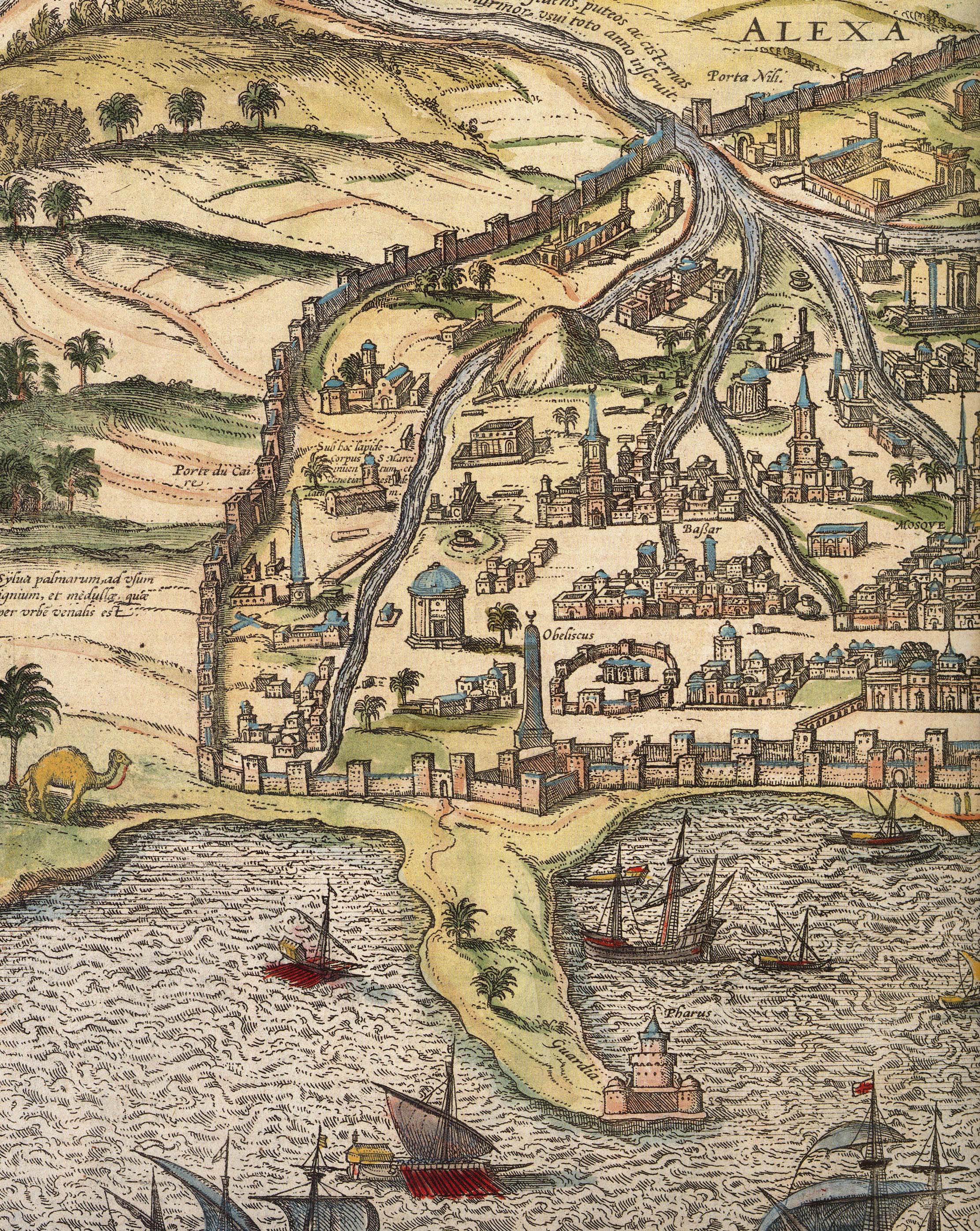
Alexandria
The Lighthouse of Alexandria was also doomed to be destroyed by earthquakes, but the bricks were used to construct the Citadel of Quaitbey. UWM professor Caroline Seymour-Jorn donated her photo collections to the AGSL , including several photos from 1996 visit to Egypt of the citadel.
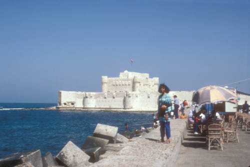
Click the link to see this photo of Alexandria, Egypt: View of Quaitbey Citadel courtesy of Caroline Seymour-Jorn in our Digital Collections
The Roman Empire adopted the Greek pharos and began building them across Italy and the Empire, including the Tower of Hercules in A Coruña, Spain and Dover. The lighthouse in A Coruña is still functional, but many Roman lighthouses were abandoned in the Middle Ages and replaced. As travel and trade by sea became more and more prevalent, the need for lighthouses grew.
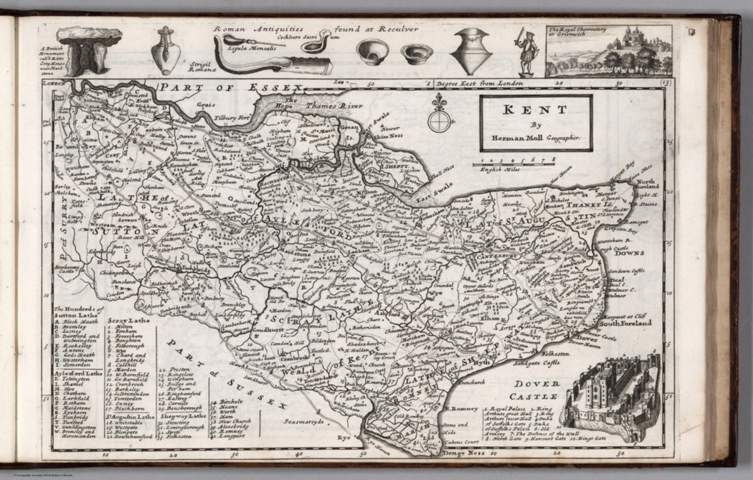
Click the link to see the 1724 Map of Kent by Herman Moll in our Digital Collections 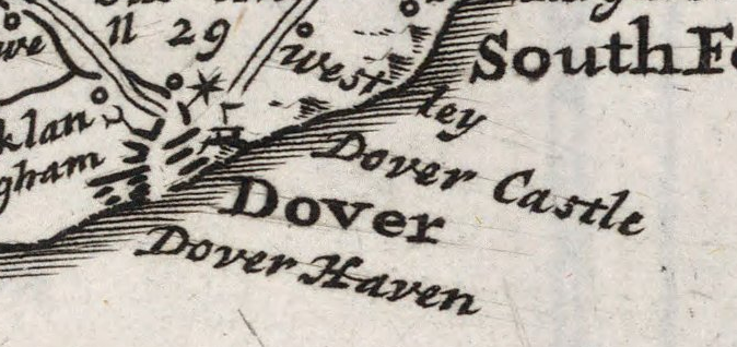
Dover, lighthouse indicated pictorially
Most lighthouses constructed during this time are no longer operational, but the Hook lighthouse in Ireland continues to be used. The building has been in operation for over 800 years and is now managed by the Commissioners of Irish Lights. Lighthouses in England were privately owned and operated during the Middle Ages and beyond. Because there was no regulation or standard policy, lighthouse keepers began to abuse their posts, stealing ship cargo and demanding payment from sailors. This problem became so pervasive that the Lighthouse Act of 1836 was passed in the hopes of making coasts safer for ships coming to port.
In the 18th century, lighthouse construction advanced to match the needs of a growing transatlantic trade. Bigger, better lighthouses were being built and were now being used as more than way markers; they could warn incoming ships and regulate boat traffic. In 1716, the first American lighthouse was built on the Boston Harbor; many more began to spring up in the subsequent years, and in 1851 Congress passed an act to facilitate the creation of the US Lighthouse Board, which would eventually be dissolved to make room for the Lighthouse Service. The AGSL has many of the Service’s records, including records of their history, finances, regulations, and buoyage and lighthouse systems.
Click the link to see the Boston Light Referenced on 1889 Map of Boston Harbor in our Digital Collections
With lighthouses increased utility and presence on coastlines, their representation on maps began to shift. Instead of being just illustrations or seamarks, lighthouses began to take on a new navigational importance. Diagrams of lighthouses, recordings of the range of their lights, and more exact buoy locations became a common part of maps.
Click the link to see Lighthouse detail from 1926 map of Puerto Deseado, Argentina in our Digital Collections 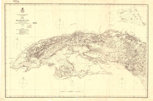
Click the link to see the Map with Lighting information for Cuba 1874 in our Digital Collections 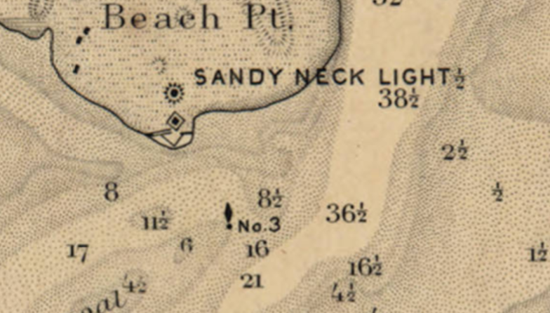
Click the link to see the Lighthouse and Buoy on Map of Barnstable Harbor, Massachusetts 1880 in our Digital Collections 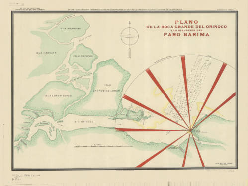
Click the link to see the Lighthouse depicted in 1906 Map of Rio Barima, Venezuela in our Digital Collections
Now lighthouses have a romantic air as well as a practical use; writers and artists work to capture the lighthouse. To the Lighthouse by Virginia Woolf comes to mind. And here, in Milwaukee, where the AGSL lives, we have our share of lighthouses on our Great Lake Michigan.
The AGSL Guided Tour: An Interview with Georgia Brown
Interview conducted by Lauren Maddox
This week, I sat down with Graduate Student Intern Georgia Brown to discuss one of her recent projects for the AGSL. Georgia is part of the School of Information Studies coordinated degree program working to receive her Master’s in both Library and Information Science and History. She has been a key member of the AGSL staff since 2018, contributing to many projects for the library. Recently, she designed a guided tour of the AGSL to make our collections more accessible to visitors exploring the library. To learn more about the tour and how you can take it, read on:
So, we’ve started giving visitors your Self-Guided Tour of the AGSL to help them navigate the library—could you talk a little about what the Guided Tour is and your process for creating it?
The guided tour helps people get into the space of the AGSL and really see more of the collection than is just out by the display cases. The process actually took a few months–I made a lesson plan last semester that had middle schoolers exploring the AGSL while also learning about the parts of a map. The lesson itself is a map of the library that the students use to figure out a different part of a map at each stop. After I made this, I realized that this would be an awesome way to have people just come visit the AGSL.
How would a visitor go about a Guided tour? Could you describe the process of getting a Guided Tour and what visitors see on it?
As soon as you walk into the AGSL, on the table to your right will be a stack of the guided tours. Someone on the library staff will ask if you need any help and if you are just there to look around, we’ll offer you the guided tour as a way to check out the library.
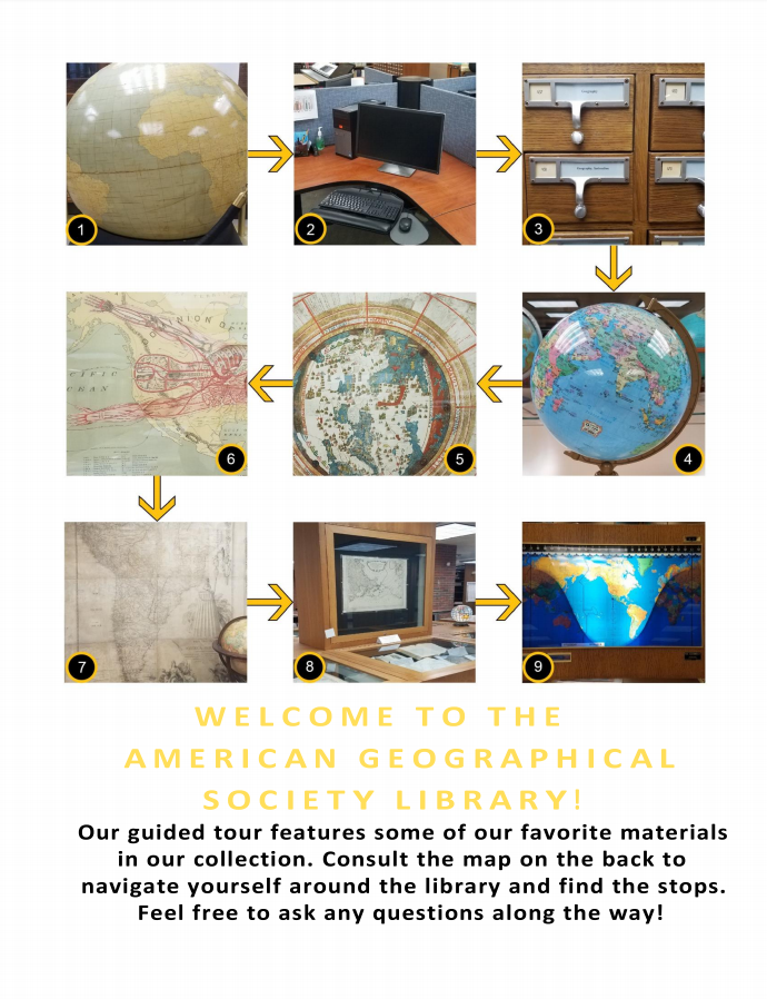
The Guided Tour, available at the front table in the AGSL 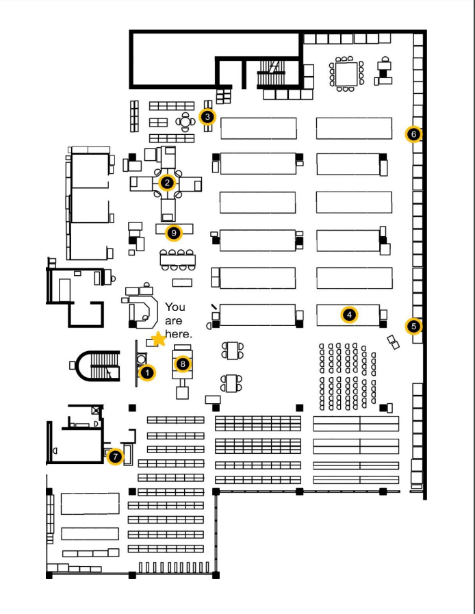
Map of the Library
Why was this a necessary project? Has it made the AGSL more accessible to visitors?
Lots of people come in to see the AGSL, and some will take the time to walk around and see everything. But one of my biggest frustrations is seeing visitors come in, spin once in a circle, and then leave. I realized there was probably more they wanted to see, but something about the space made it seem scary or hard to approach. Now that the guided tour is being handed to patrons and visitors, I feel like they are seeing more of what is on display.
What patrons benefit the most? What impact has this had on visitors’ experiences in the library?
In the two weeks that I have been handing out the guided tour, I feel like only a third of the people who start it actually finish it in its entirety. The other two thirds, however, keep getting distracted by all of our other awesome materials on display. My goal with the tour was to get people into our space, and in just a short time, I have seen people just as interested in globes and maps that aren’t on the tour as the ones that are on the tour.
Did working on this project teach you anything about the AGS Library or about libraries in general?
One cool thing about putting this together was the amount of collaboration that went into it. After I made the first version, I gave a copy to five staff members and interns, and they each gave me their notes on the project.
Thank you Georgia for joining me for this interview. To take the tour yourself and see our amazing collection in person, visit the AGSL and take the guided tour! You can find us on the third floor of UWM’s Golda Meir Library, Monday through Friday, 8:00 a.m. to 4:30 p.m. We look forward to seeing you!
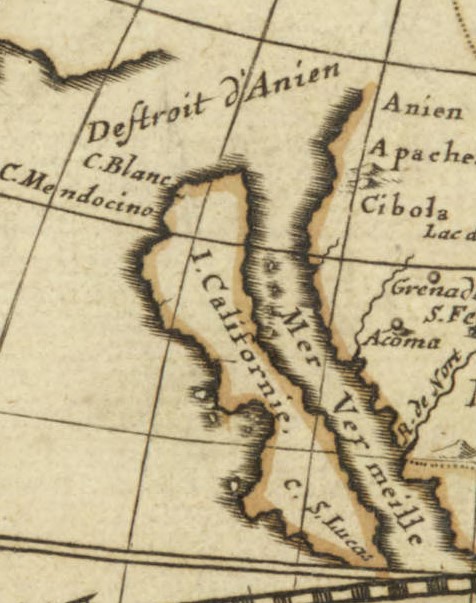
The Island of California
By Lauren Maddox
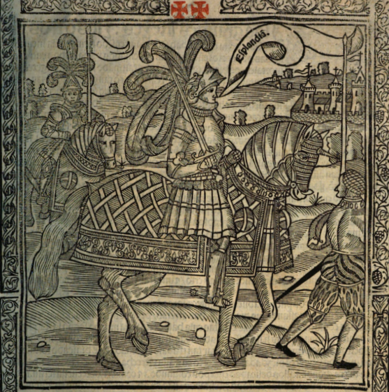
Illustration from La sergas de Esplandián
“Know that, on the right hand of the Indies, there is an island called California, very near to the Terrestrial Paradise;” this description, found in Chapter 157 of Las sergas de Esplandián, names a California at least sixteen years before Cortez spotted the coast of the land he would name California. The Spanish romance, which was a sequel to Garci Rodríguez de Montalvo’s better-known and better-received Amadis de Gaula, was largely forgotten despite being the first mention of a place named California. Esplandián was considered an inferior sequel and faded into insignificance; it’s greatest claim to fame is its brief appearance in Don Quixote’s library in Cervantes’s comical romance. And even that reference was unflattering. The curate chose to burn Esplandián instead of Amadis de Gaula because, he said, we should not “spare the son for the virtues of the father.”
So, Las sergas de Esplandián was a failed romance that was quickly forgotten. But, as the first recorded use of California, it stands to reason that this forgettable Spanish romance could have inspired Cortez when he encountered the lowest tip of the Baja California Peninsula, 775 miles from where the peninsula joins the mainland. As far as Coretz could tell from his ship, he had found an island on the right hand of the Indies, very near to the Terrestrial Paradise.
The misconception that California was an island would persist throughout the 16th century, and resurface with new, incorrect maps released in the 17th and 18th century. In 1539, Cortez’s navigator Francisco de Ullou ventured northward into California and discovered it was a peninsula, debunking the theory that California was an island just six years after the first sighting of the peninsula. Somehow, the legend persisted despite fairly correct representations of the peninsula being published as early as 1569.
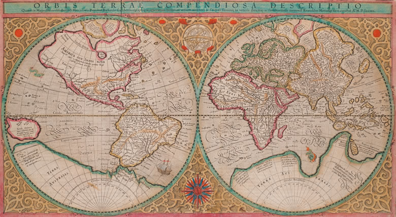
Mercator’s 1569 edition of Orbis terrae compendiosa descriptio from Envisioning the World: The First Printed Maps 1472-1700 Click the link to see this map in our Digital Collections
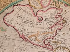
America in the Mercator Map
Many cartographers incorporated Ullou’s discovery of the peninsula into their maps, including this 1569 world map by Gerard Mercator. If you look closely at America, you can see the Baja California Peninsula clearly and correctly attached to the mainland. This representation wouldn’t stick–the Baja California Peninsula would be confused for an island again after Juan de Fuca’s voyage at the turn of the century. In 1592, de Fuca claimed to have found a strait he thought could be the Northwest Passage with a large island at its mouth. Only one account of this discovery survived, and the location of de Fuca’s strait was confused with California, reviving the representation of California as an Island.
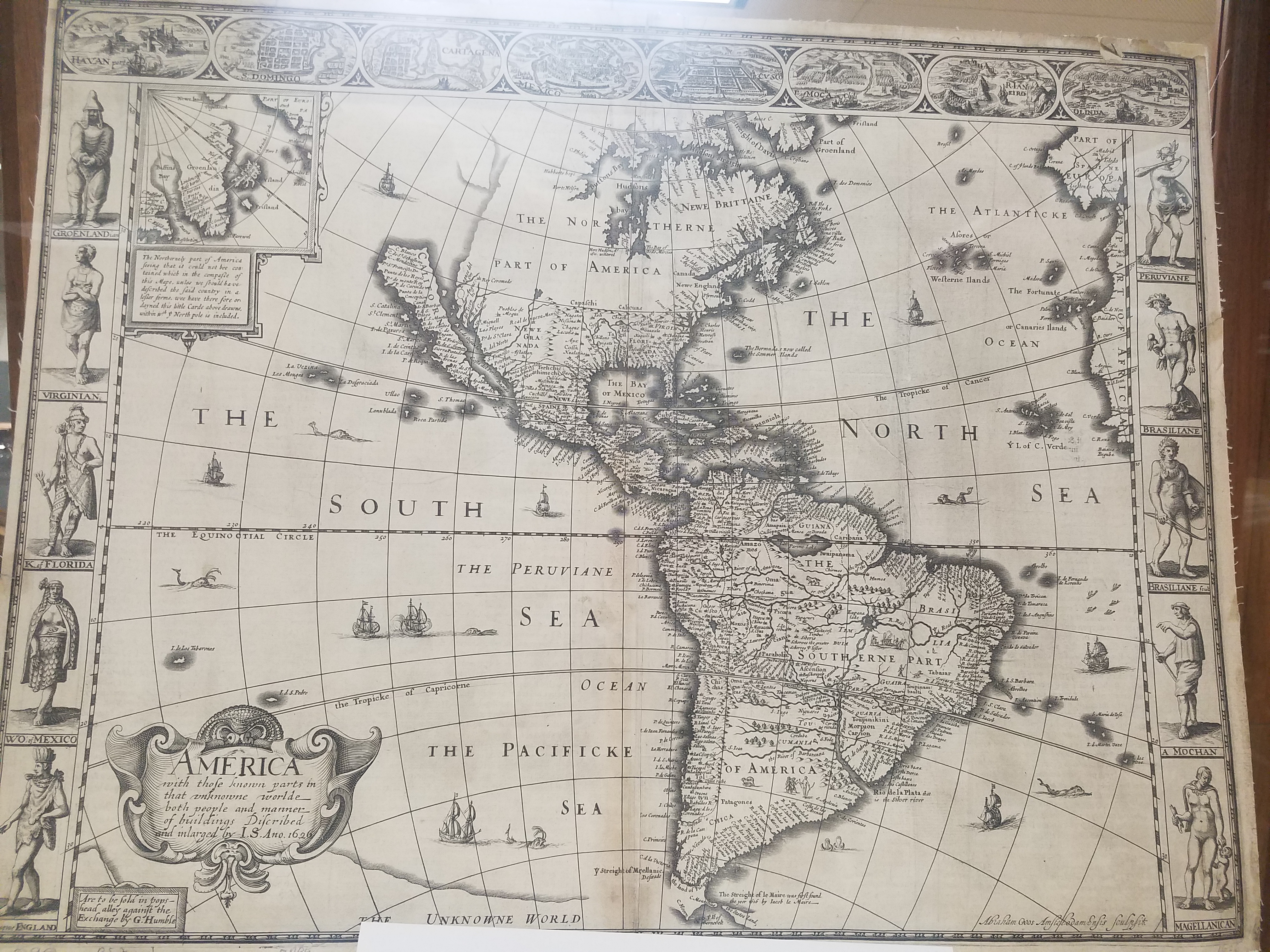
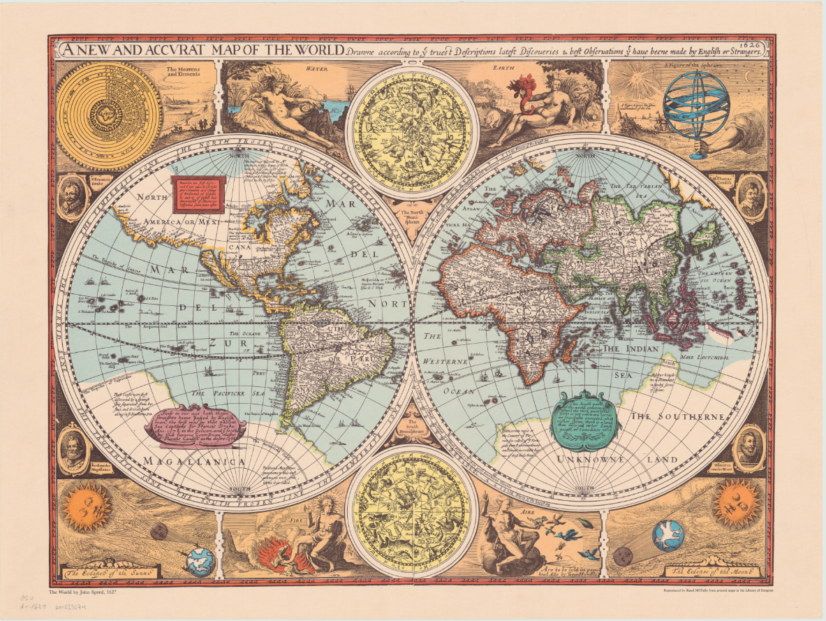
An overland expedition in 1602-1604 should have disproved de Fuca’s claim to have found a Northwest Passage, or at least cleared up any confusion about whether the Baja California Peninsula was the island he had claimed to see at the mouth of the strait. Despite Juan de Onate’s reports, the northern terminus of the Gulf of California was left vague on maps by the Spanish so that Cortez’s claim to the territory in 1533 could invalidate Drake’s later claim in 1579. Several maps released after Mercator’s map and de Onate’s reports show the peninsula detached from the mainland. One of the first atlas maps to depict California as an island was English mapmaker and historian John Speed’s America with those Known Parts in that Unknowne World both People and Manner of Building from 1626 or 27. This representation of America, seen again his A new and accurat map of the world reproduced by Randy McNally in 1966, also includes a fairly accurate mapping of the United States’ East Coast.
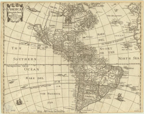
William Trevethen’s 1666 Americ descriptio nova depicts the Island of California once again. The Trevethen map also places Sir Francis Drake’s Nova Albion on the island; Nova Albion was actually a part of continental Mexico, and the English claim to Nova Albion was their foothold into claiming further continental territory, which is why the Spanish worked so hard to invalidate that claim. Nova Albion is now Point Reyes, which is just Northwest of the San Francisco area. The region North of the Island of California is marked “terra incognita” with a sea monster lurking in the waters to indicate the unknown and unexplored continent.
Click the link to see the Americ descriptio nova 1666, published in 1670 edition of Peter Heylyn’s Cosmography in our Digital Collections
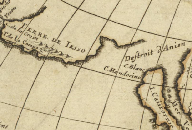
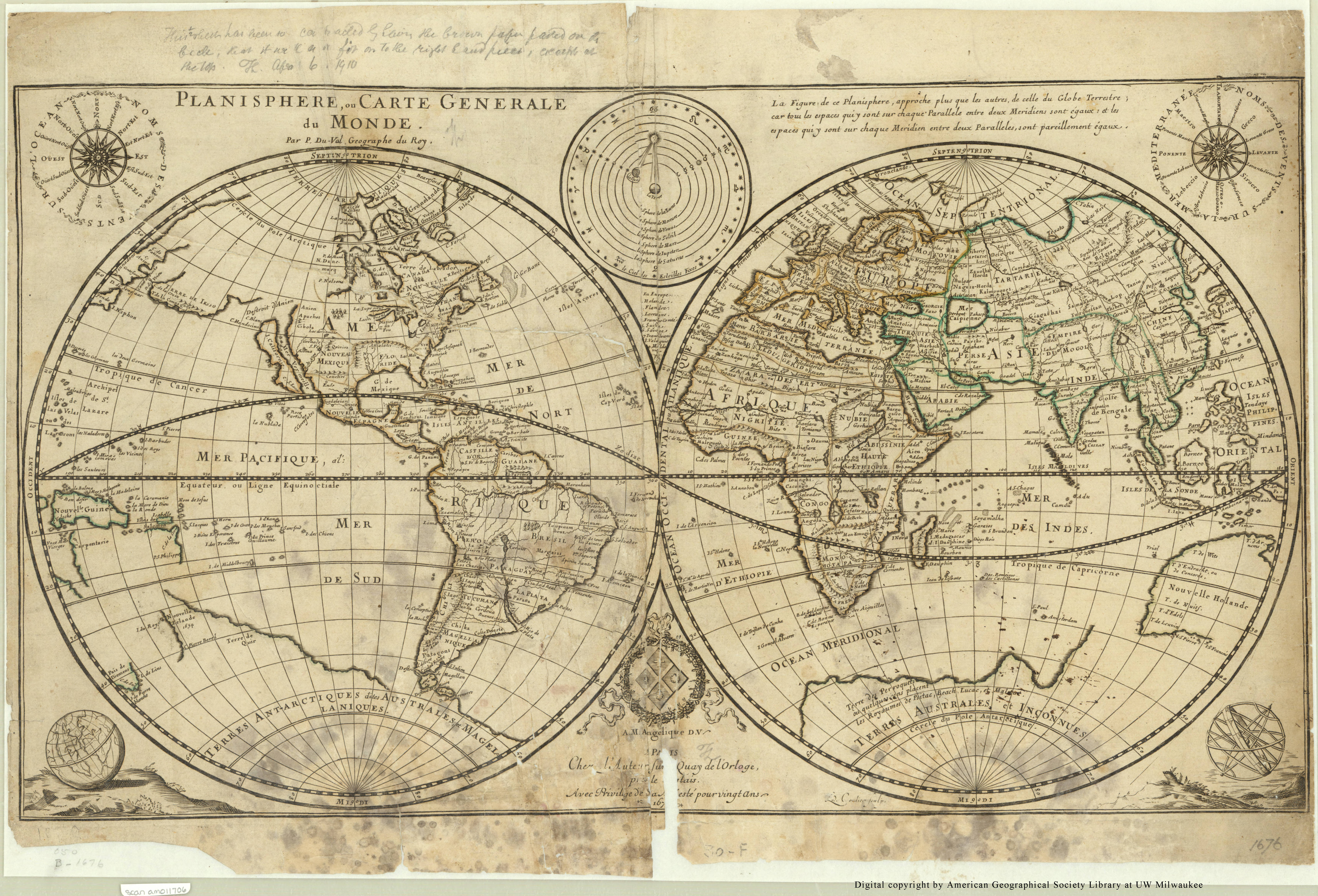
A 1677 world map in the AGSL collection by Pierre Duval includes the Island of California at the mouth of an approximately placed strait. This map also includes a vague coast line marked “terre de Iaso” just Northwest of California. The “terre de Iaso” was thought to be a region where Japan connected to North America.
L’America Settentrionale, another 1677 map by Guillaume Sanson, leaves the unexplored areas of North America blank to indicate the unknown, but clearly includes the island of California. Remarkably, the French maps do not include Nova Albion.
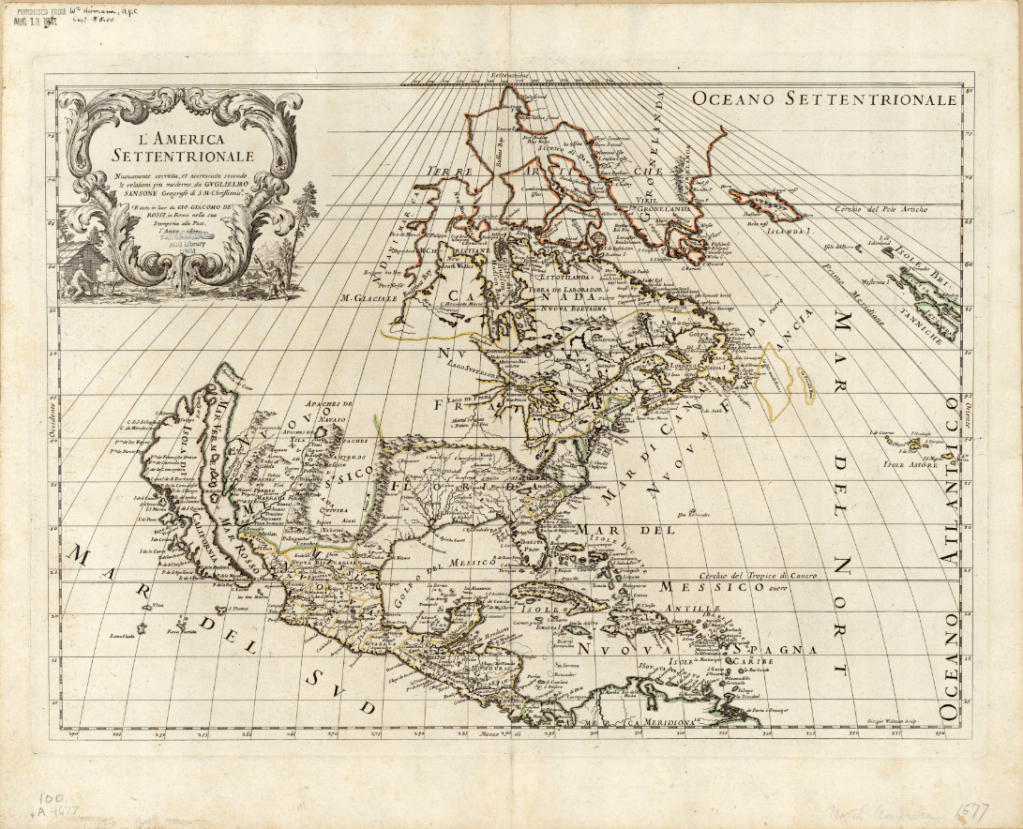
Click the link to see Guillaume Sanson’s 1677 Map of America in our Digital Collections
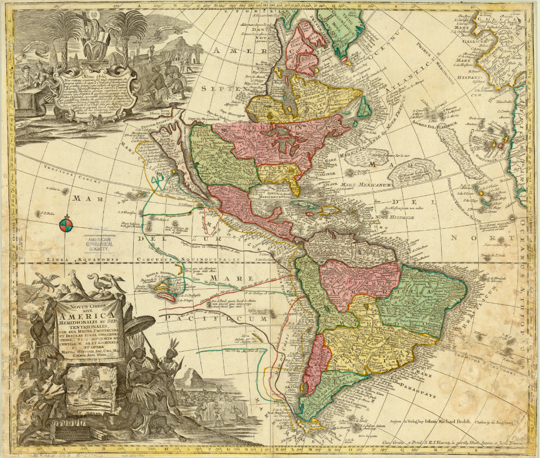
At the end of the 16th century, Dutch cartographers Gerard and Leonard Valck produced another map depicting California as an island. The Valck map, like the 1677 Duval map, includes a reference to an area connecting North America and Asia. On the Valck map, it is referred to as the “Terra Esonis.” The Valcks only include the vague coastline of the fabled connection, leaving a blank space– perhaps to leave room for future discoveries. The map includes detailed records of place names and waterways, as well as an illustrated cartouche depicting a pair of “Americans” surrounded by bountiful crops and exotic animals.
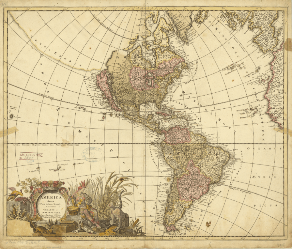
Click the link to see the Valcks’ 1690 Map of America in our Digital Collections
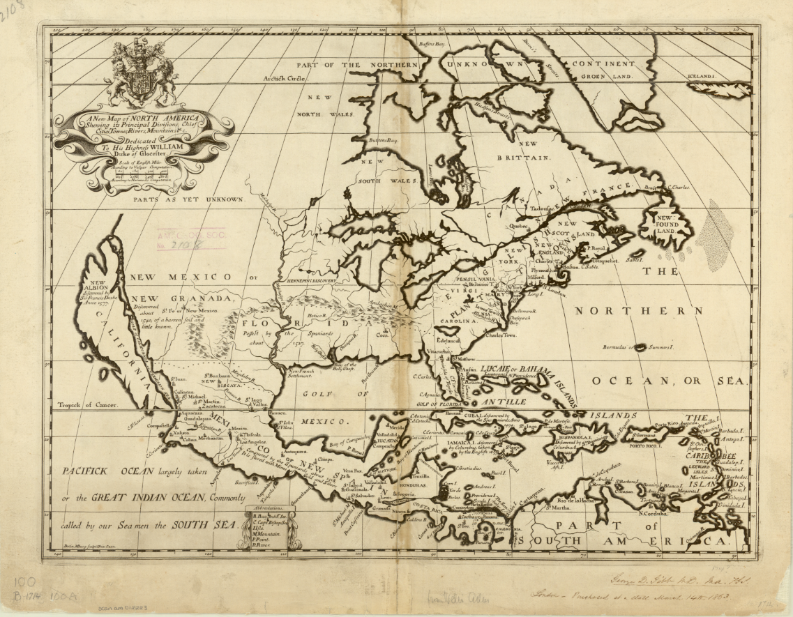
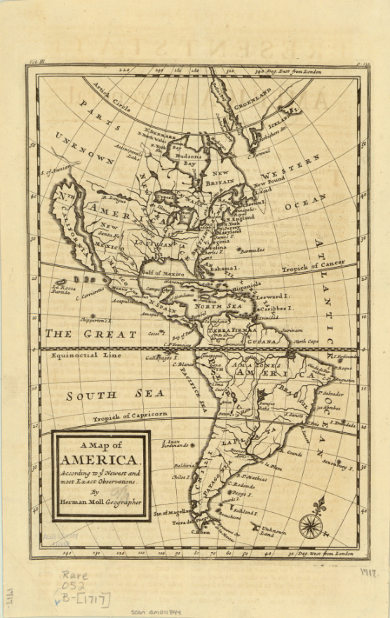
This map was produced just eight years before Eusebio Francisco Kino’s series of overland expeditions, which would finally confirm that the Baja California Peninsula was indeed a peninsula. Kino, a Jesuit missionary and cartographer, believed that California was an island until he began to explore deeper into the continent. He initially intended to establish a route between Jesuit missions in Sonoran and Baja California on his expeditions from 1698-1706, but also reported and confirmed the land connection and reestablished the existence of the Baja California Peninsula. The Jesuit order generally accepted his claims, but Europeans were slow to incorporate the peninsula into their own maps because of conflicting reports from Juan Mateo Manje, who joined Kino on several expeditions. Maps created into the 18th century by Europeans still recorded the Island of California’s existence; these two English maps were created just a few years after Kino’s final confirmation of the peninsula’s land connection. The first map, Michael Burgher’s 1714 A New Map of North America, depicts the topography of the area, as well as records of new discoveries, settlements, and claimed and unclaimed territory. The 1717 Map of America by Herman Moll has a similar focus, but includes South America.
The latest map in the AGSL collection depicting California as an island is Matthaeus Seutter’s 1740 map. The hand-colored map is filled with notes and ship routes, as well as two detailed cartouches depicting local peoples and their conversion to Christianity. Seutter’s map also references an Ocean of California surrounding the island and several sketches of aquatic plants.
Click the link to see the 1740 Seutter Map in our Digital Collections
Montalvo’s lost romance tells stories of a bountiful and fertile island ruled by women adorned in gold and jewels, and the Queen Calafia who fell in love with a Spanish man and forfeited her power, treasures, and land to their king for the chance to marry him. In Las sergas de Esplandián, the island of California is full of potential coveted by conquering Europeans. In many ways, this fiction became reality– California became an island, first by misconception, and then deception as the Spanish maneuvered to maintain their claim on the land and prevent English settlement. And in our collections, we have 200 years of maps recording one of cartography’s longest-lived errors.
The Sanborn Fire Insurance Maps: Milwaukee Before and After the Third Ward Fire of 1892
By Lauren Maddox
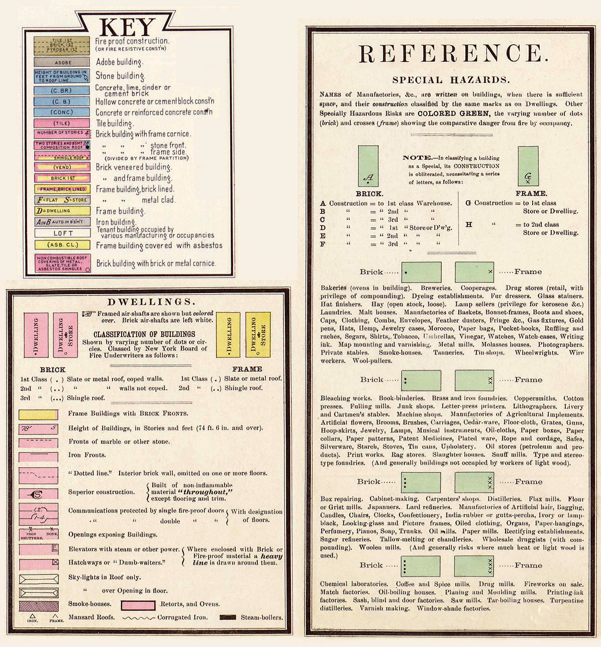
The 1894 and 1910 Sanborn Maps of Milwaukee currently featured on the AGSL website catalog over 12,000 detailed color map sheets of Milwaukee. The Sanborn map collection, which, in its entirety, contains roughly fifty thousand editions of fire insurance maps, was intended to inform fire insurance agents about fire hazards associated with individual properties in a city. The maps contain relevant information about building materials, layout, and fire prevention measures in residential and industrial buildings throughout Milwaukee as well as the actual layout of the city.
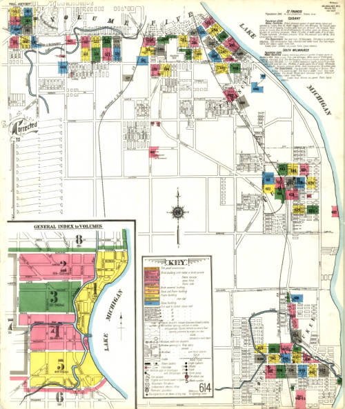
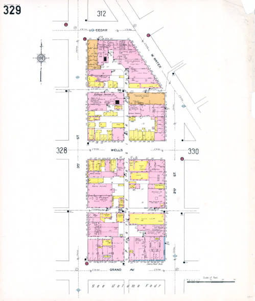
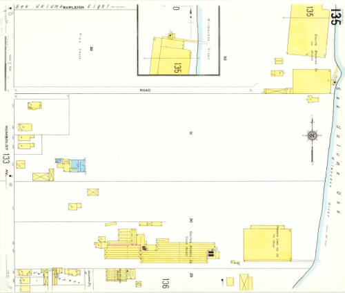
But these maps don’t just detail the fire hazards of a city– they also capture the changes that happen in an ever-growing and ever-evolving urban space. The Sanborn maps have been described as the “the single most important record of urban growth and development in the United States during the past one hundred years” and detail over 12,000 towns across the United States, Canada, and Mexico from 1867 to today. The AGSL digitized its collection of Milwaukee Sanborn maps in 2007 and made them available through the AGSL Digital Collections. Then in 2017, former AGSL student assistant Belle Lipton and the Milwaukee County Land Information Office georeferenced the AGSL’s collection of 1910 Sanborn map sheets to create the Sanborn Discovery App 1910: a seamless and immersive version of the 1910 Sanborn map sheets that overlay a current satellite map of Milwaukee. The Sanborn maps contain references to buildings that no longer exist and empty lots that have since been developed; the Riverside Printing Company on sheet 329 is now a parking lot, and underneath the mostly empty map sheet 135 now sits Carver Park’s two baseball diamonds. Looking at these two maps right on top of the other, it’s easy to see how much Milwaukee has changed in the intermediate 107 years.
However, we know that the city’s face was changing even before the Sanborn maps began to record it. Just two years before the first Sanborn fire insurance maps of Milwaukee in 1984, the historic Third Ward burned down. And years before that, the city was still growing and changing with time. The Sanborn maps capture what the city was like two years after the fire– but earlier maps in the AGSL archives reveal what the city looked like before the Sanborn fire insurance maps, before the tragic Third Ward fire, and before even the founding of Milwaukee.
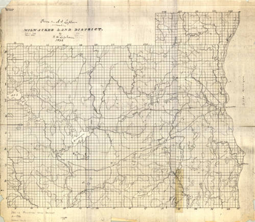
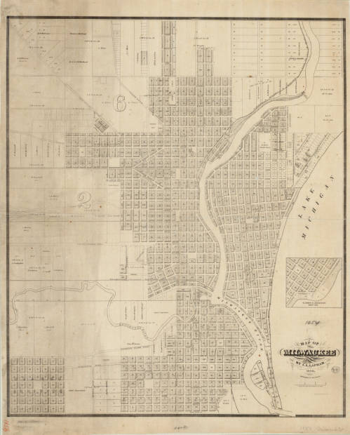
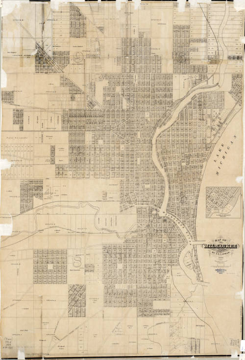
The three maps shown above, created by I.A. Lapham spanning from 1836 to 1869, illustrate Milwaukee’s growth over thirty-three years. Together, they create a picture of the city’s founding and continued development. The first map depicts the Milwaukee land district before the city was officially founded. The two later maps were recorded after Juneautown, Kilbourntown, and Walker’s Point were combined and incorporated as the City of Milwaukee. There was substantial development between 1856 and 1869, which is made even more obvious by comparing the two maps side-by-side.
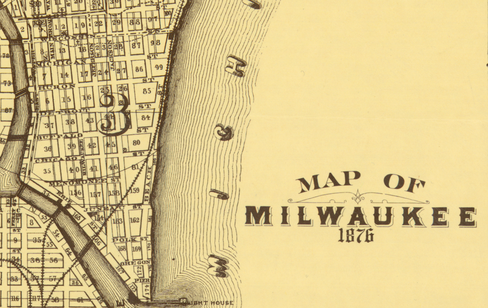
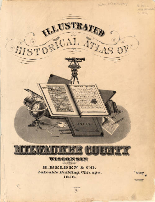
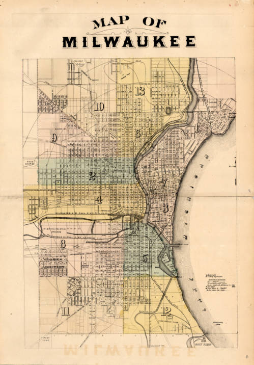
The 1876 map of Milwaukee by H. Belden and Co. presents an even more developed Milwaukee than the previous Lapham maps. The map was originally drawn up in 1876 and included in the Atlas of the State of Wisconsin in 1876, but was reprinted in 1881 as a part of the expanded Illustrated Historical Atlas of Milwaukee County Wisconsin. The first version of the map shown was donated to the AGSL by Martin Lange Jr. in 2009.
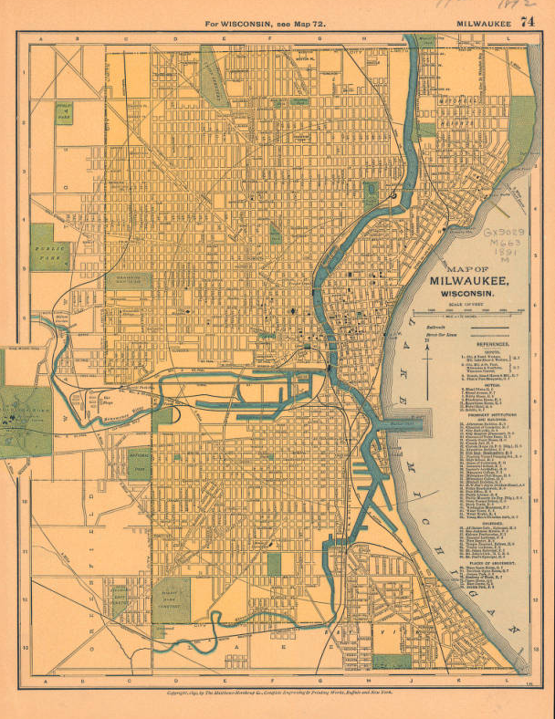
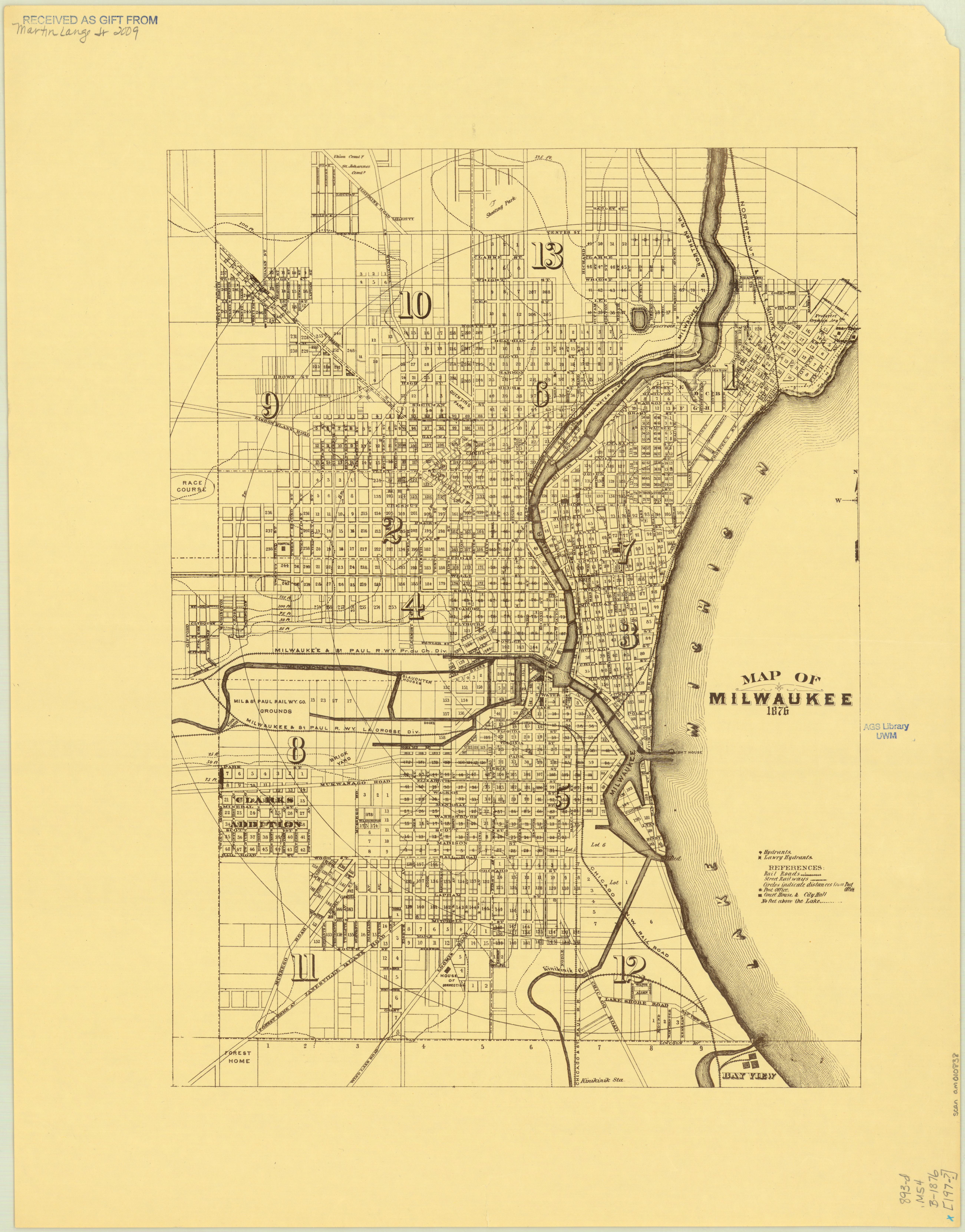
This 1891 map of Milwaukee, Wisconsin published by the Matthews-Northrup Company just one year before fire in the Third Ward gives us one last look at the city before the fire. The Third Ward was growing with the rest of the city, but sudden catastrophes will always change a place.
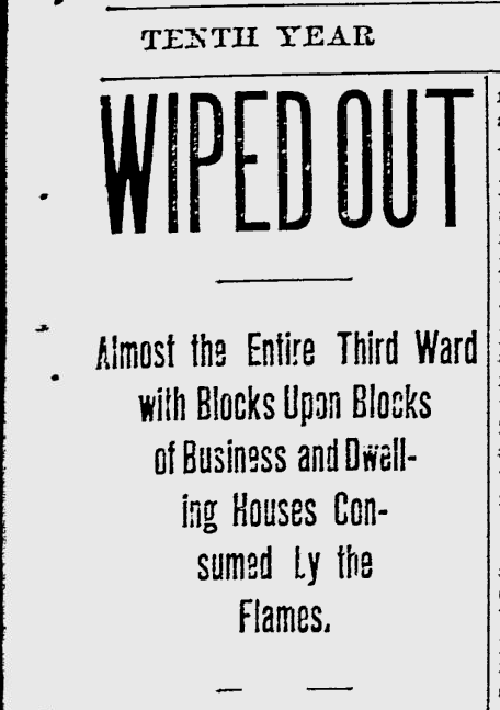
At 5:12, 5:20, and 5:40 p.m., October 28th, 1892, fire alarms rang out across Bradford and Bartlett, Greenfield Avenue, and Eleventh Avenue. Then, at 5:43, the fire alarm at East Water Street was sounded, signaling to firefighters that the Union Oil Company warehouse building was burning. The smaller fires throughout the neighborhood prevented responders from reaching the Union Oil building for fifteen minutes, by which point the fire had already become an inferno. The oil in the warehouse provided plenty of fuel, which burned brilliantly into the evening. The crisp Autumn wind carried the embers from the Union Oil Company warehouse fire to other buildings throughout the Third Ward, including a distillery, a soap factory, and countless homes.
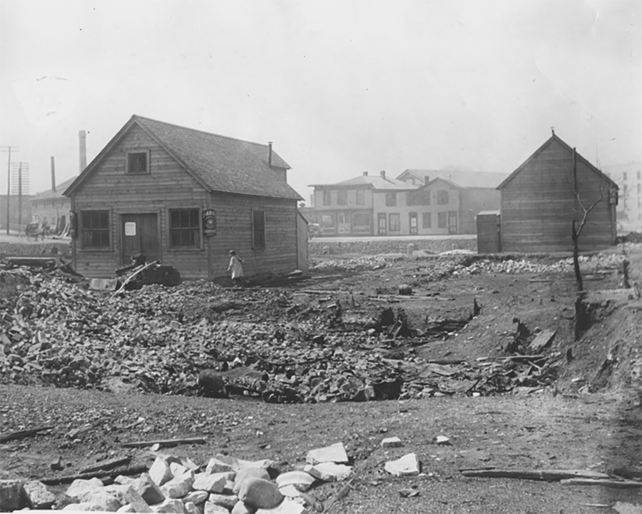
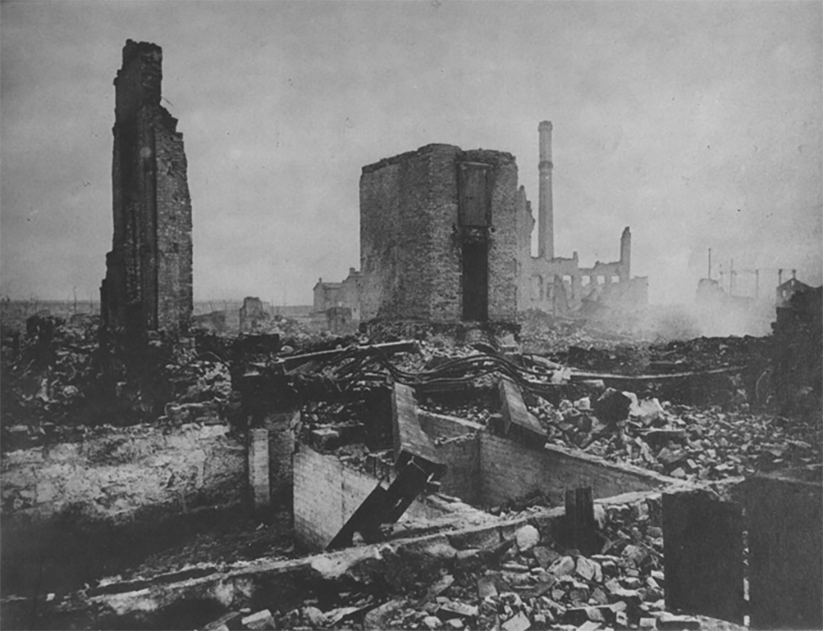
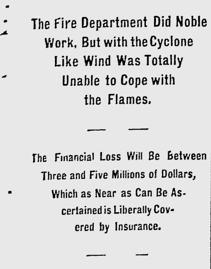
By midnight, the fire had burned through 16 city blocks, destroyed 440 buildings, killed five,injured dozens, and displaced hundreds of families. The Milwaukee Journal estimated that the total property loss was equivalent to somewhere between three and five million dollars– something more like 60 million today. Relief committees sprang up to shelter and feed victims of the fire who had lost their homes; some even endeavored to employ those whose workplaces had been destroyed overnight. The damage was so extensive that many residents were unable to rebuild. Only a small percentage of homeowners had fire insurance, and the pressure to add expensive fire-proof brick shells to their homes while rebuilding prevented many from returning. The Ward’s population shrank as residents were forced to move to other parts of the city in search of housing and work.
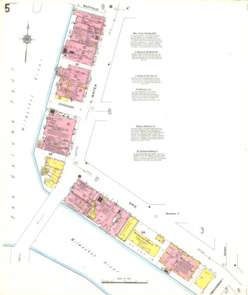
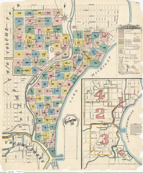
Vol. 1 Sheet 005 1910 Sanborn Map of Milwaukee depicting East Water Street 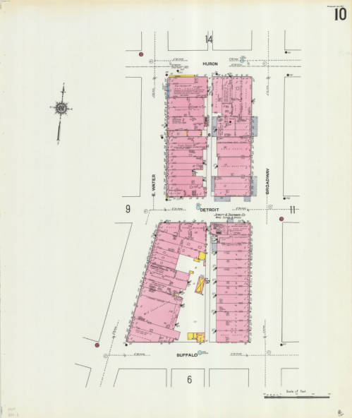
Vol. 1 Sheet 010 depicting East Water Street
This catastrophic fire transformed the Third Ward and Milwaukee as a whole. Efforts to rebuild began immediately, and over the next 30 years the Third Ward slowly became a busy commerce district again. The two Sanborn map sheets shown depict East Water St., where the Union Oil Company fire began. The neighborhood continued to change over the years until it eventually became the Historic Third Ward as we know it today.
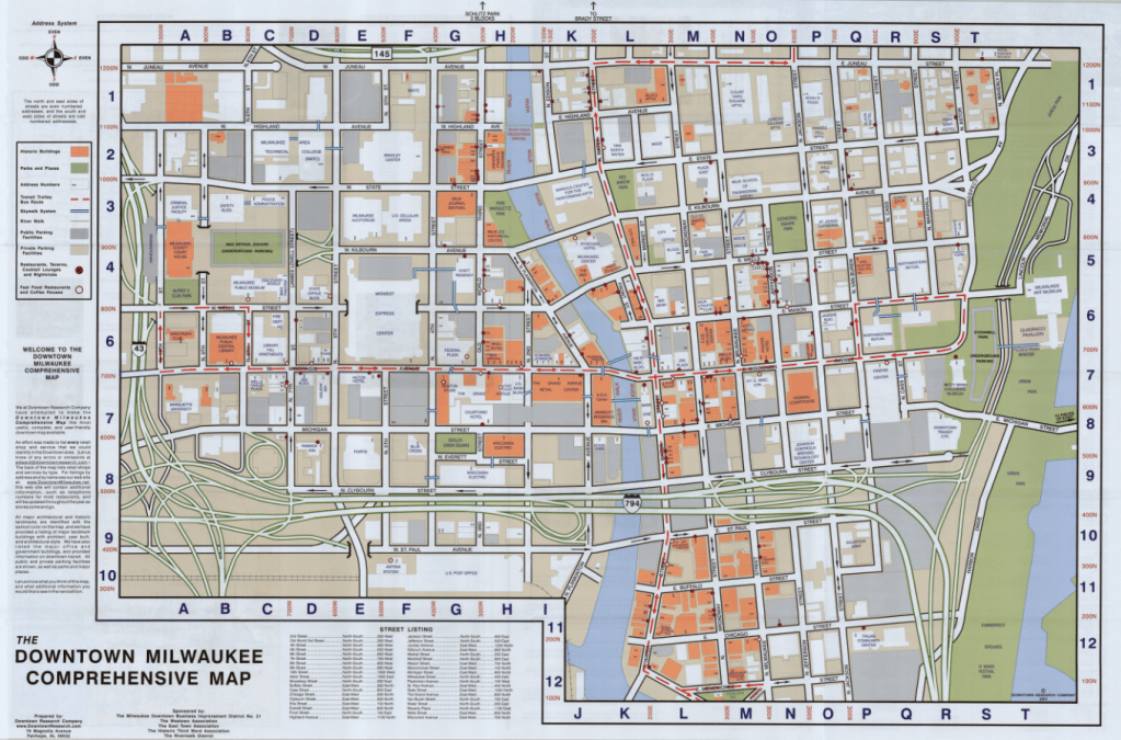
The Comprehensive Map of Downtown Milwaukee 2001 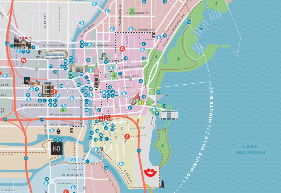
Section of the Official 2019 Milwaukee Visitors Map from Visit Milwaukee
The Historic Third Ward Association marks the Third Ward as the “site of Milwaukee’s most devastating fire and its most remarkable rebuilding efforts.” Today, the historic neighborhood is host to over 500 businesses, 20 galleries and art studios, and 1,200 residential units. It’s home to Summerfest, the Public Market, the Broadway Theatre Center, and so much more; it is, as the Association puts it, a neighborhood in renaissance. The Sanborn maps, and the many other maps of Milwaukee before and after the fire, remind us how much Milwaukee has grown, built, and rebuilt over its history, and how much we are still growing.
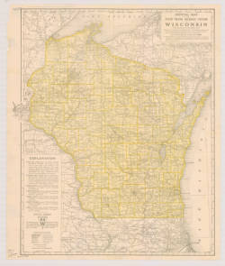
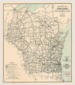
The Poole Brothers, Printers of Wisconsin’s Official Highway Maps
by Judy Aulik
Chicago is known for its “Printers’ Row,” an industrial street which housed several commercial printing firms, one of which was the Poole Brothers. Founder George A. Poole (1843-1916) was originally a partner of William H. Rand and Andrew McNally, but struck out on his own in 1870 along with his brother William. His grandson, George A. Poole III, led the family business after 1930, and was a noted book and manuscript collector.
The Poole Brothers printed some exquisite panoramic view maps, which can be seen online on the Library of Congress site. However, they are best known for their railroad maps, but in the earliest years of road maps, many were overprinted onto a railroad map base. Skokie Historical Society, on its Skokie: A Community History Using Old Maps web page, comments on how these early road maps (1915) weren’t detailed enough to retrace street development and community development because of their railroad genesis. Despite these shortcomings, the State of Wisconsin chose the Chicago printers for its state highway maps in 1918 and 1924 (two maps below).
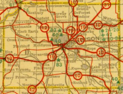
Possibly due to a flowery, ornate style seen on its railroad-commissioned work, Poole Brothers maps fell out of favor by the 1930s, except for those accompanying railroad timetables. Near the end of its existence, the firm passed through several corporate owners, including American Can Company. of favor by the 1930s, except for those accompanying railroad timetables. The printers kept afloat by printing journals and trade magazines. Near the end of its existence, the firm passed through several corporate owners, including American Can Company. Other interesting Poole Brothers maps in the AGS Library include Alaskan territorial gold field maps, plus:
• The 1914 C&NW Wisconsin and Michigan Hunting and Fishing Resorts map, featuring its railroads north of Antigo. 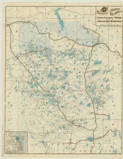
• The 1893 Chicago Evening Journal map of Chicago, showing Streets, Parks, Railroad Depots, Ward Boundaries, with Street Guide. 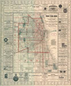
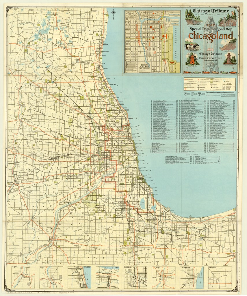
1927 Chicago Tribune Map of Chicagoland
by Judy Aulik
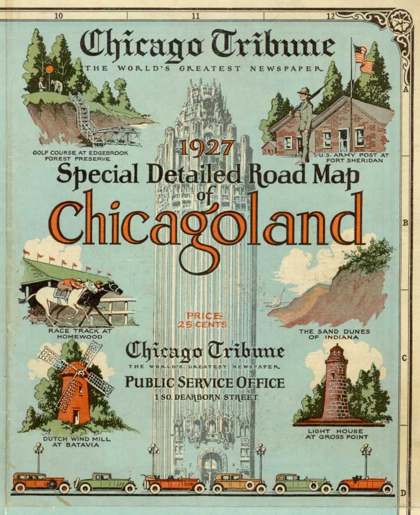
The Milwaukee Journal was not the only Midwestern newspaper giant to publish road maps. But unlike the Journal, the Chicago Tribune still has maps produced in its behalf, albeit by Rand McNally. The folding style of Chicagoland map was a mainstay of Illinois drivers for many years. It developed some delightful idiosyncrasies, such as the locations of radio broadcast transmitter towers, but at this early date, the “Trib map,” as called by residents, only showed some colleges, religious institutions, cemeteries, parks, and golf courses as landmarks and destinations. In addition, on this 1927 edition, US highways were designated by the route number in a red circle, instead of the shields used by the Rand McNally portion.
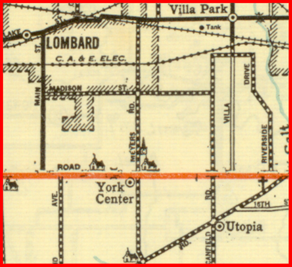
What is noticeable is the number of communities which have ceased to exist. Northeastern Illinois is notable for the number of communities denoted by the railroad stations on the major lines, spaced at fairly regular intervals. For example, on the C.B.&Q. (now the BNSF, or Burlington Northern & Santa Fe) were communities such as Belmont, now part of Downers Grove; Eola, now part of Aurora; and Lovedale, no longer extant.
Communities located on highways were not immune. On Roosevelt Road, once US 30A and today IL 38, was York Center, still denoted by churches but incorporated into Lombard. On Butterfield Road, parts of which have become IL 56, was Utopia, which is today’s Oakbrook Terrace, famous for its vast stretches of shopping malls.
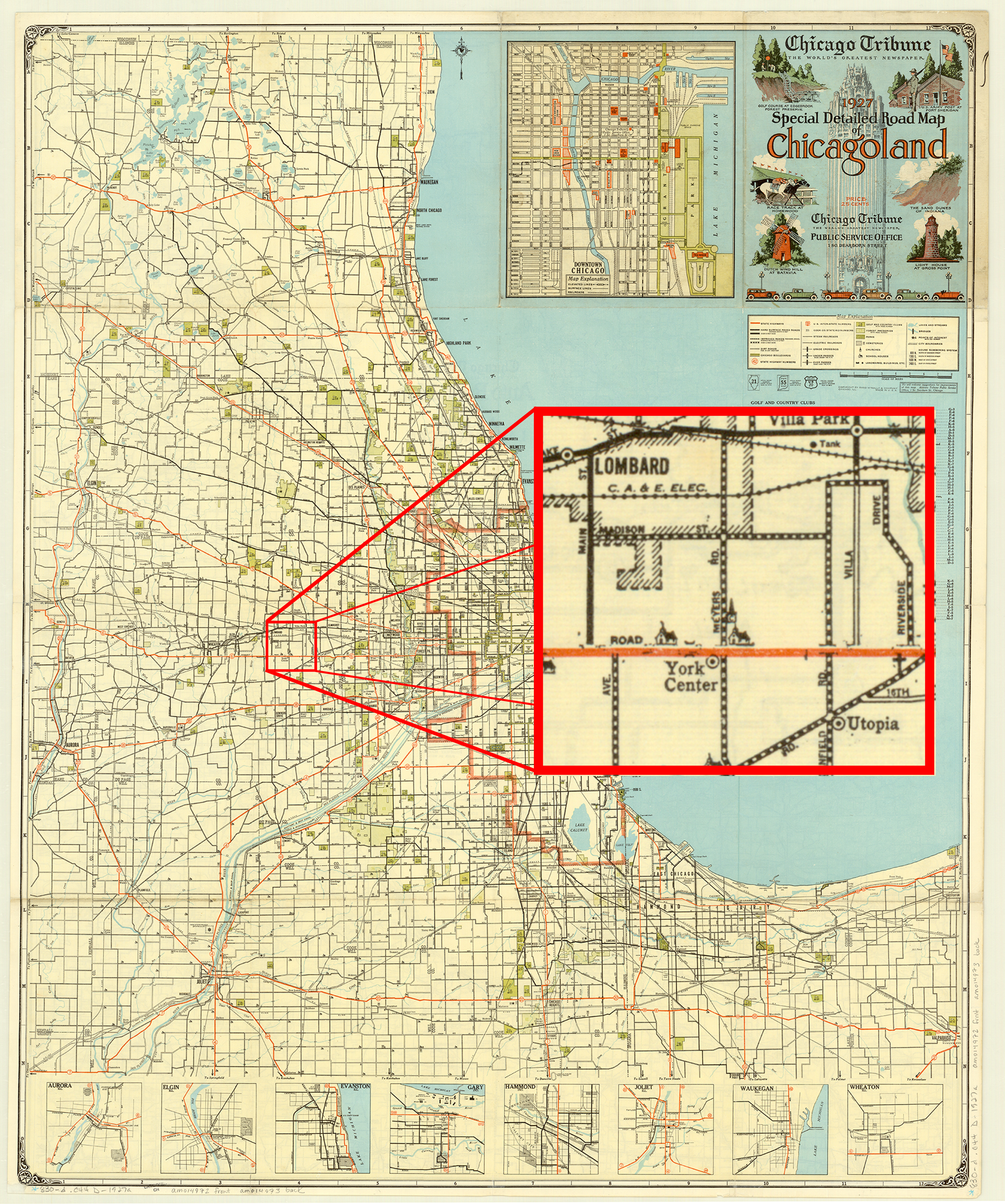
Interestingly, the reverse, a map of the states contiguous with Lake Michigan, shows us that the Tribune‘s relationship with the Chicago map giant dates back to the earliest map of the series. “Rand McNally” above “Auto Road Map” is replaced by “Chicago Tribune: The World’s Greatest Newspaper,” but with the characteristic compass rose, cartography, and copyright statement, no one would be fooled. In addition, I have a 1927 Illinois map, issued by the Tribune, but published by Rand McNally.
From a collector’s standpoint, the Chicagoland maps are common, but very difficult to find in acceptable condition. The vast majority are misfolded, heavily worn, and many are taped together, proof of the maps’ popularity. Probably due to the growth of the region–the Tribune maps did not show land beyond the Fox River–the Chicagoland map ceased publication sometime in the 1990s, with one last 2000 map. Even today, I carry a Tribune/Rand McNally 7-county street guide in my car when traveling, despite GPS. It lacks the charm of the old maps, but still gets the job done–until the next round of highway construction.
View the map in the AGS Library Digital Map Collection here
Engaging Users through Social Media
The AGSL Instagram hit 1,000 followers this December!
The account began in February 2016, and has since made over 200 posts. Students and staff alike share photo and video content of maps, atlases, globes, nautical charts, historic images, library events, and occasional goings-on about digital data.
The theme of the account reflects many of the prominent themes of the AGS Library’s Collections: travel, adventure, exploration, and the boundless world. Visitors of the page are delighted by celestial globes and atlases depicting the night sky, and artistic flourishes on maps which add embellishment and distinguish the documents as more than mere navigational tools; especially popular are “Map Monsters,” who are scary, or sometimes silly dragon-esque creatures adorning the seas of some of the older maps in the AGS Library’s Collection.
An exciting benchmark for the AGS Library’s social media is a post from this past summer (2017) about Abraham Ortelius’ Map Monsters. The post reached over 1,100 notes on Tumblr!
Visitors likewise seem to enjoy maps and graphics which convey messages in unique and beautiful ways; the post with the most love is an image depicting comparative elevation of mountains in North America, coming from the Johnson Family Atlas of the 19th century (155 likes).
As promised, Stephen got the students an ice cream cake to celebrate reaching 1,000 followers at Instagram. December 20, 2017

Follow us @agslibrary on Instagram and at agslibrary.tumblr.com on Tumblr.
Instagram Account:
https://www.instagram.com/agslibrary/
Tumblr Account:
https://agslibrary.tumblr.com/
And finally, we celebrate the graduation and successful employment of AGSL student cataloging intern Sam Balistreri. Congratulations and best luck as you embark on your career.
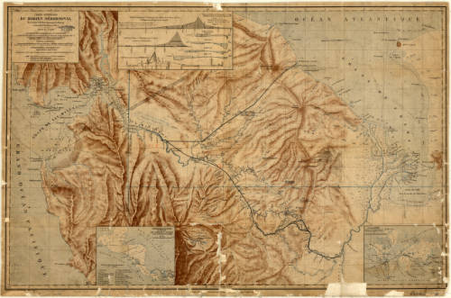
The 1913 State Highway Map of California
by Judy Aulik
The moment I first saw this map, I knew it was something very special. California is a somewhat difficult state to map attractively because of its shape. There’s a lot of negative space to fill, and W. Elliott Judge used the expected list of cities and their population. But wait! There’s more! He added the graphic of an outline map with other states included to illustrate its size. Several eastern states’ outlines were twisted and turned to fill the space. It’s clever, and something I’ve never seen before on a road map.
At first glance, it appears to be bicolored, but then the red highways and wagon trails become evident. [1913ca-legend.jpg]  Highway scarcity is expected in a 1913 edition. Confusion, however, is generated by railroad lines not using the convention of crosshatches to represent ties (sleepers). The region around Fresno illustrates how early highways tended to parallel the major railroads of the day, which also were planned to avoid the worst of California’s mountainous terrain. The 1916 edition (not shown) is remarkably similar, except the vast amount of red ink used on highways and proposed highways is clearly identifiable.
The Complete Map Works of San Francisco, Judge’s employer, appears to have only produced California highway maps for a relatively brief period. The 1913 map appears to be one of the first. Maps drawn by Judge appear in WorldCat, with the last a 1949 Pacific North West edition co-authored with W. Campbell Judge, presumed to be his son. Another Complete Map Works’ map series is the Engineers Official Map of … , which also cover midwestern states into the 1930s.
Click here to view this map in the AGS Library Digital Map Collection: https://cdm17272.contentdm.oclc.org/digital/collection/agdm/id/14269/rec/1
- ← Previous
- 1
- …
- 4
- 5
- 6
- Next →
