maps
Ocean liner routes between Germany and Africa, 1914
by Angie Cope
Afrika / Geograph. Anstalt von Wagner & Debes, ; L. Friederichsen & Co. ; Woermann-Linie A.G.
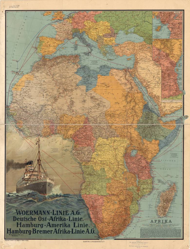
This map of Africa was published in Germany in 1914, shortly before the outbreak of World War I. It shows the ocean liner routes between Germany and Africa, as well as coastal and inland routes.
Relief is shown by hachures and spot elevations. In the lower left are an illustration of a steamship on the high seas and a listing of the major German steamship lines providing service to Africa, Woermann-Linie A.G., Deutsche Ost-Afrika Linie, Hamburg-Amerika Linie, and Hamburg-Bremer Afrika-Linie A.G.
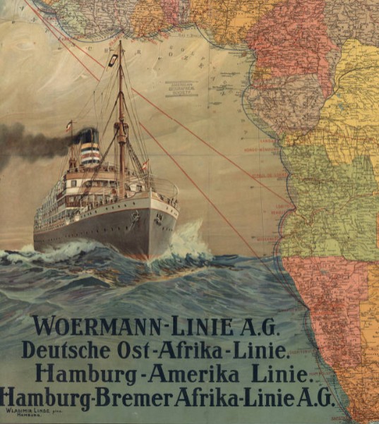
In the upper right is an inset map of the coastal region of the German colony of Cameroon and an inset to the inset showing the inland course of the Cameroon River. Below these maps is another inset showing the eastern part of German East Africa. The key at the lower right indicates the wealth of information contained in the map.
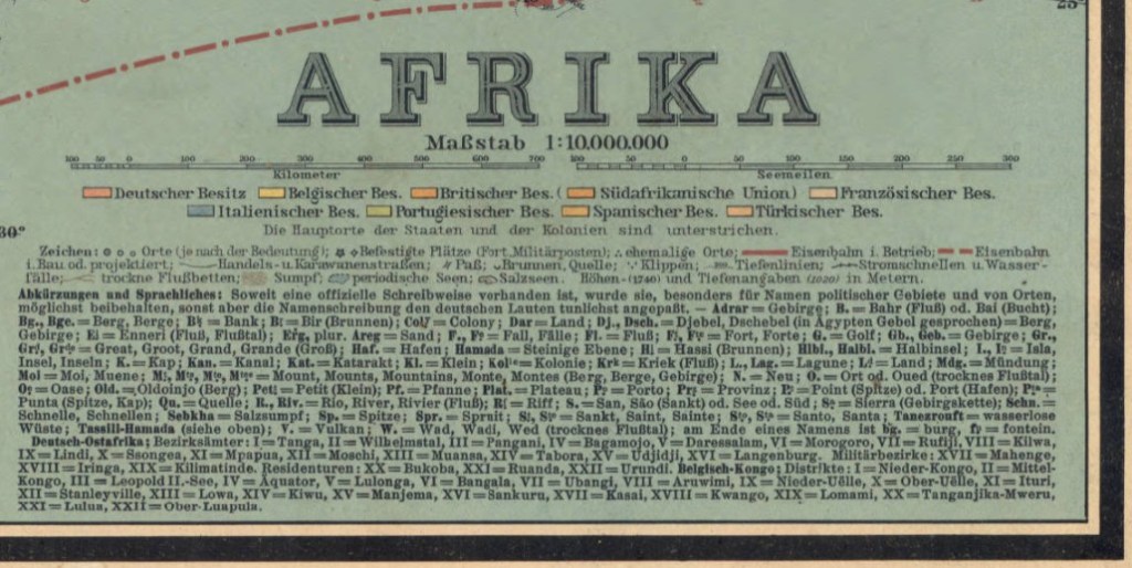
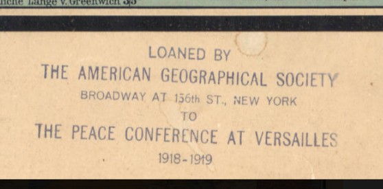
Two distance scales are provided, kilometers and nautical miles. Different colors are used to mark the colonial possessions of Germany, Great Britain, Belgium, France, Italy, Portugal, Spain, and Turkey. Symbols indicate cities and towns by population size, forts and military posts, ruins, railroads (operational and planned), caravan routes, mountain passes, wells and springs, and swamps and other geographic features. There is an alphabetical list of abbreviations for geographic terms in local languages and their German equivalents. Roman numerals are used to identify the districts and other administrative divisions in the Belgian Congo and German East Africa. The map was prepared by Wagner & Debes, a German firm that specialized in providing maps for inclusion in the famous guidebooks for travelers published by Karl Baedeker in the 19th and early 20th centuries. A stamp at the bottom indicates that the map was loaned by the American Geographical Society of New York to the Peace Conference at Versailles, 1919.
View map in the American Geographical Society Library Digital Map Collection
https://collections.lib.uwm.edu/digital/collection/agdm/id/364/rec/1
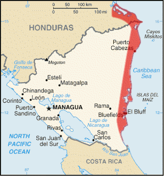
Mosquito Coast, Nicaragua 1845
By Angie Cope
The Mosquito Coast is the region along Nicaragua’s eastern coast. It was claimed by Great Britain from 1655 until 1820s. The region became part of Nicaragua in 1860, with a northern portion granted to Honduras in 1960. In 1840s, when this map was created, Nicaragua was studied as a possible transoceanic canal connecting the Atlantic and Pacific Oceans. The region also provided a route for travelers from the eastern United States during the California Gold Rush, via the use of the San Juan River and Lake Nicaragua.
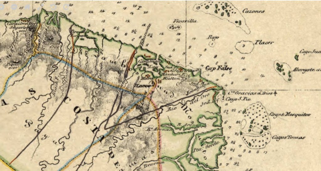
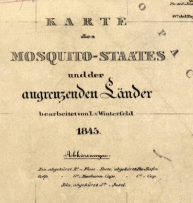
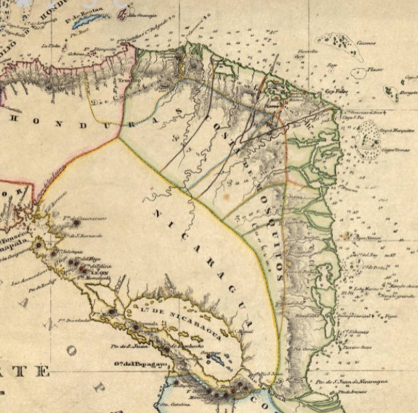
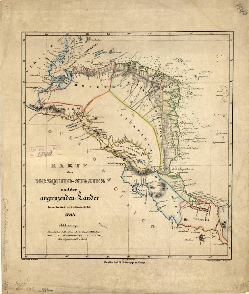
Karte des Mosquito-Staates undder angrenzenden Länder / bearbeitet von L. v. Winterfeld ; S. Schropp & Comp., 1845
Call number: (AGS) (RARE) 220 B-1845
1 map : color ; 33 x 30 cm.
Published in Berlin by Simon Schropp’sche Hof-Landkartenhandlung.
https://collections.lib.uwm.edu/digital/collection/agdm/id/360/rec/1
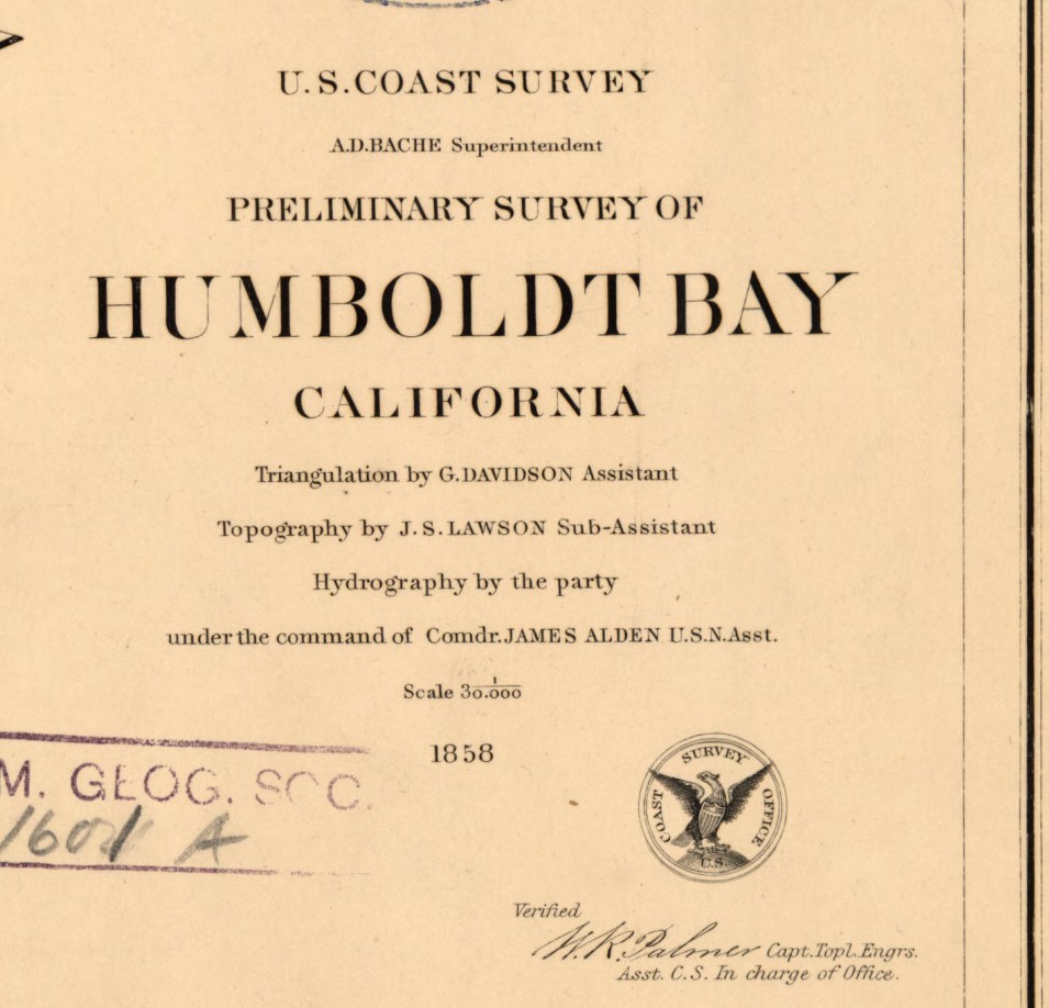
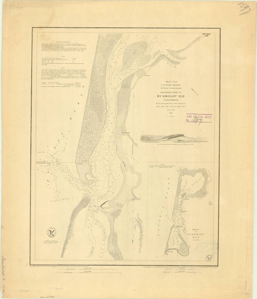
Humboldt Bay, California 1850s
by Angie Cope
Preliminary survey of Humboldt Bay, California / U.S. Coast Survey, 1858.
Rare Map: Chart CS Pacific Humboldt Bay 1858
https://collections.lib.uwm.edu/…/collec…/agdm/id/6097/rec/1

Humboldt Bay is a natural bay located on the rugged North Coast of California between San Francisco Bay and Puget Sound. The Bay is home to more than 100 plant species, 300 invertebrate species, marine and land mammals, hundreds of fish species, and more than 200 species of birds.
The Wiyot people were the first to inhabit the Humboldt Bay region, estimated to have arrived around 900 A.D. Their name for the bay is Wike or Wiki. Indian villages shown on this 1858 map are circled in pink.
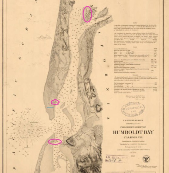
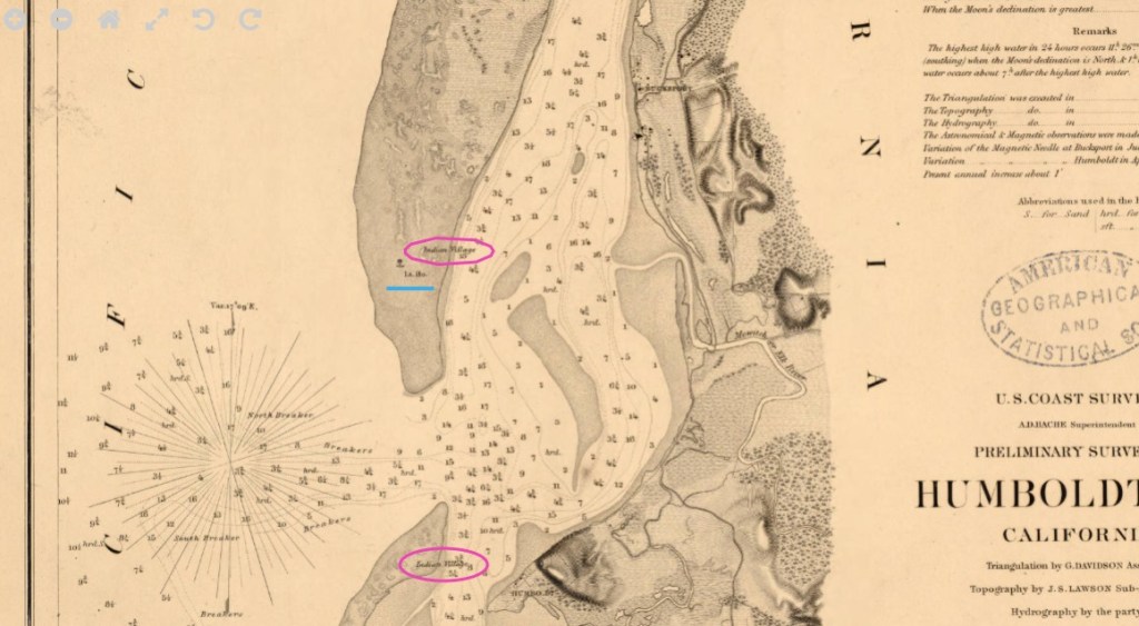
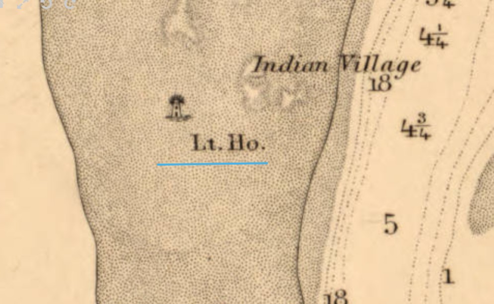
Beginning in the 1850s, settlers used the bay for shipbuilding and the export of lumber. In 1856 the Humboldt Harbor Light was built on the north spit (underlined in blue).
Interesting factoid: There is a memorial to the USS Milwaukee in Eureka, California on Humboldt Bay. In 1917, the USS Milwaukee ran aground while trying to tow a beached submarine. Remnants of the wreck are still visible today at low tide.
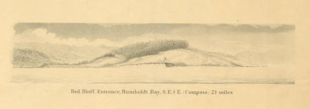
Illustrated view: Red Bluff entrance, Humboldt Bay, S.E. 1/2 E. (compass) 2 1/2 miles
From: Reconnaissance of the western coast of the United States : middle sheet : from San Francisco to Umpquah [sic.] River, 1854
https://collections.lib.uwm.edu/digital/collection/agdm/id/6717/rec/17
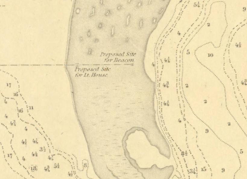
Preliminary survey of Humboldt Bay, California / U.S. Coast Survey, 1852
https://collections.lib.uwm.edu/digital/collection/agdm/id/4778/rec/1,
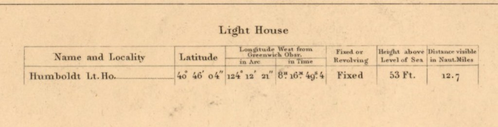
Shows the proposed site for the light house built in 1856.
John Arrowsmith’s 1860 Arctic discoveries map
by Angie Cope
If you’re watching the AMC series “The Terror” you’ve experienced the dramatization of Sir John Franklin’s final voyage in 1845 in HMS Erebus and HMS Terror. The journey ended in tragedy for him and all his men, becoming the worst disaster in the history of British polar exploration.
Sir John Franklin’s Arctic discoveries, between Baffin Bay & Cape Bathurst, combined with those of Sir Edward Parry in 1819, and the several searching expeditions, concluding with that of Sir Francis L. McClintock in 1859 / constructed by John Arrowsmith, 1860
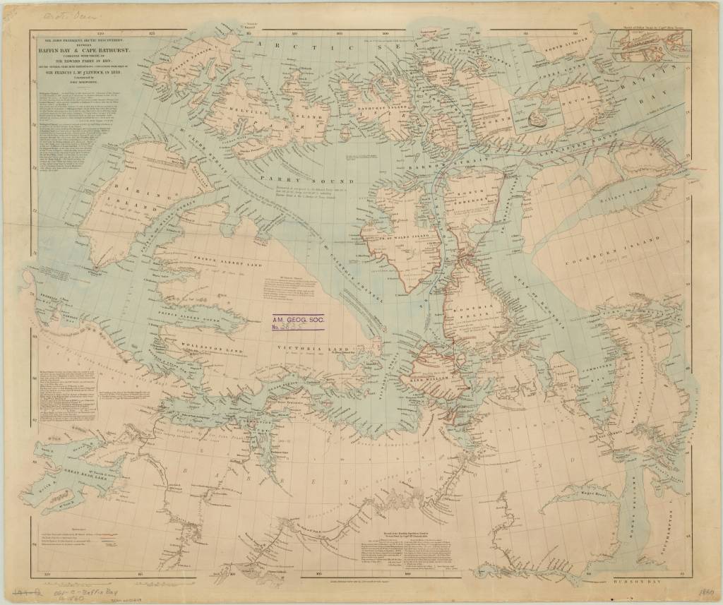
https://collections.lib.uwm.edu/…/colle…/agdm/id/21392/rec/4
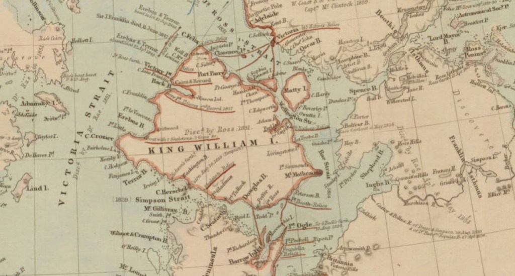
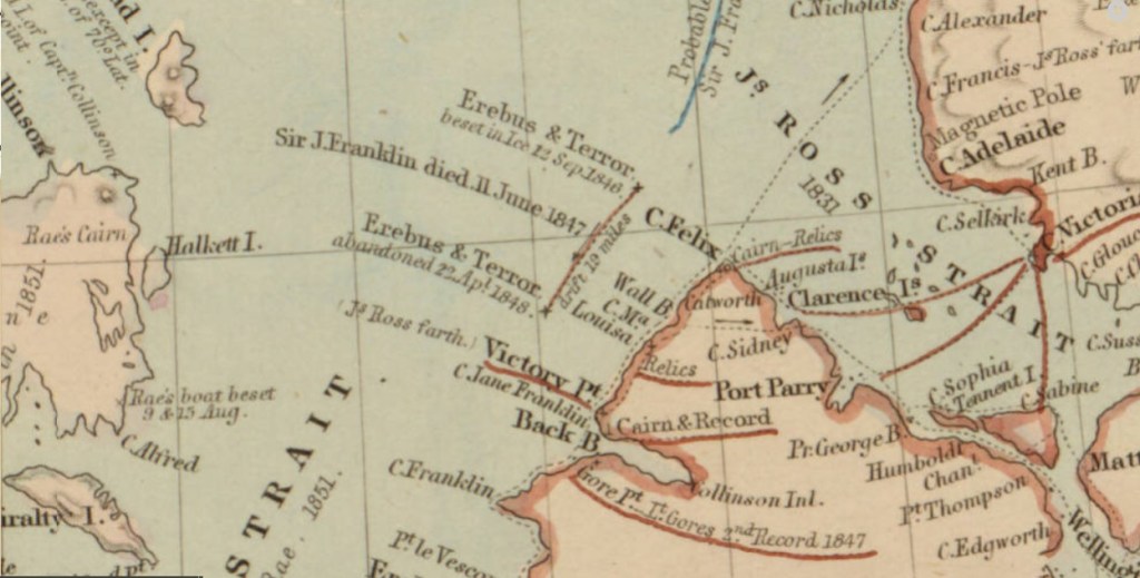
From Royal Museums Greenwich:
Franklin’s two naval vessels sailed up the Wellington Channel before turning south toward Beechey Island, where they would spend the winter. In the spring, they sailed south down Peel Sound but, off the northernmost point of King William Island, were trapped by the ice flow down the McClintock Channel.
In the spring of 1847, a party from the expedition travelled across the ice to Point Victory on shore and deposited a written record of their progress. It is thought they reached Cape Herschel on the south coast of the island, filling in the unexplored part of the North-West Passage. Sir John Franklin died in June that year.
Still trapped in the ice, Erebus and Terror drifted south until Captain Crozier ordered their abandonment in April 1848. Weakened by starvation and scurvy, the 105 surviving men headed south for the Great Fish River. Most died on the march along the west coast of King William Island.
To read the entire article. https://www.rmg.co.uk/…/john-franklin-final-north-west-pass….
Moravia 1741 by Georges-Louis le Rouge
by Angie Cope
Carte particulière de la Moravie Divisée en six Cercles avec les Principaux Postes de ce Marquisat / pour l’intelligence de la Guerre presente a Paris par et chez le Sr. Le Rouge Ingr. Geographe du Roy … 1741
This map was created a year after the unsuccessful invasion by Prussian forces under Frederick the Great in 1740. Moravia and Bohemia formed a powerful kingdom of the Holy Roman Empire from the 16th Century to the early 20th Century. After the First World War, Moravia was integrated into the new state of Czechoslovakia.
Symbols used for cities and topography; title detail ; detail of Olmutz (Olomouc)
This map is attributed to Georges-Louis le Rouge who was a Paris based map publisher. He was born in Hanover, Germany as Georg Ludwig where he was educated and employed as a military engineer, hydrographer and cartographer. This map of Moravia was made a year after Le Rouge moved to Paris and Francophied his name. He set up shop on the Rue Des Grands Augustins and produced thousands of maps and diagrams ranging from city and town plans, to atlases, plans of military campaigns and sea charts. He received the title “Geographe du Roi” to King Louis XV. Le Rouge also worked with Benjamin Franklin to produce the important 1769 Franklin/Folger Map of the Gulf Stream. Franklin, who met Le Rouge in Paris, writes that “He [Le Rouge] is, I believe, a proper person.” *
Includes 4 inset maps: A. Olmutz — B. Iglaw — C. Neustatt — D. Brunn.
The copy of the map held at the AGS Library is from the personal collection of Albert Gallatin (1761-1849) who served as the Secretary of the Treasury under both Presidents Thomas Jefferson and James Madison between 1801 and 1814. The maps were given to the American Geographical Society of New York in 1919 by Gallatin’s great grandson, Albert Eugene Gallatin (1882-1952) who served on the AGS Council in 1913. The maps, spanning the years 1700 to 1842, were originally bound as an atlas factice entitled “Atlas generale,” but have been disbound and conserved by the AGS Library at UW Milwaukee Libraries.
*Le Rouge Cohn, Ellen R., Benjamin Franklin, Georges-Louis Le Rouge and the Franklin/Folger Chart of the Gulf Stream, Imago Mundi, Vol. 52, (2000), pp. 124-142.
Beautiful countryside makes beautiful maps : The Alps in Austria
By Angie Cope
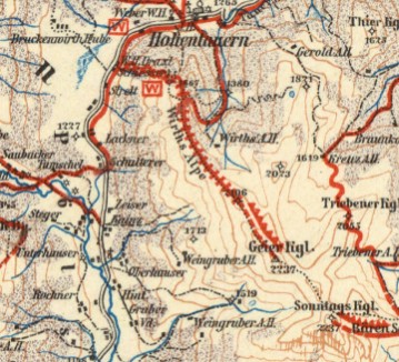
There is a beautiful set of maps dating from 1913 by map great G. Freytag. The American Geographical Society Library has 7 from this 1:100,000 series and they’re packed full of information. From a distance, the maps appear to be basic topographic maps, but if you look closely and think about all the detail you can imagine the complexity of human and natural interactions. Viewing the maps along with photos from the AGS Library photo collections, you begin to understand that this is both a snap shot in time and a reference for the present.
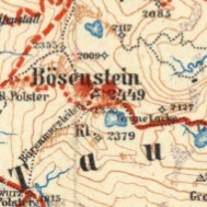
G. Freytags Skirouten-Karte des Ennstales und der Rottenmanner Tauern (G. Freytag’s ski route map of the Enns Valley and the Rottenmanner Tauern)
1913
https://collections.lib.uwm.edu/digital/collection/agdm/id/12013/rec/1
Liezen Torfstich or peat bogs.
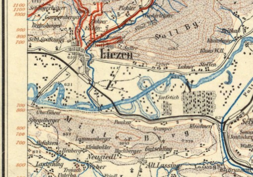
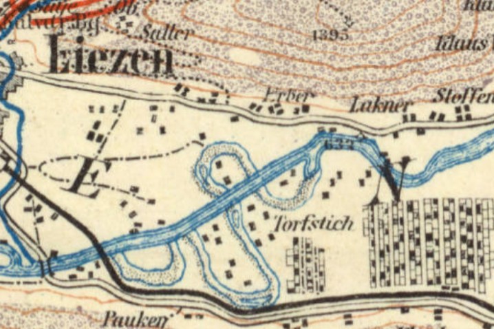
The above-ground extraction of peat is referred to as peat cutting. This organic material, which is created in bogs from the carbon from dead plants, serves as a low-energy fuel, to improve soil ventilation in horticulture and to a small extent also for the production of textile fibers and for medicinal purposes.
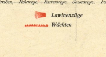
Interesting map symbology for avalanche warnings. (click on any image to see a larger view)
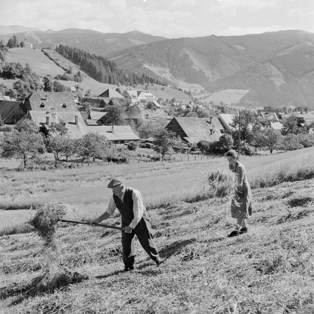
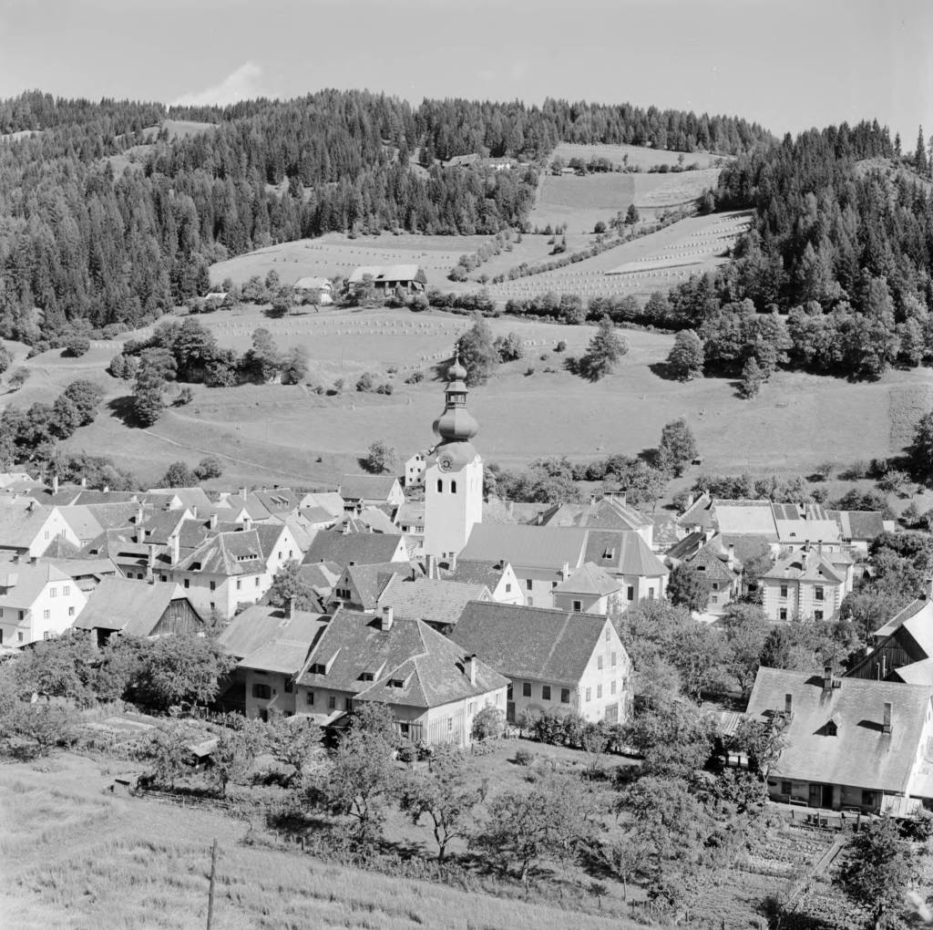
Photos from from the Eugene V. Harris collection between 1937 and 1969 showing the beauty of the region. (click on any image to see a larger view)
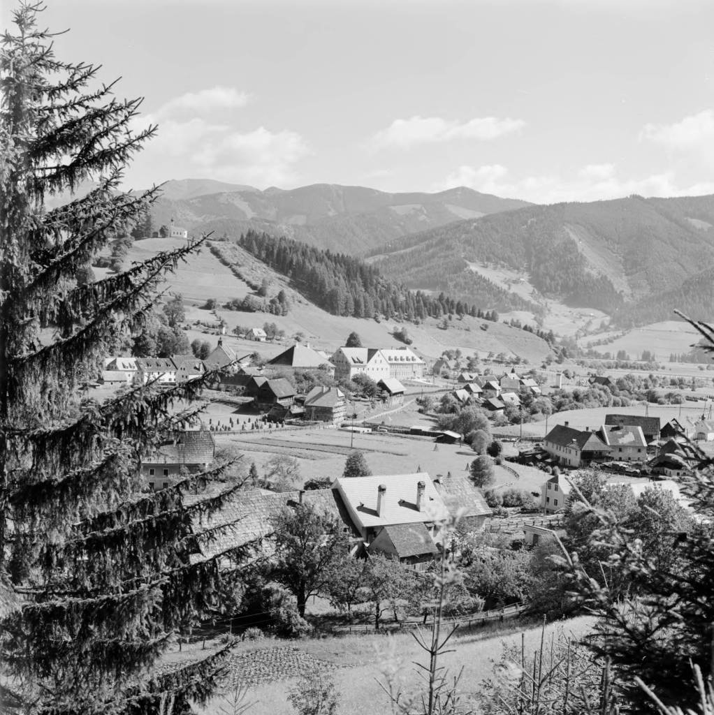
Austria, view of town of Oberzeiring from hill
https://collections.lib.uwm.edu/digital/collection/agseurope/id/1508/rec/1
Austria, view of Oberzeiring and hillside with St. Nicholas Church tower
https://collections.lib.uwm.edu/digital/collection/agseurope/id/1250/rec/13
Austria, people raking hay in field in Oberzeiring
https://collections.lib.uwm.edu/digital/collection/agseurope/id/1690/rec/17
On the Road to Algoe: Revisiting the Paper Town
By Lauren Maddox
John Green’s Paper Towns posed a question that stumped many of its readers: how can spaces be simultaneously fictitious and real?
The novel was received by an excited public in 2008; the book won the Edgar Award, was Editor’s Choice for book of the year at Booklist and Voya, and was top of the list for Best Book at the Chicago and New York public libraries. In 2014 and 2015 interest in the novel and its faux-setting peaked– Paper Towns was being adapted into a film starring Nat Wolff and Cara Delevingne. Excitement for the move inspired a plethora of articles by news outlets like NPR, MNN, and Gizmodo describing the paper town that the book is centered around: Algoe, New York.
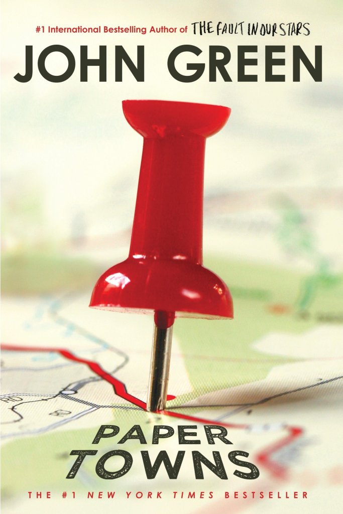
Check this book out from the UWM library! Click the link to learn more.
Algoe was unique in that it wasn’t and then was and then wasn’t a real place. Mapmakers would sometimes include fictitious entries as a way to subtly sign their work. It’s almost impossible to prove that a representation of reality has been copied, but copyright traps were a way to prove that a work had been stolen. If the copycat included the fictional place names from the original map in their version, the original mapmaker could prove that it was their intellectual property. Algoe was one of these copyright traps. It appeared to be a small hamlet in upstate New York, nestled between interstate routes. In reality, “Algoe” was just an anagram of mapmakers Otto G. Lindberg’s and Ernest Alpers’s initials.
Esso bought the map from Lindberg and Alpers and began distributing it. A few years later, Algoe appeared on another map by Randy McNally. Lindberg accused McNally of having stolen the map because, of course, Algoe wasn’t a real place. But McNally protested. His company had gotten the records of Algoe completely legally. A general store owner had seen the town name Algoe on the Esso map years earlier and decided to name his general store after it. Just like that, Algoe had become a real place. After a few years, the store shut down, and Algoe ceased to exist again. You can still find it, though, if you search for Algoe on Google Maps.
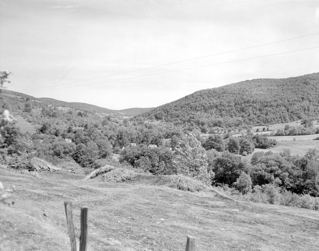
Photo of Delaware County, New York, where Algoe was supposed to be. Click this link to see this photo in our Digital Collections!
Trap streets and paper towns were just one way that a mapmaker might mark their work– the map sheets below, which are part of a survey of the Gold Coast (now Ghana), depict a hidden elephant in the elevation chart. Frank Jacobs’s “How to Hide an Elephant in a Map” tells the story of a hot, uncomfortable British surveying expedition who, upon discovering a particularly inaccessible stretch of land, decided to just doodle an elephant and call it a day.
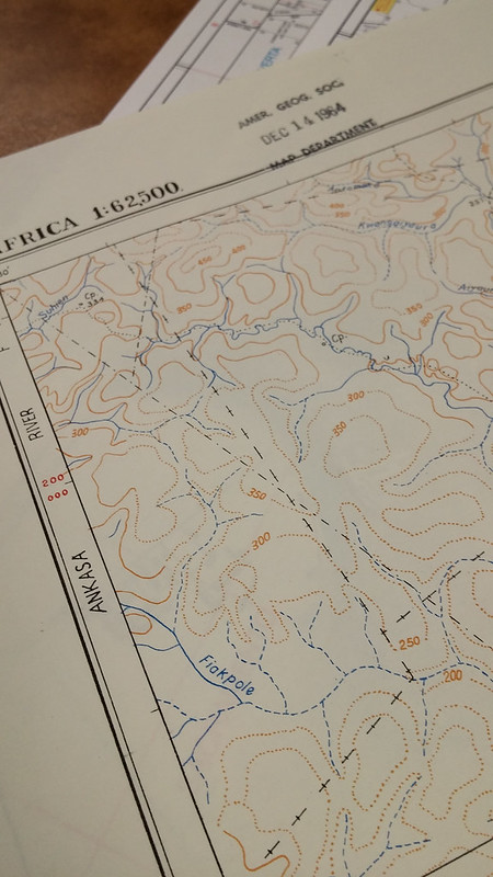
1964 Edition of the Gold Coast Survey Maps. Click the link to check out our Flickr! 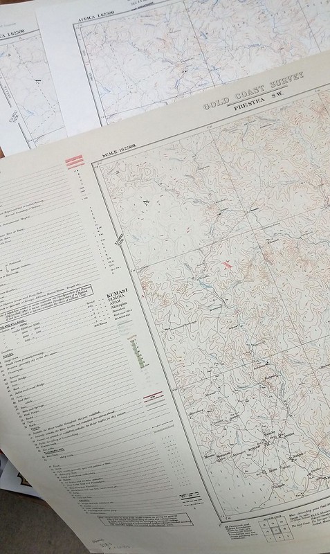
Three editions featuring the elephant. Click the link to check out out Flickr!
In this case, the hidden mark on the map wasn’t to protect intellectual property; apparently, the expedition decided to fill the blank space in their survey so that they could pack up and go home. But the result was the same– the creator’s left a unique stamp on their work that was copied in later editions over and over again. Just in the AGSL archives, there are three editions of this map sheet with the elephant from 1924, 1951, and 1964.
We expect maps to tell the truth– they appear, on the surface, to be objective representations of reality. But the truth is, they often aren’t; mapmakers and the people who finance them have an agenda. In Algoe’s case, it was a white lie designed to protect the intellectual property of mapmakers who wouldn’t otherwise be able to prove that their work had been stolen. And the tired British expedition’s elephant was a way for them to avoid traversing any deeper into an inaccessible landscape. These are the innocent lies that maps sometimes tell us– but other times, a map could be lying to us for other, more nefarious reasons.
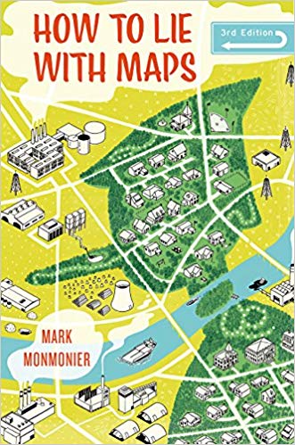
Monmonier’s How to Lie with Maps. Click the link to see this book in our Digital Collections!
Mark Monmonier’s How to Lie with Maps outlines the many lies, harmless or not, that maps sometimes tell us. According to Monmonier, “map users…need to appreciate the perils and limitations” of maps because they are “rhetorical tools fully capable of ‘lying'” to us, accidentally and purposefully. These lies can be fairly small– a fake hamlet in upstate New York or an elephant masquerading as a hill. Algoe isn’t a threat to our perceptions of reality. However, it does remind us that maybe our maps aren’t as truthful as we like to believe.
In 1993, a series of cases against the board game company behind Trivial Pursuit ended the use of copyright traps. The courts found that, in the same way you can’t copyright a real place, you can’t copyright a lie. No one looks for these copyright traps anymore, since they aren’t functional protections against copycat map makers– which means there might be even more hidden places on our maps, waiting to be discovered.
Disney’s Darkest Day
By Lauren Maddox
July 17th is celebrated at Disneyland as the park’s official opening day. This year marks the 65th anniversary– Disney hasn’t announced any official celebration plans yet, but fans can most likely expect a birthday bash to remember. The park’s anniversary wasn’t always celebrated on July 17th, however; during Walt Disney’s life, the official date was July 18th, one day after what we consider to be the opening day now.
Walt Disney was adamant that the July 17th opening not be acknowledged as the official opening– and with good reason. July 17th, 1955 was such a disaster that Disney sometimes called it “Black Sunday.”
Expectations for the July 17th preview day were high. Disney had been planning his amusement park since at least 1948, when he sent the first memo to Dick Kelsey describing his plans for a Mickey Mouse theme-park. But the original idea pre-dated even this first draft of the park concept; Disney’s own father worked at the World’s Columbia Exposition in 1893.

Map of the Chicago World’s Fair in 1893. Click the link to see this map in our Digital Collections! 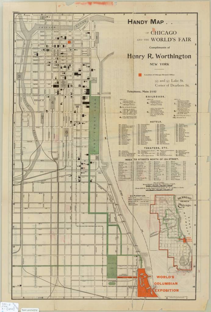
Map of the Chicago World’s Fair in 1893. Click the link to see this map in our Digital Collections!
The World’s Columbia Exposition was a Chicago’s World’s Fair held in 1893 to celebrate the 400th anniversary of Christopher Columbus’s first arrival in North America. The Fair was supposed to be a symbol of the burgeoning ideas of American exceptionalism and Chicago’s recovery from 1871 fire. The Fair was a monumental undertaking; the grounds covered more than 650 acres, and nearly 26 million visitors passed through. More important to Disney’s story than the grandiosity of the fair: the 1893 World’s Fair was the first to host a dedicated amusement park area.
His father’s memories of that Fair and its amusement rides stayed with Disney until his own fatherhood. Disney cited watching his children on a merry-go-round as the final inspiration that lead him to Disneyland.
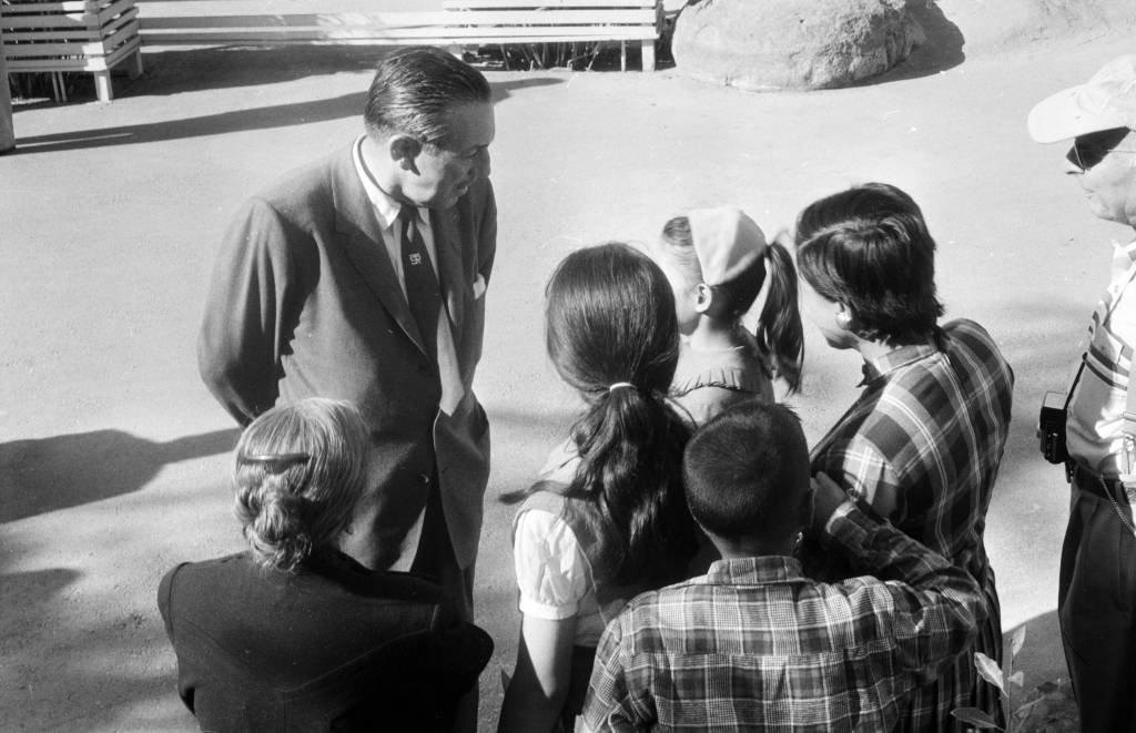
Disney talking to a group of children at Disneyland in 1957. Click the link to see this photo in our Digital Archives!
Besides his tender family memories, Disney also had a practical reason to build an amusement park. He was, after all, a businessman first. As Disney’s animation studio in Burbank gained more success, more and more fans wanted to come visit. The inside of an animation studio isn’t actually that interesting, and it would be hard to get any work done with crowds of tourists peeking in on the animators who worked there.
The original plans for Disneyland put the amusement park right next door to the Burbank studio. After realizing how much of an undertaking (and how many more acres) the amusement park was going to be, Disney moved the location to the Anaheim site.
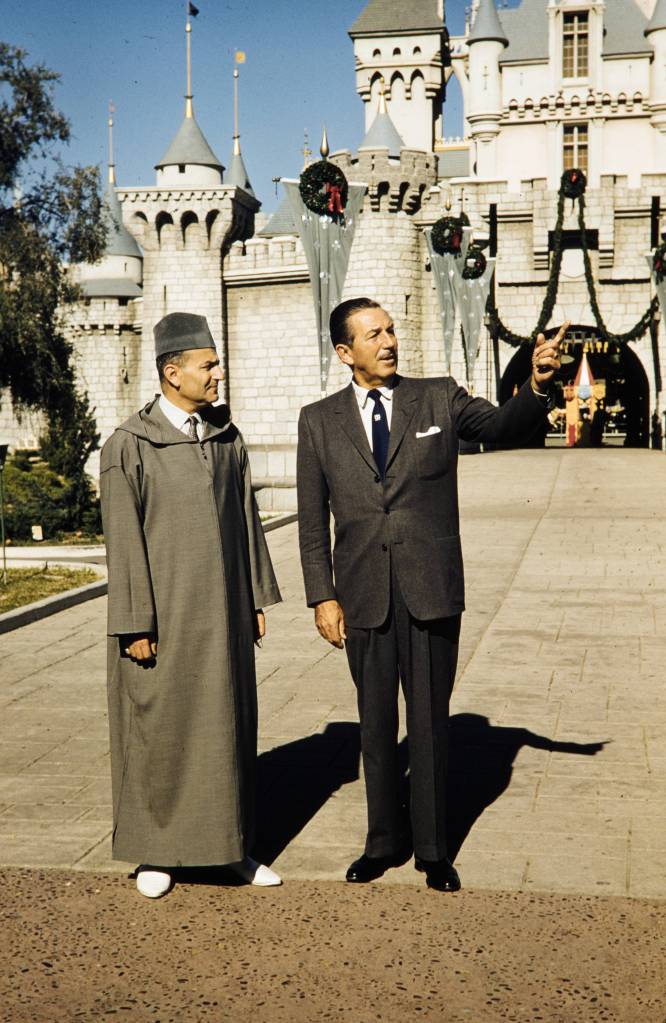
Disney entertaining King Muhammad V at Disneyland, 1957. Click the link to see this photo in our Digital Archives!
For the preview day, Disney invited a select group of 14,000 guests. This included the press as well as friends and families. This was the first thing to go wrong that day. Around twice as many guests actually showed up to the park– many had purchased counterfeit tickets to gain entry to the preview day opening, but many more simply climbed over the walls and broke into the park. Disneyland, for the day, was only prepared to serve the 14,000 intended guests; vendors ran out of food, half of the water fountains weren’t functioning because the plumbers working on the park went on strike (and offered the ultimatum “bathrooms or water fountains”). The event was sponsored by Pepsi, so many park-goers accused Disney of forcing them to buy drinks by sabotaging the water fountains. It was an unseasonably warm day for Anaheim, and the freshly poured asphalt was so soft that women’s high heels would sink into it.
Besides these critical logistical failures, the media coverage of the event was a circus. Disney himself missed the cue to read his dedication, and said, to the camera live and on air, that he’d thought he’d been given the signal to start. Bob Cummings was caught on camera flirting with the dancers and even kissing one girl. Other commentators lost their mics and had to cover for themselves while the tapes ran on.
In summary, the whole day was deeply embarrassing to Disney. He never acknowledged the July 17th preview as the opening day of Disneyland, and it was only after his death that it was adopted as the official anniversary.
Disney’s legacy lives on, for all the good and ills that entails. But perhaps his greatest contribution to the amusement park circuit, besides Disneyland itself, is the impact his choices made on amusement park cartography.
When Disney was first pitching the park idea to investors, he used maps created by Herbert Ryman to help draw the picture of the park that he was imagining and struggling to put into words. Ryman’s version of the park didn’t make it to brochures, partially because his maps were of an imaginary park that wasn’t quite the same as the real Disneyland.
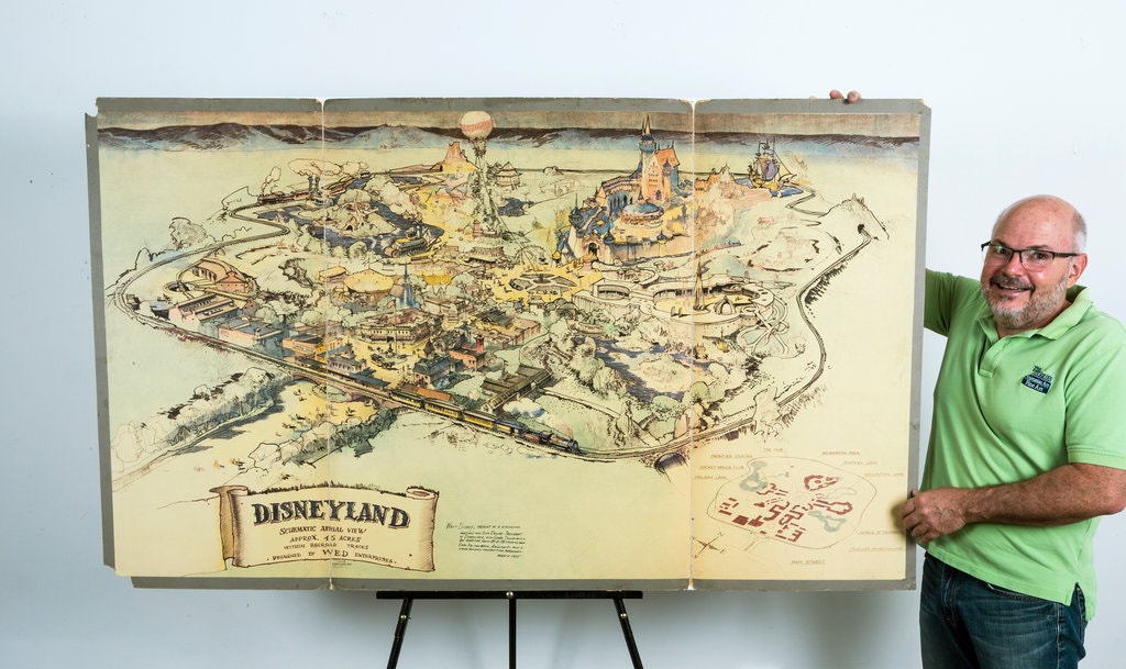
The 1953 Ryman Map of Disneyland from the New York Times. Click the link to see the rest of this article!
Due to budgeting issues, the official map of Disneyland took another three years after opening day to create. Sam McKim was the artist behind the first official park maps in 1958. The maps, at this point, still had some aspirations for parts of Disneyland not yet built, but mostly functioned as tools for park-goers to use to find their way around and as free souvenirs they could take home. Sam McKim’s maps ran, with some slight adjustments over the years, until 1964. For his contributions to the Disney brand, he was named “Map Maker to the Kingdom” and a tribute to his work can still be found at Disneyland.
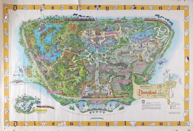
McKim’s 1958 Map of Disneyland. Click the link to see this map on Mouse Maps!
Maps as souvenirs was not a new concept; many World’s Fairs gave out artful brochure maps for visitors to remember their day at the Fair. But McKim’s willingness to push the boundaries of realistic map making in order to appeal to the imaginative and exciting nature of Disneyland revolutionized the amusement park map. After McKim, the artists behind the brochure maps became anonymous, but his impact on the work remains clear.
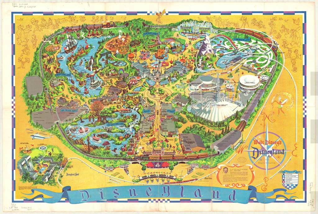
1968 Map of Disneyland. This version removed Edison Square and Liberty Park, which were not built but still included on the previous generation of maps. Click the link to see this map in our Digital Collections!
Cartography was a key tool in Disneyland’s creation. And it continues to be an important part of the Disneyland brand an experience– but more than that, the maps at Disneyland give us a way to take the park home. That first day may have been a disaster, but many, many Disney fans have experienced and loved the park since then. Happy 65th anniversary! Remember to take a map before you go–they help us find our way.
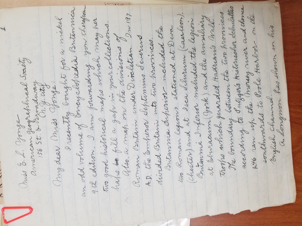
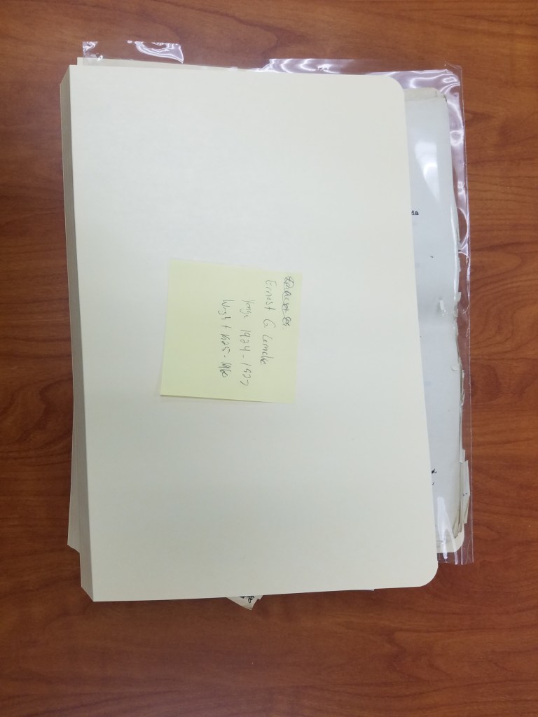
The Mysterious Case of Ernest G. Lemcke
By Lauren Maddox
Sometimes I like to pull back the curtain a bit for you– show you some of the behind-the-scenes work that goes on unseen at the AGSL. I was given a special project a few months ago that I thought the readers of this blog would be interested in hearing about.
Some things about me you need to know: I love puzzles and I have never seen Mission Impossible. Most of the AGSL staff loves puzzles; we are currently working on a 4,000 piece puzzle (which you can see if you visit us!). Generally, my work at the AGSL has me at a desk writing– that’s my job. But sometimes someone gives me something different to work on.
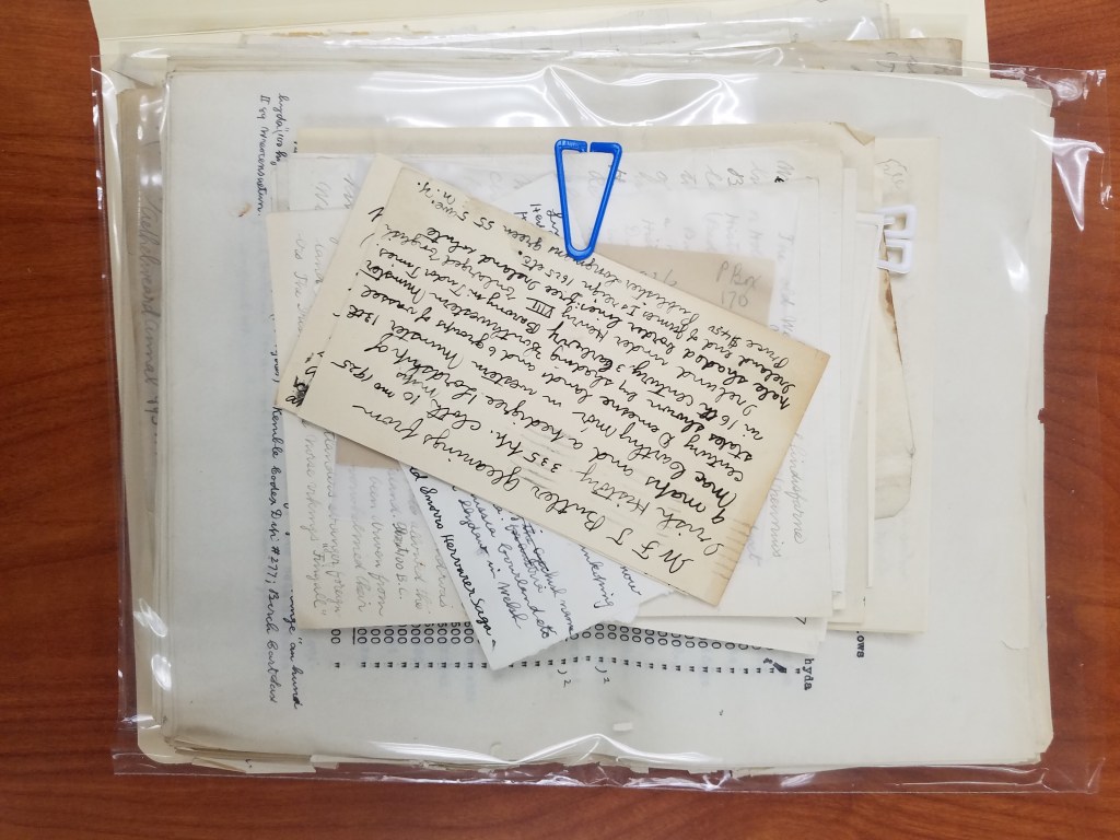
Susan Peschel stopped by my desk with a nondescript beige box.
“Your mission, should you choose to accept it–” she stopped to ask me if I remembered Mission Impossible. I didn’t, but I had at least heard the quote before. Susan told me that she had a puzzle for me (and that it might explode once she walked away).
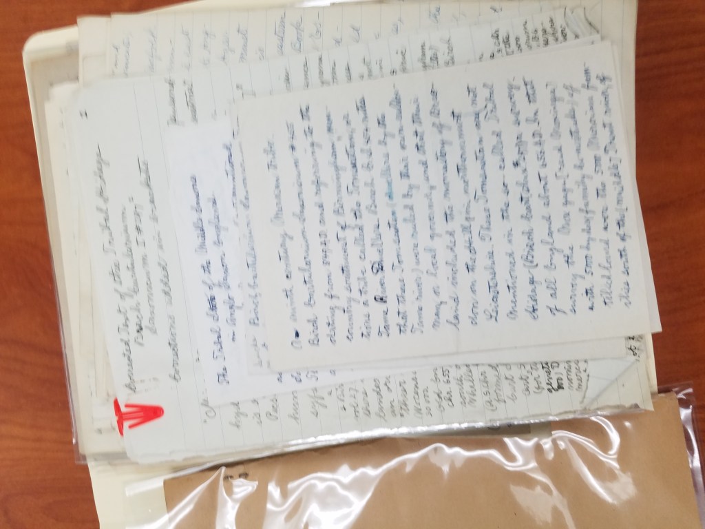
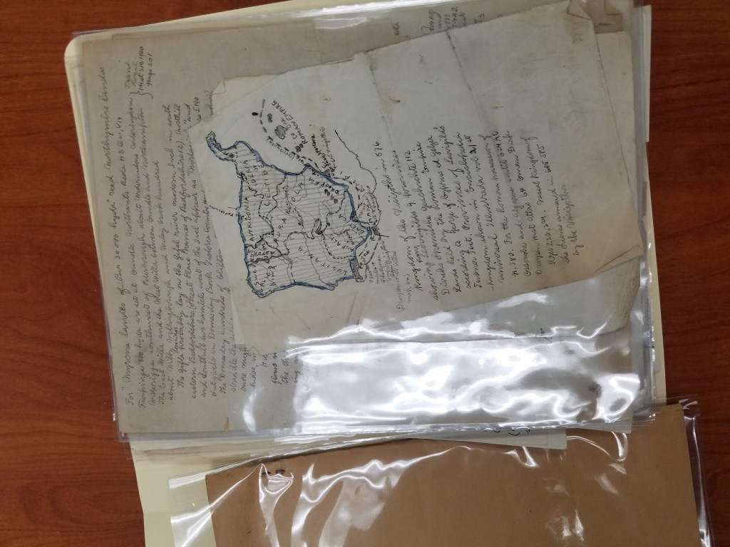
The problem with the box, which had traveled with the AGSL’s collection from New York to Milwaukee in the 70s, was that it had never been archived. The papers in the box were unsorted– no one even knew what they were. By all appearances, the collection of handwritten pages and letters seemed random. There were maps in the pile, but they were either hand-drawn or, stranger, road maps that had been drawn over. My mission (and I did accept it) was to figure out what we had and then to put it into some semblance of order.
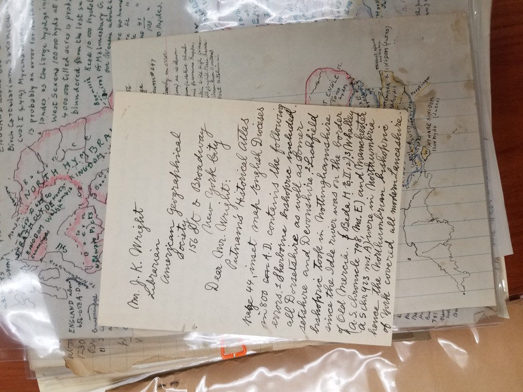
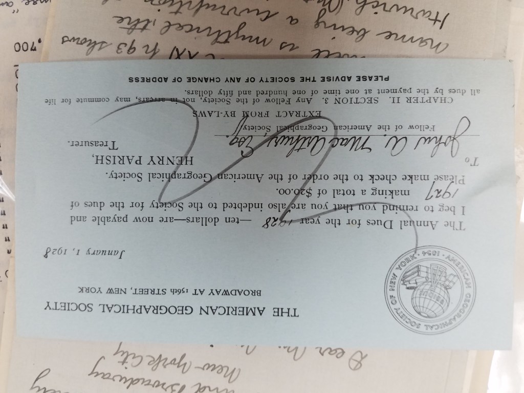
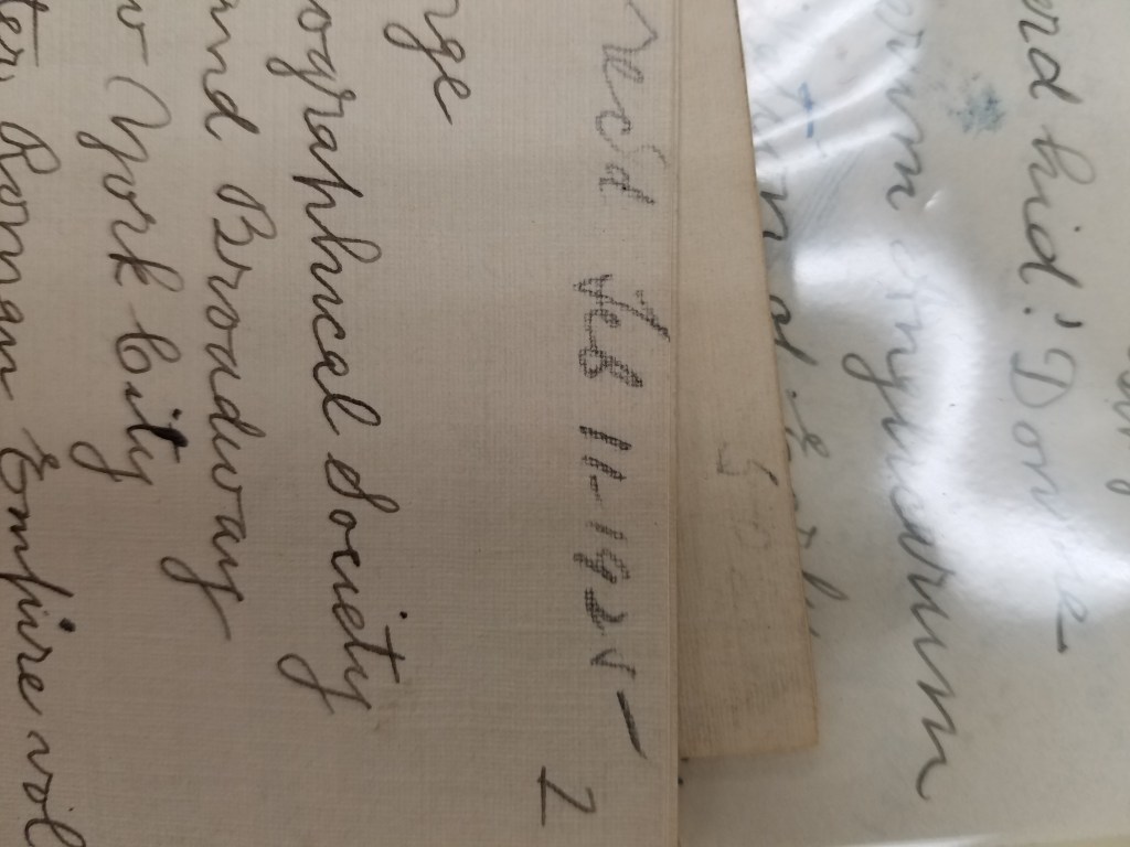
We didn’t know much, but we did know his name: Ernest G. Lemcke. We knew he was a card-carrying member of the American Geographical Society of New York because we have a record of his membership dues:
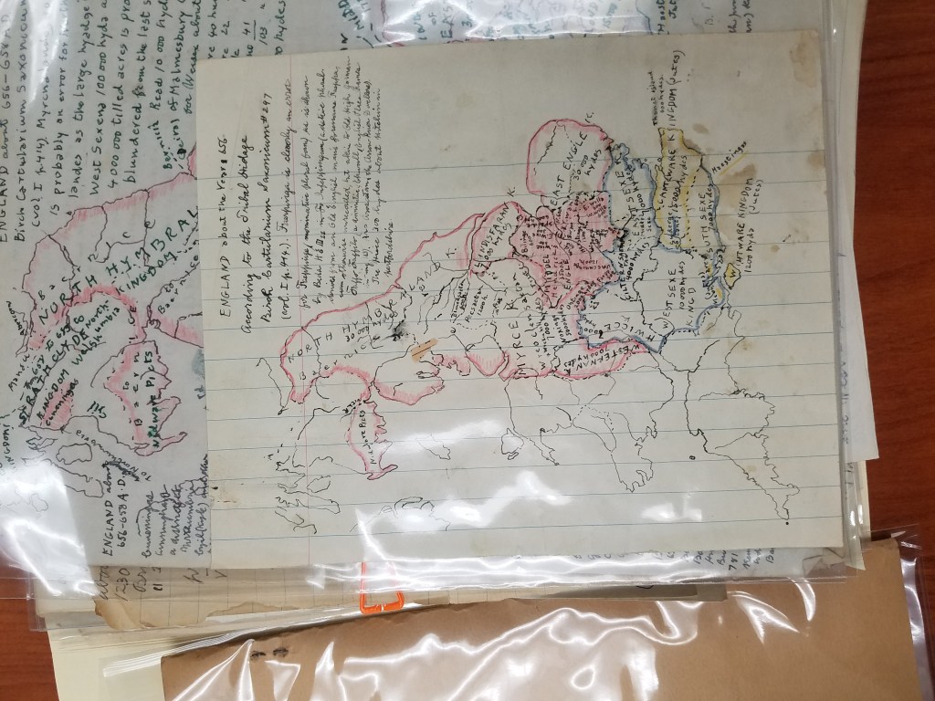
He wrote a trove of letters to Ena L. Yonge and John K. Wright. He bought a roadmap in 1926 and hand-drew a medieval military event in England from the 1300s. He was a book publisher in New York– which I discovered because some of his stationery had letterhead from Lemcke&Buechner, “Booksellers, publishers, importers.”
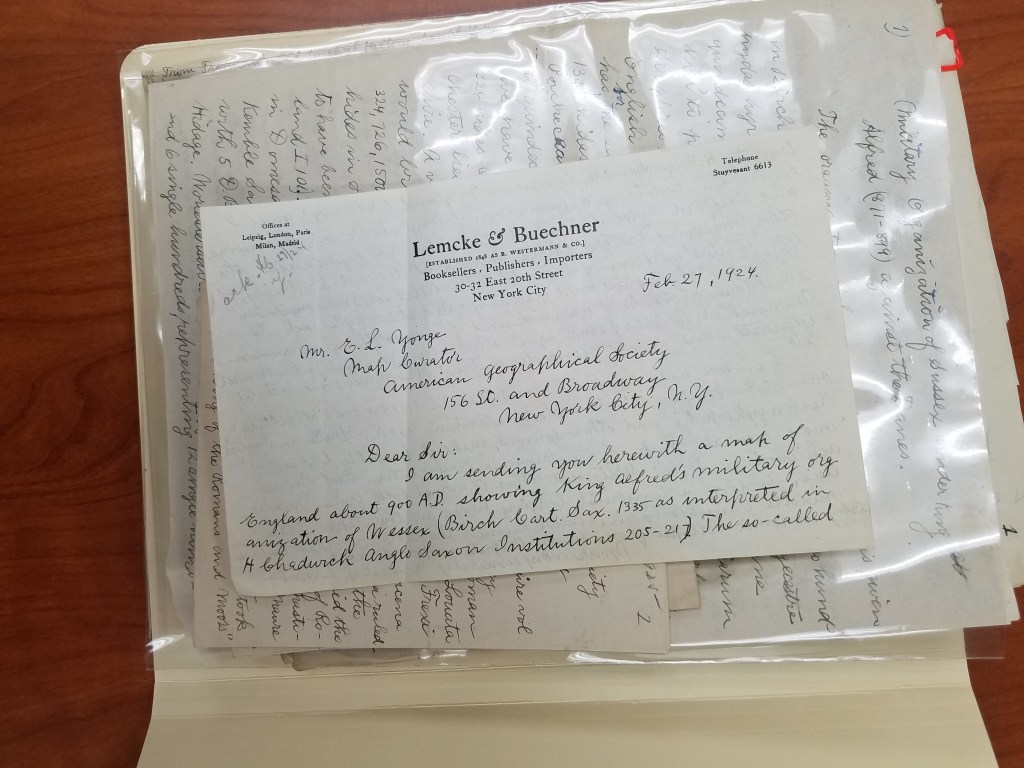
Part of the trouble with deciphering the box was figuring out what was meant for who. The maps were easy– Ena L. Yonge was map curator for the AGS of New York at the time, and his maps often came with a letter explaining what they were. But the partial manuscripts, many handwritten first drafts, and article corrections for the AGS’s periodical were mysterious and dense.
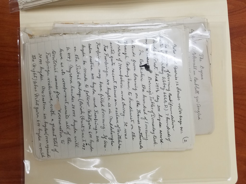
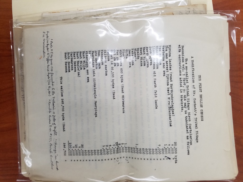
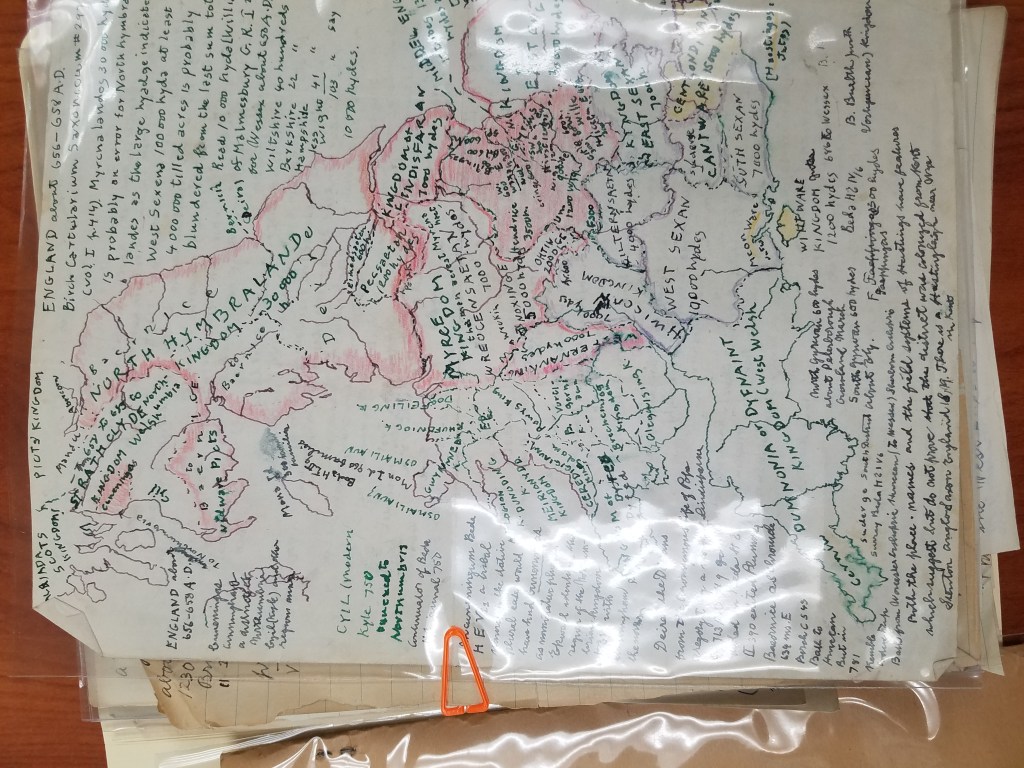
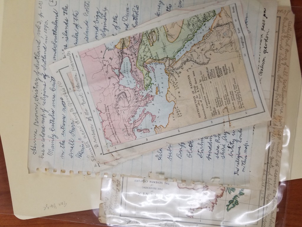
After many fruitless Google searches, I learned a few things about Lemcke: besides being a book publisher, he was also a historian with several books out, many specifically interested in the “Tribal Hidage” in Wessex. As it turns out, the University of New Hampshire also has a collection of Lemcke papers! Which was how I tracked down some of his publications and discovered that the many handwritten pages about a “tribal hidage” and the first English Census were partial drafts of his later, completed publications.
Now that I had a better idea of what we had, I came to the next part of the puzzle: putting it in order. I started with separating the things that were obviously addressed to Yonge or Wright. Maps were obviously meant for Yonge, and corresponded with letters that he had sent. John K. Wright was once director of the AGS of New York, but that didn’t help place many of Lemcke’s letters. But as it turned out, before he was director, Wright was the editor of the AGS’s regular publication from 1920-1956. This was exactly the period of time Lemcke was writing. The periodical corrections, then, seemed to be for the editor of the publication. And after reading Lemcke’s letters, I found him explaining corrections to his manuscript to Wright.
Once the letters were sorted by recipient, I started to put them in a chronological order. Some of the letters were dated– those were easy. But many of the letters weren’t dated. For several of them, I found a reference he made to an article he had just read, which helped me place it in the chronology. But many more had to be dated by their relationship to the other letters, which made for some puzzling work.
After finishing the work of putting the box in order, it was time to have it officially archived. This was definitely out of my expertise, so I reached out to fellow graduate intern Georgia Brown, who consulted our curator, Marcy Bidney, about what to do with the box.
Soon, the Lemcke papers will be officially archived! Since all of his correspondence was addressed to Ena L. Yonge and John K. Wright, the letters will be incorporated into their existing correspondence collections, cataloged, and made available for viewing! And now, with a little puzzling, we have put a years-old AGSL mystery to rest.
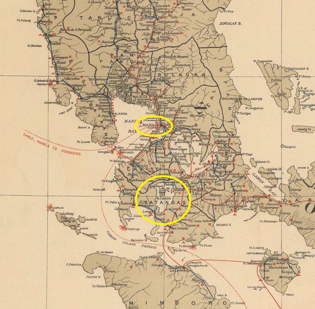
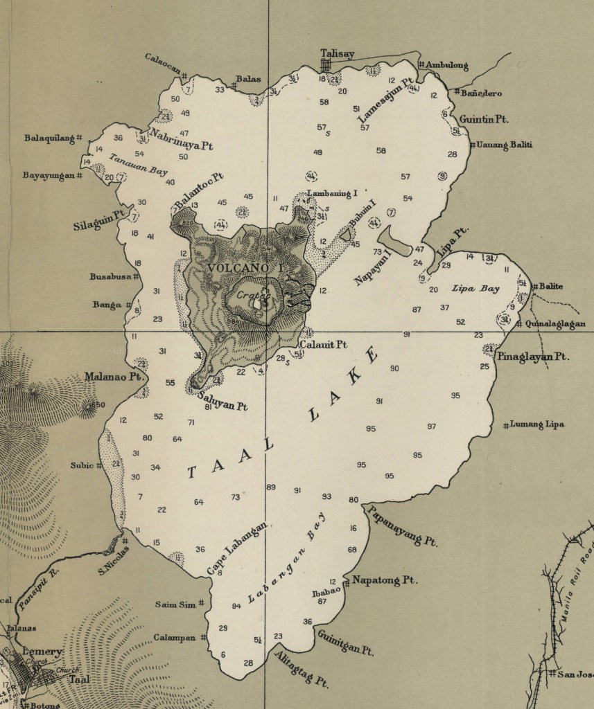
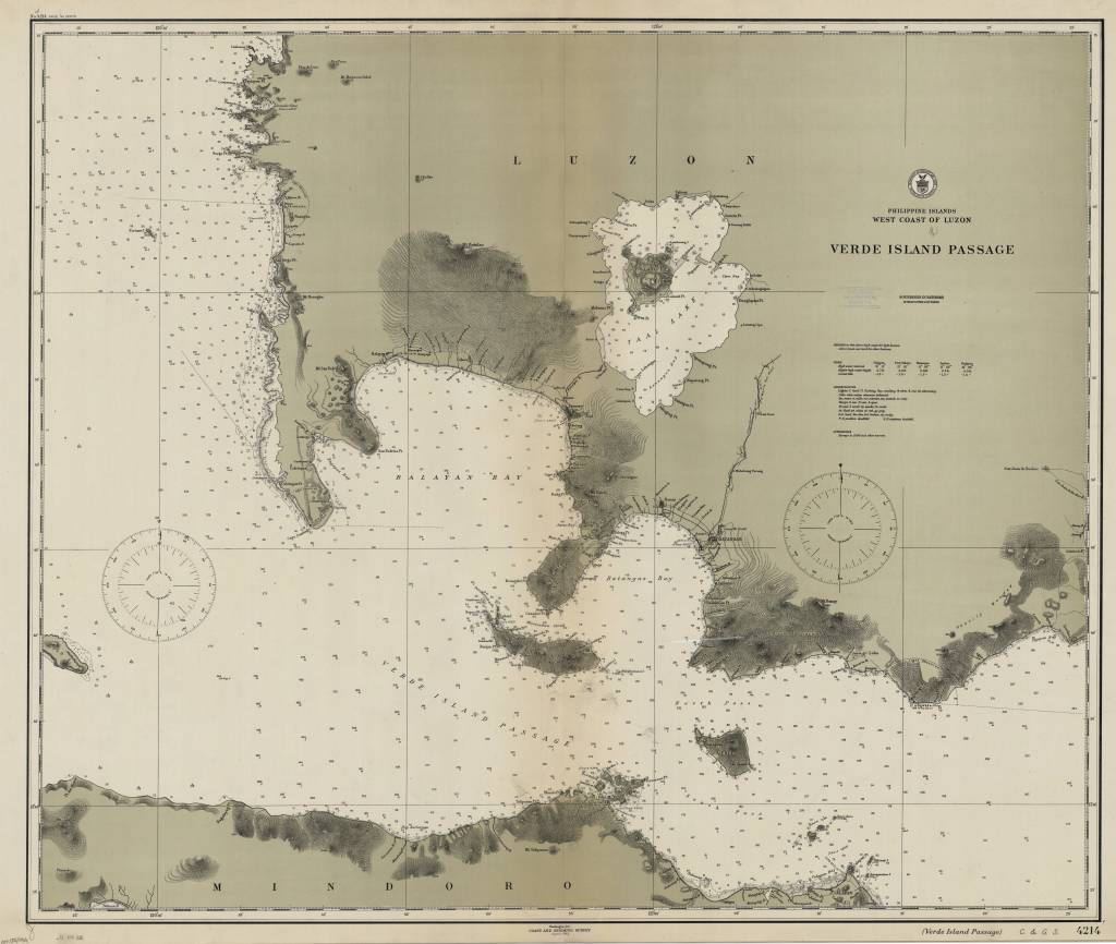
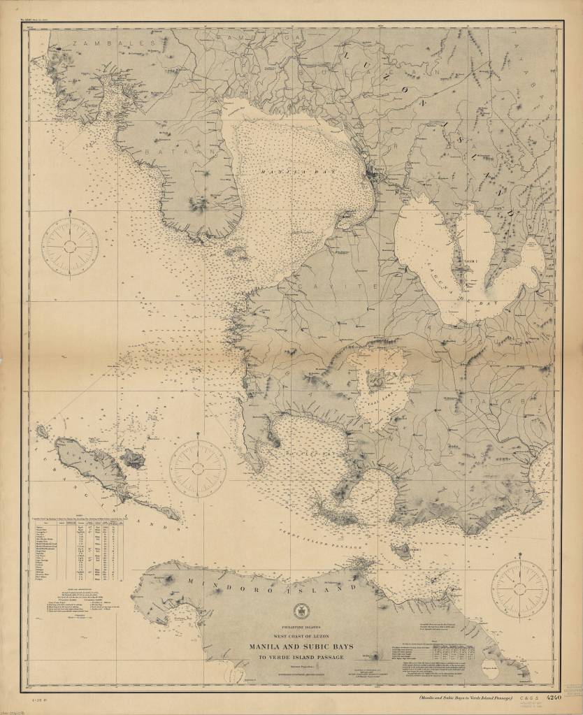
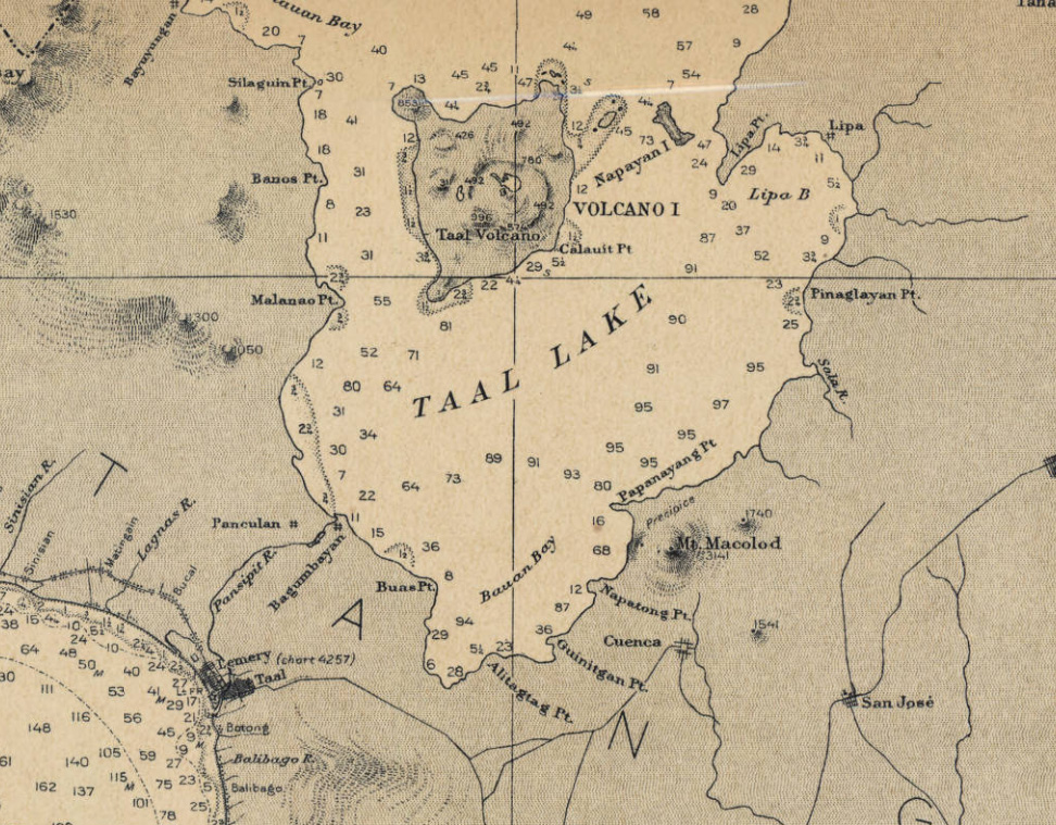
Taal Volcano, Philippines
by Angie Cope
The Taal Volcano in the Philippines is about 37 miles (60 kilometers) south of the capital Manila on the island of Luzon. The volcano sent a plume of ash, steam and rock six to nine miles into the sky with a violent explosion on Sunday, January 12, 2020. The area remains on an alert level four out of five which means a “hazardous eruption” is immenent in a region which is heavily farmed and popular for tourism.
Scientists warned that new fissures were appearing in the ground, and about 50 earthquakes jolted the area in just eight hours on Tuesday, all signs that another, possibly larger eruption was coming.
Around 459,000 people reside within a danger zone with a 14-kilometer (8.7 miles) radius around the volcano, according to a map by the agency, while more than 930,000 people live in a wider 17-kilometer (10.5 miles) danger zone.
Taal has been spewing fountains of red hot lava half a mile high, sparking its own spectacular lightning storms and turning green, tropical vistas grey with ash.
Philippine Islands, west coast of Luzon : Verde Island Passage / [U.S.] Coast and Geodetic Survey 1912
https://collections.lib.uwm.edu/digital/collection/agdm/id/6440/rec/30
Philippine Islands, west coast of Luzon : Manila and Subic Bays to Verde Island Passage / published … by the Coast and Geodetic Survey, O.H. Tittmann, Superintendent ; compiled from surveys by the Coast and Geodetic Survey … and from Spanish and other sources 1907
https://collections.lib.uwm.edu/digital/collection/agdm/id/6373/rec/4
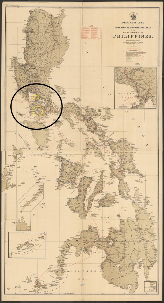
Progress map of Signal Corps telegraph lines and cables in the Military Division of the Philippines / prepared under the direction of Brigadier General A.W. Greely chief signal officer U.S. Army ; by Major R.E. Thompson Signal Corps, U.S. Army 1903
https://collections.lib.uwm.edu/digital/collection/agdm/id/25398/rec/23